



The End of the Beige Era
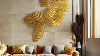
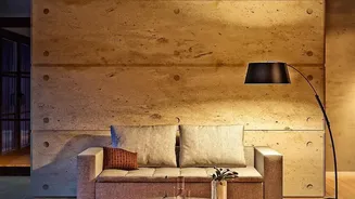
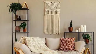
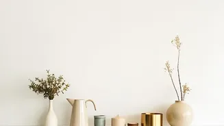
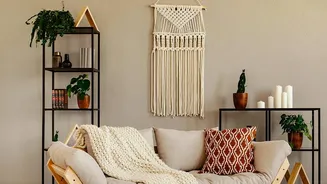
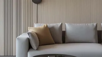
For the better part of a decade, walking into a stylish home often felt the same: shades of beige, greige, and off-white dominated walls, furniture, and textiles. This minimalist aesthetic, popularized by the 'quiet luxury' trend, offered a sense of calm
and order. It was an easy, safe choice that promised a timeless, sophisticated backdrop. However, designers and homeowners alike are beginning to feel a sense of fatigue with these once-beloved neutrals. The very safety of beige has become its downfall, leading to spaces that can feel impersonal, flat, and even 'borderline boring'. The uniformity that once felt calming now often feels devoid of personality and emotion, prompting a collective desire for something more expressive.
The Rise of Dopamine Decor
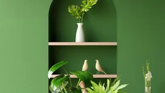
The rebellion against beige has a name: 'dopamine decor'. This trend, which has seen a huge surge in interest, is all about creating spaces that make you feel good. Instead of adhering to strict visual rules, it prioritizes joy, individuality, and emotional connection. It’s a move away from designing for future resale value and toward designing for your present life and mental well-being. This doesn't mean a chaotic explosion of neon; rather, it’s a thoughtful use of colour, pattern, and texture to boost your mood. Trending colours include rich blues, earthy greens, warm terracottas, and even soft mauves, all used to create an atmosphere that feels vibrant and alive.
What Is a Balanced Colour Palette?
Moving away from beige doesn't mean you have to paint your entire home in bright, bold hues. The key is balance. A balanced palette creates harmony and prevents a space from feeling overwhelming. A classic rule used by designers is the 60-30-10 principle. Here’s how it works: 60% of your room should be a dominant colour, usually a neutral or subdued shade on the walls. 30% should be a secondary colour, found on furniture or curtains. Finally, 10% is your accent colour, a bold pop on items like cushions, artwork, or decorative objects. This formula allows you to introduce exciting colours like buttery yellows or deep wine tones without sacrificing a sense of calm and cohesion. The goal is to layer colours with varying intensity and depth to create visual interest.
How to Start Introducing Colour
If you're feeling hesitant to break up with beige, start small. You don't need a complete overhaul to inject personality into your home. One of the easiest ways to start is with textiles. Swap out neutral cushions and throws for ones in a colour you love. Another impactful strategy is to use artwork to guide your palette; pick a piece you adore and pull a few accent colours from it to repeat subtly throughout the room. Even a single piece of statement furniture, like an armchair in a rich velvet or with a sculptural shape, can act as the 'main character' in a room and disrupt the monotony of an all-neutral scheme. The inclusion of colour, no matter how big or small, can make any room feel more dynamic and layered.
More Than Just Paint
Creating a balanced and interesting home goes beyond just the colours on your walls. Texture and materials play a crucial role in adding depth and warmth that colour alone cannot. In the post-beige world, there is a renewed focus on how a space feels, not just how it looks. Think about contrasting textures: a plush velvet chair against a smooth wall, a nubby bouclé sofa, or gauzy linen curtains that diffuse light beautifully. Natural materials like wood, stone, and metal also add character and a sense of grounding. Light itself is a powerful tool; the way it interacts with different surfaces—reflecting off a metallic object or being absorbed by a matte finish—adds another layer of sensory experience to your home.