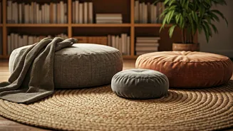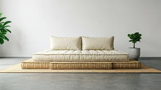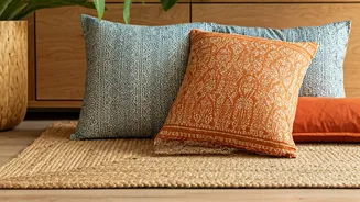

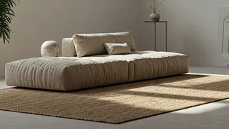


Embrace the Textural Contrast
The magic of this pairing lies in its beautiful contrast. Jute, with its rustic, fibrous, and robust nature, provides a wonderfully earthy and grounded base. It speaks of durability and a connection to the natural world. When you place soft, organic cotton
or linen cushions on top, the difference is immediate and inviting. The smooth, breathable fabric of the cushions offers a gentle counterpoint to the coarse weave of the jute. This play on textures is a fundamental principle of interior design that adds depth and interest to a space, preventing it from feeling flat or one-dimensional. The combination feels tactile and begs to be touched and experienced. It’s not just a visual arrangement; it’s a sensory one that enhances the feeling of comfort and relaxation in your home.
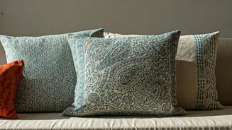
Mastering the Art of Pattern
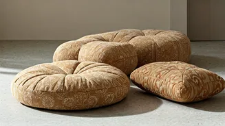
Block printed fabrics are celebrated for their intricate patterns and the subtle imperfections that reveal their handmade origins. When matching these cushions with jute, the neutral, solid base of the seating acts as a perfect canvas. This allows the patterns to truly shine without overwhelming the space. For a cohesive look, start by choosing a unified colour story. You might opt for classic indigo prints, earthy rusts and ochres from Bagru, or delicate floral butis from Sanganer. Don't be afraid to mix different patterns, but follow a simple rule of scale. Pair a cushion with a large, bold motif with one or two others featuring smaller, more delicate designs. This creates a visual hierarchy that is dynamic yet balanced. The jute’s simple texture ensures that even a vibrant mix of patterns feels intentional and chic, not chaotic.
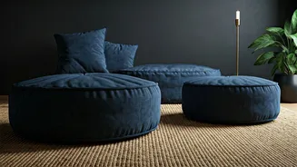
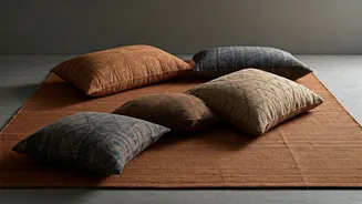
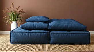
Building a Harmonious Colour Palette
The natural, sandy beige of jute is a designer's dream. It’s a versatile neutral that works with almost any colour palette. For a serene, minimalist aesthetic, pair it with cushions in shades of off-white, cream, and charcoal. The block prints in this case can be subtle, perhaps in a single contrasting colour like black or grey. If you crave a more vibrant, bohemian vibe, use the jute as a grounding element for a riot of colours. Think cushions in deep jewel tones like sapphire blue, emerald green, and ruby red. The key is to ensure the colours are harmonious. Look for prints that share at least one common colour to tie them together. The organic dyes often used in block printing—like indigo, madder, and turmeric—have an inherent earthiness that naturally complements the raw quality of jute, ensuring the final look is sophisticated, not jarring.
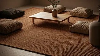
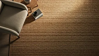
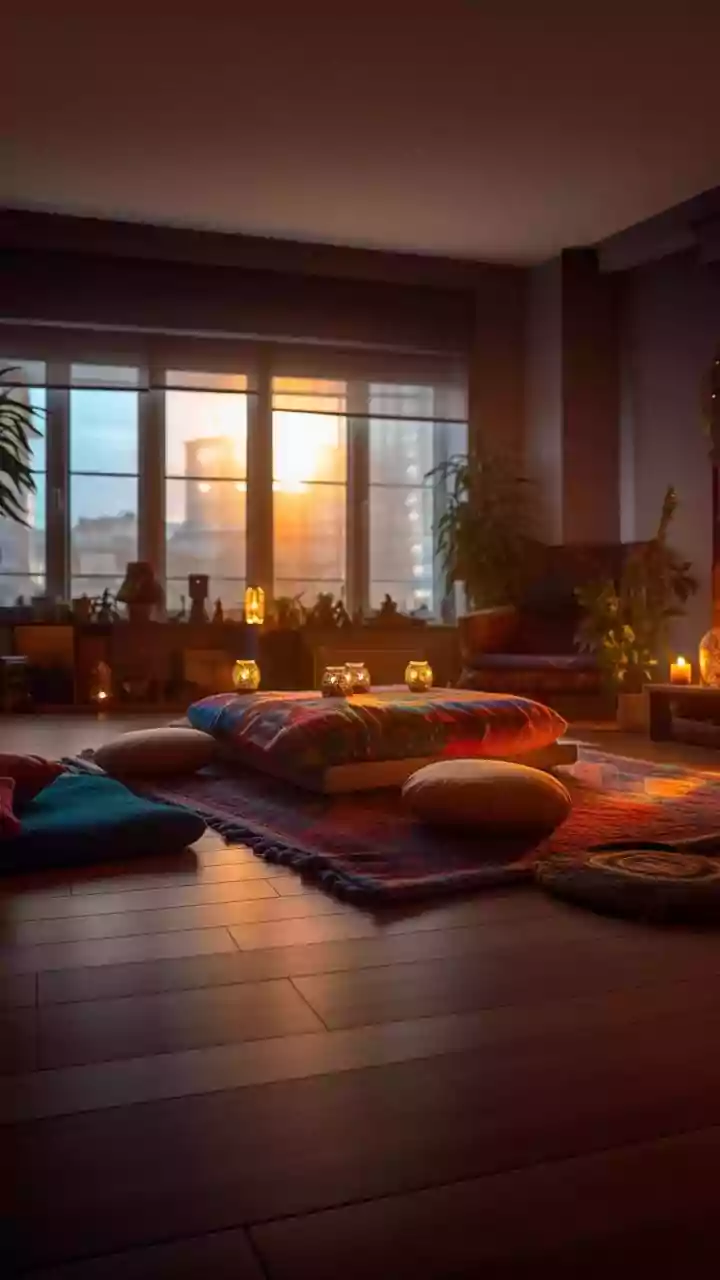
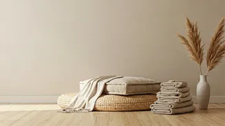
Styling the Perfect Floor Nook
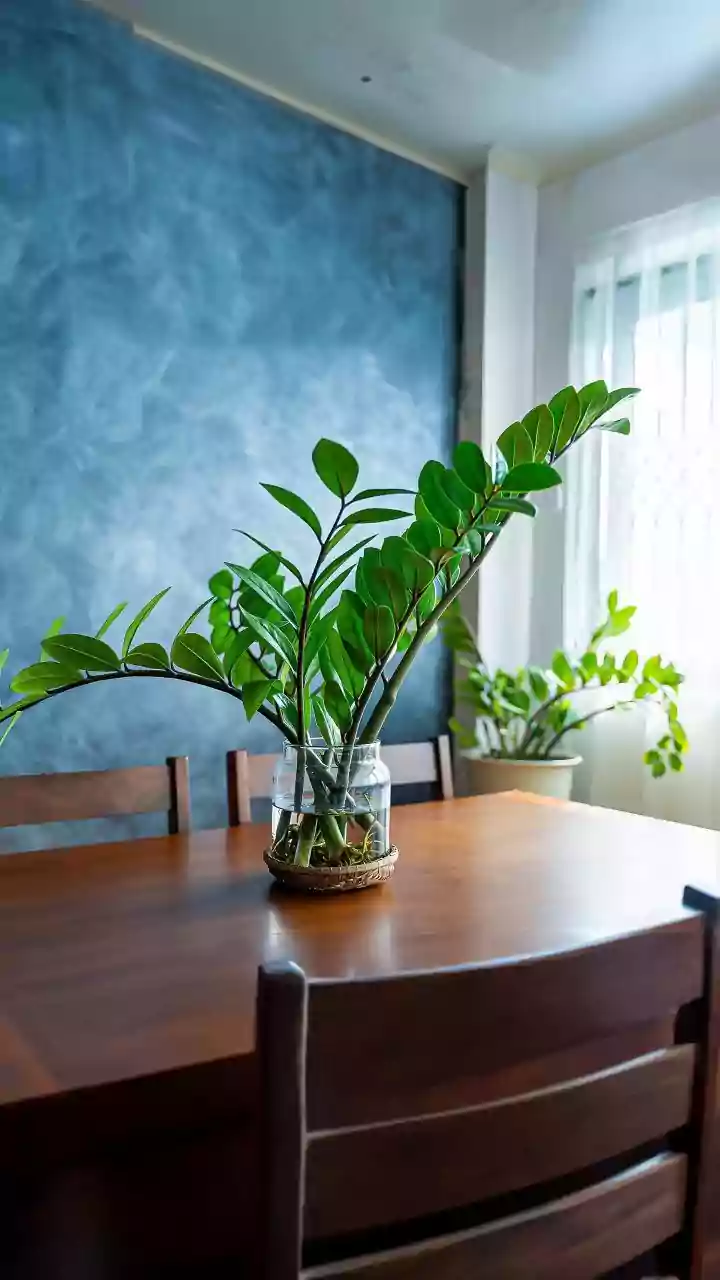
Once you have your jute seating and cushions in place, the final step is to style the surrounding area to create a complete and inviting nook. Low seating calls for accompanying elements that are also close to the ground to maintain a sense of balance. Consider a low-slung wooden table, perhaps crafted from mango or sheesham wood, to hold a cup of chai and a few books. A handcrafted brass or copper tray can add a touch of metallic warmth. To enhance the cosy atmosphere, place a tall, minimalist floor lamp behind the seating for ambient light. Indoor plants are another essential element; a large fiddle-leaf fig or a collection of smaller terracotta pots will amplify the organic, natural feel of the setup. This isn't just about placing furniture; it's about curating a corner that feels personal, lived-in, and peaceful.