





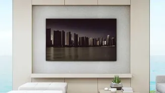
The Golden Rule of Scale and Proportion
The first step isn't just about ensuring the art physically fits; it's about making sure it is proportional to its surroundings. Interior designers often use the two-thirds rule: artwork should be approximately two-thirds to three-quarters of the width
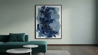
of the furniture it hangs above. For example, if your sofa is 90 inches wide, you should look for a piece of art that is around 60 inches wide. This creates a pleasing sense of balance, anchoring the art to the furniture and making the composition feel intentional. A small piece above a large sofa will look lost, while a piece that’s too wide can feel heavy and overpowering. For a blank wall without furniture, a good guideline is to have the artwork occupy about 60-75% of the wall's width.
Mastering the Art of Height
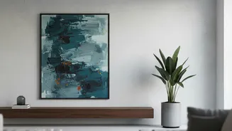
One of the most common mistakes in hanging any art, especially large pieces, is placing it too high. Art that floats too close to the ceiling feels disconnected from the room and its inhabitants. The gallery-standard rule is to hang artwork so that its center is at eye level, which is generally considered to be 57 to 60 inches from the floor. When placing art above furniture like a sofa, console, or headboard, the rule shifts slightly. The bottom of the frame should be between 6 and 10 inches above the top of the furniture. This small gap is critical; it connects the two pieces visually without making them feel crowded.
Create a Real-World Template
Before you finalise the purchase, bring the art's dimensions into your home. This is the single most effective way to prevent buyer's remorse. You don't need the actual art, just its measurements. Cut a piece of craft paper or tape together newspaper to the exact size of your prospective artwork. Using painter's tape, which won't damage your walls, stick your paper template onto the wall. Live with it for a day or two. This allows you to see how the scale feels not just head-on, but also as you move through the space. You can assess its impact from different angles, check sightlines from doorways, and ensure it doesn't obstruct traffic flow. This simple trick moves your decision from abstract numbers to a real-world visualisation.
Consider the 'Visual Weight'
Two paintings of the exact same size can have vastly different impacts based on their 'visual weight'. This interior design concept refers to how much an object commands attention. Factors like color, complexity, and texture all contribute. A dark, busy, or heavily textured piece will feel 'heavier' and take up more visual space than a light, minimalist, or airy piece of the same dimensions. A bold abstract with saturated colors will have a stronger presence than a subtle line drawing. When choosing your oversized art, consider its visual weight in the context of your room. If your space is already filled with heavy furniture and dark colors, a visually lighter piece of art might be a better choice to create balance. Conversely, a minimalist room can handle a piece with significant visual weight to serve as a powerful anchor.
Plan for Practicalities
Beyond aesthetics, there are practical considerations. Oversized artwork can be heavy, so it's vital to plan for secure installation. Ensure you use the correct hanging hardware for the weight of the art and the type of your wall (plaster, drywall, brick). Using inadequate hooks or anchors is not only a risk to the artwork but also a safety hazard. Also, think about lighting. Great art deserves great light. Avoid placing artwork in direct, harsh sunlight, which can cause fading over time. Instead, consider adjustable track lighting or a dedicated picture light to highlight your new statement piece and bring its colors and textures to life in the evening.