



What is a 'Main Character' Label?
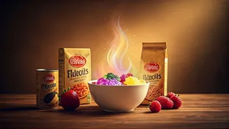
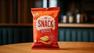
Forget busy designs crowded with cartoon mascots and competing claims. The new school of snack packaging is confident, minimalist, and unapologetically bold. Think matte finishes, vibrant, blocky colours, and witty, sans-serif fonts. These labels aren't
screaming for attention; they're creating a vibe. A bag of chips no longer just says 'Salt & Vinegar.' It might say 'Crunchy. Salty. Yours.' in a clean, elegant script. This isn't just packaging; it's a personality. Brands are realizing that in a crowded market, the label is the first handshake, and they’re designing it to be a memorable one. This aesthetic often signals a premium, modern, or health-conscious product, using design to convey quality before you even taste what's inside.
The Social Media Stage
The single biggest driver of this trend is the digital shelf. In the age of Instagram, TikTok, and endless unboxing videos, the package has become a prop. A snack is no longer just food; it’s content. Brands know that a visually striking or 'Instagrammable' package is far more likely to be shared, creating organic marketing moments. Consumers essentially become brand ambassadors when they post a picture of a beautifully designed snack. Direct-to-consumer (DTC) brands, born online, perfected this playbook. Without a physical store shelf to rely on, their packaging had to do all the work, creating an exciting unboxing experience that customers would want to share. This has forced legacy brands to rethink their own shelf appeal in a world where every product is one photo away from going viral.
Packaging as an Identity
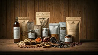
For younger consumers, particularly Gen Z, purchases are often an extension of their identity and values. A snack isn’t just a snack; it’s a statement. The packaging they choose can signal their commitment to sustainability, their appreciation for minimalist design, or their support for a small, local business. These new labels speak that language. They often feature prominent claims about being 'plant-based', 'gluten-free', or made with 'natural ingredients'. The use of earthy tones and kraft paper can signal an eco-friendly ethos, while bold, playful aesthetics might align with a more carefree, indulgent identity. By choosing a certain brand, consumers are aligning themselves with the story and values that the packaging communicates. Research shows a significant portion of Gen Z has tried a product simply because the packaging stood out.
The Indian Snack Aisle Glow-Up
This global trend is clearly visible on Indian shelves, both physical and virtual. A new wave of homegrown brands is challenging the dominance of legacy players by marrying traditional Indian flavours with contemporary design. Brands are turning to clean, modern aesthetics to appeal to younger, health-conscious consumers. For example, you might see baked bhujia or popped pani puri chips in packaging that feels more at home in a high-end design store. Companies like Cornitos use bold colours and resealable pouches to appeal to on-the-go snackers, while others use traditional motifs in a modern way to evoke authenticity without looking dated. Even traditional giants like Haldiram's and Bikaji are evolving their packaging to balance heritage with a modern appeal that stands out on crowded shelves.
From Functional to Foundational
What this all points to is a fundamental shift in the role of packaging. For decades, the primary jobs of a snack wrapper were to protect the product and provide basic information. That is no longer enough. Now, packaging is a key part of the product itself—a marketing tool, a brand storyteller, and a cultural signifier. It has to be durable enough for shipping, beautiful enough for a close-up, and clear enough in its values to attract a loyal community. It’s no longer just the opening act; it’s a core part of the main event.