



The Golden Rule: Vary Your Scale
The single most important rule for successfully mixing patterns, especially botanicals, is to vary their scale. When two prints of a similar size are placed next to each other, they compete for attention, creating visual noise. However, by pairing a large-scale
pattern with a small-scale one, you create a clear visual hierarchy. One print becomes the star of the show, while the other acts as a supporting detail. Imagine a beautiful floral arrangement; it’s captivating because it contains a mix of large blooms and smaller, more delicate flowers. The same principle applies to your decor, allowing the eye to move comfortably between the two patterns without feeling overwhelmed.
Start with a 'Hero' Print
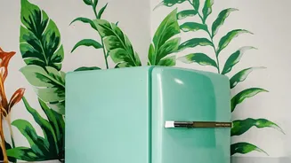
Every well-designed room with mixed patterns starts with a single 'hero' or dominant print. This is typically your large-scale botanical. It might be a dramatic floral wallpaper, a sofa upholstered in a bold leaf pattern, or curtains with oversized blossoms. This piece will set the tone for the entire room and serve as the foundation of your design scheme. Don't be afraid to go big here. A large pattern needs space to be appreciated, so it works best on significant surfaces where the full repeat of the design is visible. By choosing this element first, you give yourself a clear direction for all subsequent choices.
Find a Supporting Partner
Once your hero print is in place, it’s time to find its companion: the small-scale botanical. This pattern should be noticeably smaller and more subtle than your first choice. Think of a delicate vine, a tight repeating leaf motif, or a tiny floral sprig. This secondary pattern works wonderfully on smaller items like accent pillows, lampshades, or a lightweight throw blanket. The goal is for this print to add texture and interest without challenging the dominance of your large-scale hero. It should read almost as a solid colour from a distance, revealing its detail only upon closer inspection.
Unify Everything with Colour
Even with perfectly scaled prints, your room won't feel cohesive without a unifying colour palette. This is the secret that ties everything together. Look closely at your large-scale hero print and pull two or three colours from it. Use these shades to inform your choice of the second botanical pattern and other elements in the room. For example, if your large floral wallpaper has shades of green, cream, and a touch of blush, your smaller print could be a simple green-and-cream vine. This shared colour DNA ensures that even though the patterns are different, they feel like they belong in the same family, creating a harmonious and intentional look.
Give the Eye a Place to Rest
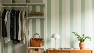
With two beautiful botanical prints in play, it's crucial to incorporate 'negative space' to prevent the room from feeling too busy. This doesn't mean leaving walls bare; rather, it means strategically using solid colours and simple textures to provide a visual break. A solid-coloured sofa, a neutral-toned rug, or plainly painted walls can ground the patterns and make them pop even more. These quiet moments are just as important as the patterns themselves, creating balance and ensuring your carefully chosen botanicals remain the celebrated focal points of the space.