


The Charm and Challenge of Vintage
There's a unique joy in finding a vintage piece with a story—a weathered armchair, an ornate mirror, or a mid-century sideboard. These items bring character that mass-produced furniture often lacks. However, the very thing that makes them special—their
individuality—can also make a room feel cluttered or disjointed. The challenge isn't just collecting beautiful things; it's about making them feel like they belong together in a space that tells your story, not just the story of a flea market.
Why Colour Is Your Unifying Secret
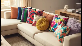
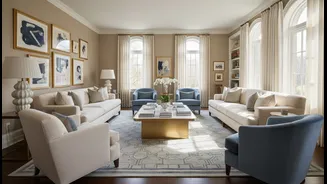
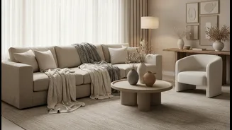
Colour is one of the most powerful tools in interior design. When you repeat a colour throughout a room, you create a visual rhythm that guides the eye and connects disparate objects. This repetition acts as an invisible thread, making the mix of different styles and eras feel deliberate and harmonious rather than chaotic. A consistent colour story is the glue that can hold a room of eclectic treasures together, transforming a collection of random items into a curated, intentional design.
How to Build Your Colour Palette
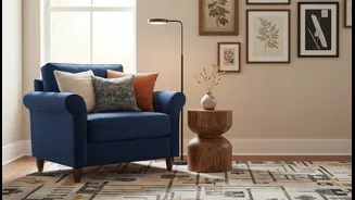
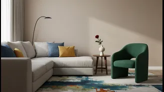
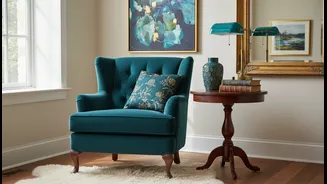
Start by choosing a primary piece to draw inspiration from. This could be a patterned rug, a favourite piece of art, or a bold velvet armchair. Pull two or three key colours from that item to form your palette. A simple rule to follow is the 60-30-10 principle: 60% of your room should be a dominant, often neutral colour (like your walls), 30% a secondary colour found in furniture or curtains, and 10% an accent colour for smaller accessories. This limited palette prevents the space from feeling overwhelming and provides a clear framework for your vintage finds.
Weaving the Colours Throughout
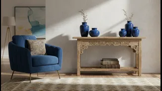
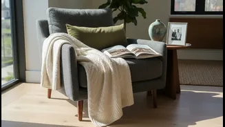
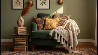
Once you have your palette, the goal is to sprinkle these colours across the room. For example, if your inspiration rug has a deep green, echo that shade in a cushion on the sofa, a ceramic vase on a bookshelf, and perhaps even the leaves of a houseplant. The repetition doesn't have to be obvious. These subtle echoes create visual links, so the eye travels smoothly around the space, connecting the dots and registering the room as a complete, unified whole. Accessories like throws, books, and smaller decor are perfect for carrying your accent colour to every corner.
Don't Forget Tones and Textures
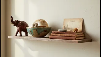
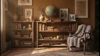
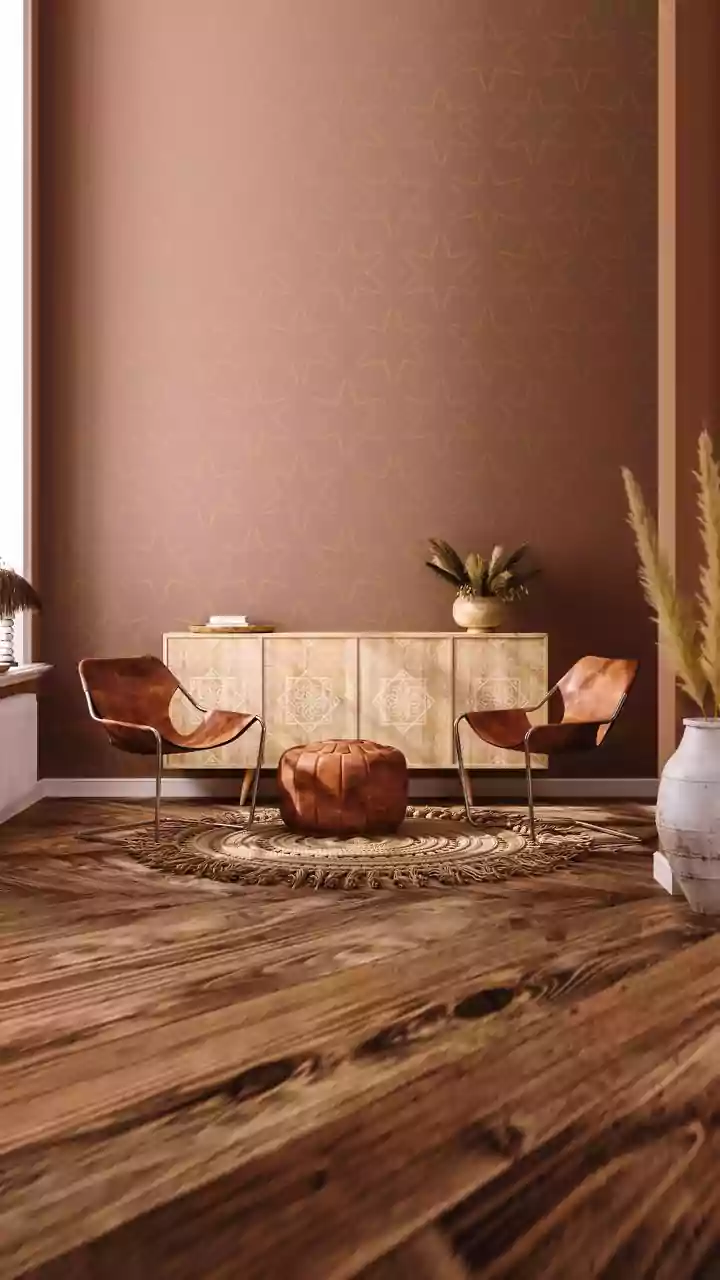
Colour repetition isn't just about bold hues. It also applies to materials and finishes. Creating harmony can be as simple as repeating a specific wood tone or a metallic finish. If you have a vintage teak credenza, look for other warm wood tones in picture frames or the legs of a chair. Likewise, if you find a charming brass lamp, repeating that brass finish in cabinet hardware or a mirror frame creates a subtle but powerful sense of cohesion. This layering of similar materials and tones adds depth and sophistication, making the room feel thoughtfully collected over time.