


Understanding Vastu Principles
Vastu Shastra, an ancient Indian architectural science, emphasizes the balance of the five elements – earth, water, fire, air, and space – to create harmonious
living spaces. Within the context of bedrooms, adhering to Vastu principles can significantly influence the quality of sleep, relationships, and overall well-being. By thoughtfully selecting colors based on Vastu, one can encourage positive energies and create a sanctuary that promotes rest and rejuvenation. These principles guide the selection of colors, the placement of furniture, and the orientation of the room to ensure that the space resonates with positive vibrations, leading to a peaceful and balanced living experience.
Best Colors for Bedrooms
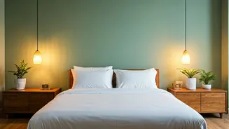
According to Vastu, the best color choices for bedrooms often include soft, calming shades. Light blues and greens are highly recommended as they represent tranquility, serenity, and harmony, thereby creating a peaceful atmosphere. Gentle shades of pink are also considered favorable, particularly in master bedrooms, as they are associated with love, compassion, and romance. Avoid using dark or bold colors, especially in large amounts, as they can sometimes lead to feelings of restlessness or anxiety. If you choose to incorporate bolder colors, use them as accents rather than as the primary color, carefully balancing their effect with neutral tones to achieve the desired equilibrium.
Color Placement & Direction
Vastu suggests that the direction of your bedroom can also impact the choice of color. For instance, if your bedroom is in the southwest direction, earthy tones like beige or brown are often recommended to provide stability and grounding. If the bedroom is in the north or northeast direction, light blue or green shades can enhance a sense of peace. When painting your room, consider where the color will be most dominant. It's often beneficial to paint the walls in lighter shades and use darker colors for accent walls or furniture. This approach ensures a balanced energy flow, promoting a harmonious environment. The distribution of colors should complement the overall design and facilitate the flow of positive energy within the space.
Color Combinations & Accents
When creating your bedroom's color scheme, it's essential to consider the impact of color combinations and accents. Pairing light blue with white creates a serene and spacious feel, perfect for relaxation. Green combined with soft yellow evokes freshness and a connection to nature. Accent colors can be introduced through artwork, pillows, or curtains. For example, using a touch of orange or yellow can add a vibrancy that stimulates creativity while maintaining the overall calming effect. Incorporating metallic accents like gold or silver can bring a sense of luxury and sophistication, enhancing the aesthetics and harmonizing the energy flow within the bedroom.
Colors to Avoid
Certain colors should be avoided or used sparingly in bedrooms according to Vastu principles. Very dark shades like black or deep red can create a heavy and overwhelming feeling, disrupting the balance and tranquility of the room. While a small amount of dark colors might be acceptable in accents, using them as primary colors can be unsettling. Bright and overly stimulating colors like neon shades or very bold primary colors should be avoided in large quantities as they can disrupt relaxation and sleep. Opting for softer, more subtle hues ensures that the bedroom remains a peaceful retreat.