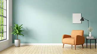


Vastu Color Fundamentals
Vastu Shastra, an ancient Indian system of design and architecture, deeply understands the profound influence of colors on our environment and emotional
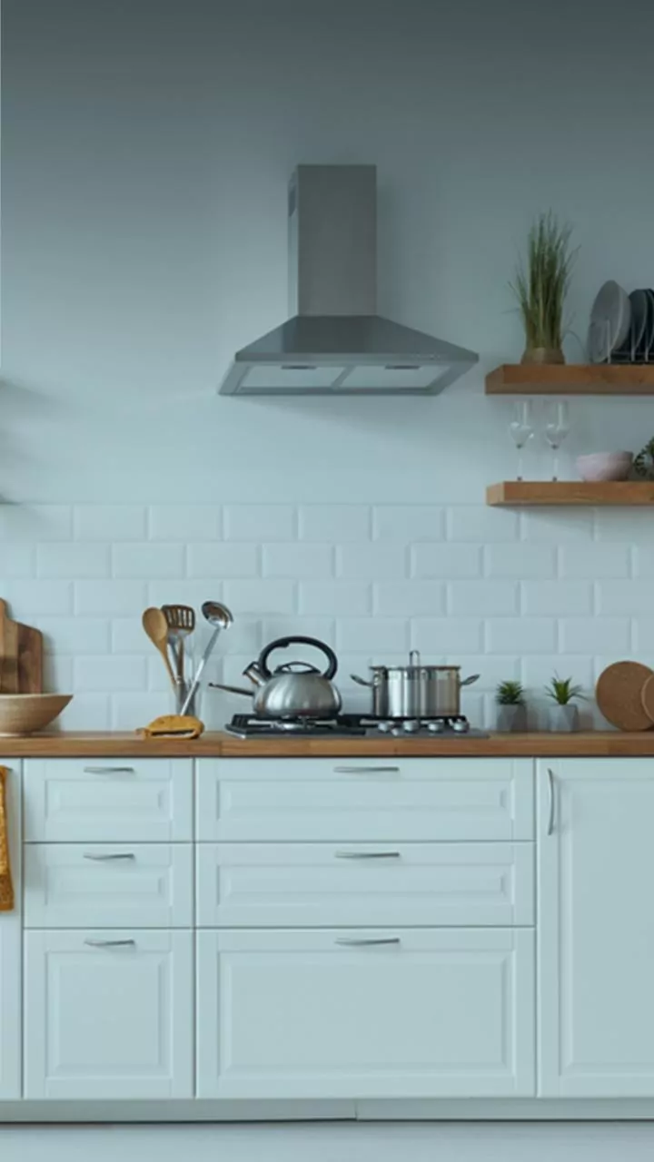
state. It posits that judicious use of specific hues can cultivate a more positive, harmonious, and energetically balanced living space. Each color is believed to resonate with particular elements and energies, affecting mood, vitality, and mental clarity. For instance, white is lauded for its purity and ability to foster peace and a sense of spaciousness, making it suitable for any room. Yellow is associated with happiness and intellectual stimulation, ideal for areas where creativity and learning are encouraged, such as living rooms or study spaces. Blue, a shade of tranquility and trust, brings calmness, especially in bedrooms or meditation areas, promoting deep relaxation. Green embodies nature, renewal, and healing, offering a sense of freshness that benefits kitchens and restful spaces. Red signifies passion and energy, best applied subtly as an accent to avoid overstimulation. Orange brings warmth and enthusiasm, excellent for vibrant social areas or children's rooms. Pink promotes love and emotional balance, perfect for bedrooms and spaces dedicated to affection. Finally, brown offers stability and comfort, creating a grounded and secure atmosphere in living or sleeping quarters.
Zone-Specific Vastu Hues
Beyond general significance, Vastu Shastra meticulously assigns colors to specific directions and zones within a home to maximize their beneficial impact. The North, associated with wealth and career advancement, benefits from the calming and prosperous energies of blue and green. For the East, the direction of the sun and health, vibrant yellows and invigorating oranges are recommended to enhance vitality and well-being. The South, linked to fame and recognition, can incorporate reds and oranges, though these should be used cautiously to prevent an overly intense atmosphere. Gains and profits are said to be amplified by blue and silver in the West. The Northeast, a sacred zone for spirituality and tranquility, thrives with soft blues, yellows, and pristine white. The Southeast, the zone of fire and dynamic energy, calls for lighter shades of orange, pink, and red to infuse warmth without overwhelming heat. Relationships and stability are nurtured by peach, brown, and green in the Southwest. Lastly, the Northwest, associated with air and movement, finds balance and clarity with white, silver, and light gray.
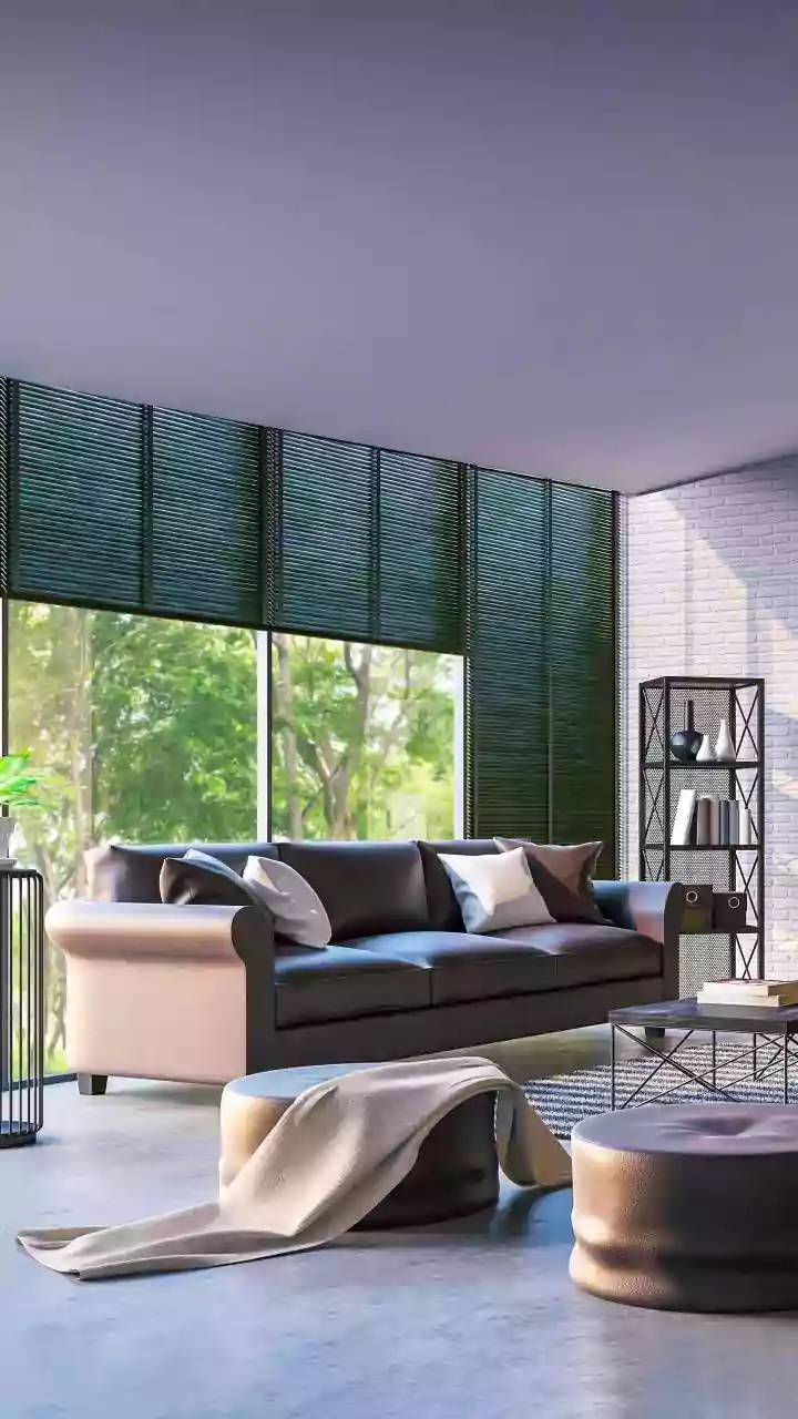
Master Bedroom Serenity
The master bedroom holds immense importance as the emotional core of a home, serving as a sanctuary for relaxation, intimacy, and rejuvenation. According to experts, the colors chosen here significantly impact emotional balance and rest. Loud or overly stimulating shades should be avoided to cultivate an environment that feels like a comforting embrace. Instead, the focus should be on soft, grounding hues that promote a sense of peace and security. Recommended colors include warm, inviting tones like beige, soft cream, blush pink, muted peach, taupe, and gentle mocha. These shades work harmoniously to create a tranquil atmosphere, facilitating deep rest and emotional restoration after demanding days, fostering a deeper connection between partners and allowing for effective energy replenishment.
Children's Room Vibrancy
Children are particularly sensitive to their surroundings, making the color choices in their rooms crucial for their mood, behavior, creativity, and concentration. While parents often opt for bright, bold colors to create a fun atmosphere, an excess of strong hues can lead to overstimulation. The ideal environment for a child's room balances joy with emotional safety. For younger children, soft pastel shades such as powder blue, mint green, buttery yellow, lavender, and aqua are recommended. These gentle tones help to foster both calmness and imagination. For older children and teenagers, particularly students, softer greens and blues are suggested as they are known to support focus and alleviate stress. Furthermore, color choices can be tailored to individual personalities; highly active children might benefit from cooler tones to promote settling down, while more reserved children could thrive with slightly warmer shades to boost confidence and self-expression.