


Color as Shorthand
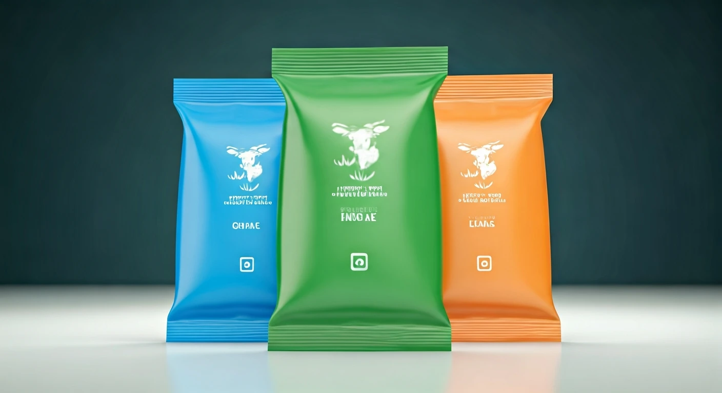
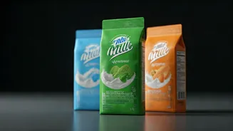
Walk into any Indian dairy aisle and you'll notice milk packets aren't just plain white; they come in a distinct spectrum of colors including blue, green,
and orange. This visual coding system has evolved into an everyday shorthand, allowing shoppers to quickly identify the type of milk inside – whether it's lighter or richer – even before delving into the detailed labels. This intuitive method has become a fundamental part of the grocery shopping experience, enabling consumers to make rapid choices without deciphering technical specifications. While regulatory bodies like FSSAI oversee essential labeling, the specific color choices are determined by individual dairy brands as a way to communicate fat content or milk variations. The underlying principle is straightforward: color acts as an immediate visual cue for the milk's fat percentage and its overall character, making product selection swift and efficient.
Decoding the Hues
The color-coding on milk packets, while decided by individual brands, generally adheres to established conventions that serve as a visual guide to fat content. Typically, a blue packet signifies toned milk, which contains approximately 3.0% fat. Green packaging usually indicates standardized milk, boasting a slightly higher fat content of around 4.5%. For those seeking a richer option, the orange packet represents full cream milk, typically containing about 6.0% fat. Some brands also utilize magenta to denote double-toned milk, a lighter choice with roughly 1.5% fat. Therefore, the color is not merely decorative; it's an integral part of the product's identity. This system empowers consumers who understand the code to select the precise milk they need at a glance, whether for their morning tea, for making creamy curds, or for preparing rich sweets and dishes.
Beyond Quality Perception
A common misunderstanding is that brighter or darker colors on milk packets equate to superior quality. This perception is inaccurate regarding the function of the color-coding system. The primary purpose of these colors is to denote the specific type of milk and its associated fat percentage, rather than signifying an absolute higher quality of one packet over another. Each category serves distinct consumer needs: double-toned milk is the leanest, toned milk offers a balance, standardized milk is more substantial, and full cream milk is the richest. Consequently, determining the 'best' packet is subjective and depends entirely on individual household preferences and intended uses. While some prefer lighter milk for daily consumption, others choose richer milk for its enhanced flavor, texture, and suitability for cooking. The color coding effectively simplifies this decision-making process, eliminating the need to scrutinize nutritional information.
Integrated into Daily Life
The vibrant color scheme on milk packets has seamlessly integrated into the daily vernacular of Indian households. Consumers may not always recall the exact fat percentages, but the colors blue, green, and orange are instantly recognizable. Over time, these colors have become a form of shorthand, passed down through generations, making requests like 'the blue packet' universally understood within a family. This visual system imbues milk packets with a sense of familiarity and even a touch of personal connection. They are common household items that carry a form of domestic memory, with people often continuing to purchase the color they grew up with, even if they no longer consciously analyze the labels. This simple design choice has profoundly shaped consumer habits and preferences.
Design for Convenience
At first glance, the array of colors on milk packets might seem like a purely aesthetic branding choice. However, these distinct hues function as a concise language designed to enhance consumer convenience. The shades of blue, green, and orange enable shoppers to make rapid purchasing decisions, easily distinguishing between different milk varieties and selecting products that precisely match their requirements. Within the official categorization of dairy products, these colors are not random; they are deliberately linked to specific fat percentages and distinct milk classifications. This deliberate association is the core reason for the enduring effectiveness of the color-coding system. Its simplicity, memorability, and practicality make it exceptionally efficient, fulfilling a key objective of excellent design in streamlining choices within the rapid pace of modern life.