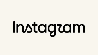








New Delhi: Instagram has launched a completely new take on its wordmark, which is the first major change in its design in almost 10 years. The new appearance
will be designed to give the brand a cleaner, more modern look while maintaining some aspects of its originality.
The change was announced in an Instagram post by Instagram head Adam Mosseri, who stated the wordmark had not been updated in 10 years, and it was time to make the change. He said that the new design was “cleaner and more modern” yet had the whiff of Instagram.
Users Quickly Spot a Problem
There’s already a tonne of puns and gags on the web about the redesign. Several users said the stylised letters are difficult to read, with some claiming the wordmark looks like “Instagzam” or “Instagwam”.
Matt Navarra, the social media consultant, also chimed in about the redesign on X. He said designers would likely have “a fun day tearing it apart“, while adding that he personally liked the fresher look.
Mosseri seemed to have been expecting the reaction. He posted the news on Threads and asked people to post their “hot takes” about the new design.
Creators Want Bigger Changes
Design peeps are going to have a fun day tearing it apart.
For what it’s worth, i dig it. Fresh, modern, true to the original.
Although some are saying it reads: Instagzam.
I dig that 😆 pic.twitter.com/n8p4lpZmoD
— Matt Navarra (@MattNavarra) August 13, 2026
Not everyone’s criticism was about the logo. Some Instagram users suggested that Meta should address bigger platform concerns, such as AI content and bots and account recovery.
The account Resiliência Humana, with over 12 million followers, pleaded with Mosseri to explain the reason for the loss of access to the creator’s account without providing any support. Instagram’s colourful camera icon is unchanged. This last update only addresses the wordmark.