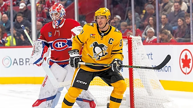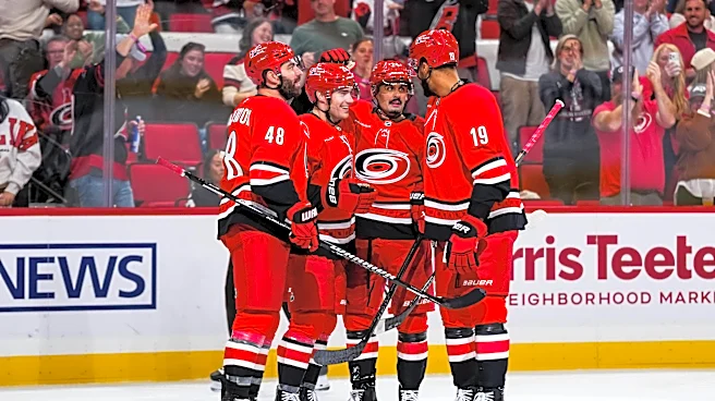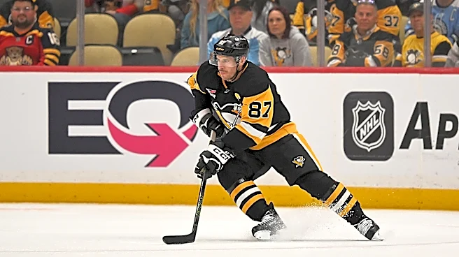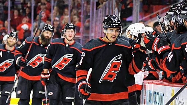




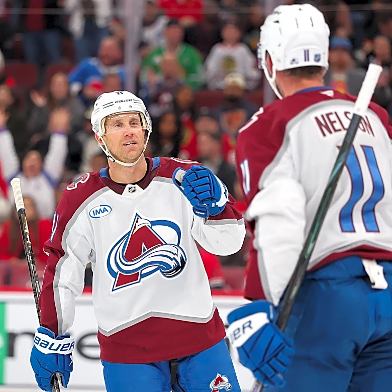

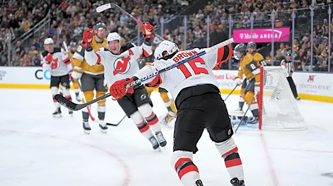
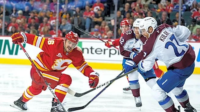
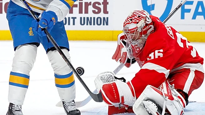

We've got ourselves some awesome new NHL jerseys to sift through -- it's time for he Hometown Remix editions, with each of the 32 teams putting together logos and color schemes meant to focus on the local city culture of the franchises. It's a pretty cool program that's given us some sweet new threads.
Some of them are pretty awesome. Others? We feel like they missed the mark and maybe didn't do as well when it comes to the originality aspects -- some of these feel like we've seen them before. Either way, we're here to rank them all from worst to best.
Away we go:
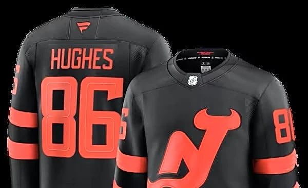
32. New Jersey Devils

It's... just kind of bland. We want more!
31. Chicago Blackhawks

It's very green!
30. New York Islanders

Is there really nostalgia for the Fish Stick logo? I guess so.
29. Montreal Canadiens

Maybe a little too minimalist.
28. Calgary Flames

Kinda looks like a normal Flames jersey?
27. Edmonton Oilers

Just too dark for me.
26. Vancouver Canucks

Too blue!
25. New York Rangers

Not sure how original it is.
24. Pittsburgh Penguins

There's a lot going on here.
23. St. Louis Blues

There's not enough going on here.
22. Detroit Red Wings

The Hockeytown logo is neat but otherwise? I want other stuff tweaked!
21. Boston Bruins

Points for originality but it looks like a Minnesota Gophers jersey.
20. Ottawa Senators

A little too gold.
19. Nashville Predators

I like the little touches on the shoulders, but not the color scheme.
18. Buffalo Sabres

Like the color scheme.
17. Toronto Maple Leafs

Dig the logo but it's a little plain.
16. Dallas Stars

A little too glow-in-the-dark but it's fun.
15. Philadelphia Flyers

I think I've underrated these. I like them!
14. Carolina Hurricanes

It's almost so NOT hockey that it works.
13. Washington Capitals

My first thought was "corny!" but it's growing on me.
12. Los Angeles Kings

Speaking of growing on me: These are getting better every time I look at them.
11. Minnesota Wild

Love the colors.
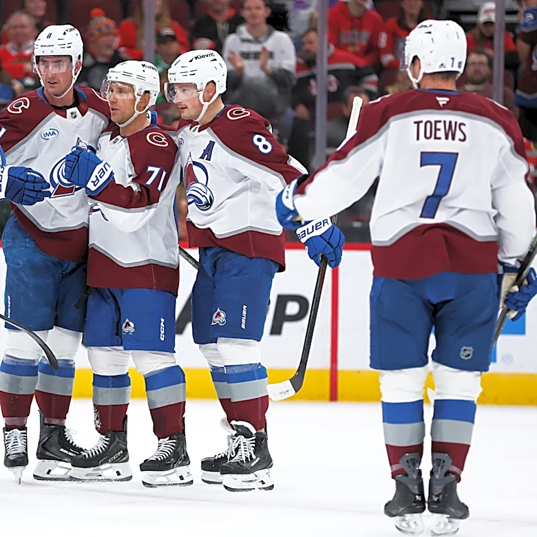
10. Colorado Avalanche

That's sleek as heck.
8. Utah Mammoth

A near-perfect combo.
8. Tampa Bay Lightning

I LOVE THAT LOGO!
7. Florida Panthers

You could either think these will burn your retinas or are a perfect summary of Florida. I take the latter.
6. Anaheim Ducks

Oh yes. These are NICE.
5. Seattle Kraken

The anchor, the sleeves... yes!
4. Vegas Golden Knights

I will buy this and wear it to the craps table, thanks.
3. San Jose Sharks

The bite in the sleeves is what got me.
2. Winnipeg Jets

They look like they're glowing like a jet engine.
1. Columbus Blue Jackets

The color scheme and the cannon make this one the winner.
This article originally appeared on For The Win: Every NHL Hometown Remix jersey, ranked from best to worst