



We're in year two of the Nike Rivalries uniform era in the NFL. That means an opportunity for the league to sell some new alternate jerseys and for lapsed fans across the nation to stumble upon a primetime game, squint at the television and ask "wait, who's playing?"
The 2025 debut hit the AFC East and NFC West, coincidentally bestowing Super Bowl powers on these divisions. That's great news for the Chicago Bears' ascension and the Jacksonville Jaguars' turnaround, because this year's eight kits belong to the teams in the AFC South and NFC North. That gives Nike a wonderful opportunity to ruin both newer, weirder uniforms and established classics that have been largely unchanged for decades.
It's tough to get too upset about jerseys and helmets
that will only be worn for a fraction of the season. And, in fairness, some of these kits look pretty nice! But who's winning the rivalry race from a sartorial standpoint? Let's compare all 16 "Rivalries" uniforms and see who came out ahead in this styles exchange.
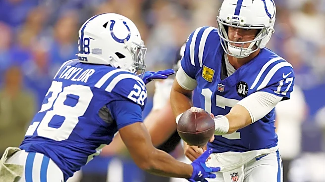
16. Indianapolis Colts
What sets this apart from the blue-and-black blackout uniforms of the Detroit Lions and Carolina Panthers? Why, the grommets, of course!
— Indianapolis Colts (@Colts) August 25, 2026
15. Miami Dolphins
Hmmm. Looks like your standard Group of 5 college football blackout kit.
From the depths. 🌊
— Miami Dolphins (@MiamiDolphins) August 28, 2025
Introducing our Rivalries uniform. Available in-store on 9.10. pic.twitter.com/RPmNYFvSLV
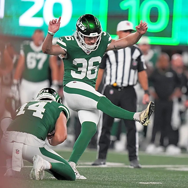
14. New York Jets
You know what I think about when I think New York City? Manholes.
A closer look at the new threads
— New York Jets (@nyjets) August 28, 2025
📰: https://t.co/hFlxe98pFD pic.twitter.com/BDIj7FFhNY
Despite all the talk of Gotham City, it's only referenced on the *interior* of the jersey. And while I know licensing a D.C. Comics product is an unnecessary expense, would it killed the Jets to make things at least a little more Batman?
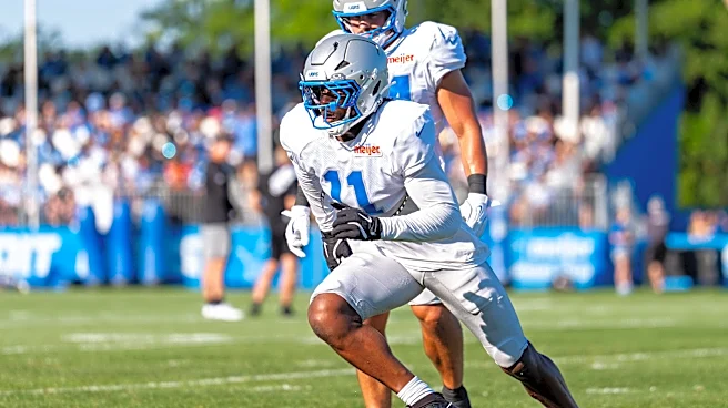
13. Detroit Lions
These look a lot like color-swapped late 2010s-early 2020s Jets uniforms. You know, the ones Sam Darnold was caught seeing ghosts in. That's probably not a great sign.
Defend. The. Den. pic.twitter.com/PiIQN5cf0u
— Detroit Lions (@Lions) August 25, 2026
12. Tennessee Titans
It's better than the generic, paneled uniforms the team introduced in the 2000s and has begrudgingly stuck with. It's worse than the Houston Oilers-themed robin's egg blue-and-whites.
— Tennessee Titans (@Titans) August 25, 2026
11. Los Angeles Rams
The material on the numbers has gone from Fruit Roll-Up to old gym locker doors:
Work in the dark.
— Los Angeles Rams (@RamsNFL) August 28, 2025
Earn the spotlight.
Available 09.10.25 pic.twitter.com/uBJwWDVlBQ
The black is boring and the two-toned paneling is a bit jarring. But I love a good shoulder/sleeve stripe, and the Rams didn't mess with the best part of their uniforms.
10. Arizona Cardinals
It's, uh, sand!
Survival isn’t given - it’s earned. Built To Last.
— Arizona Cardinals (@AZCardinals) August 28, 2025
NFL x Nike Rivalries | #BirdGang pic.twitter.com/0sS9S44OiX
9. Chicago Bears
A perfectly cromulent uniform.
— Chicago Bears (@ChicagoBears) August 25, 2026
8. Green Bay Packers
A vague throwback look that's much nicer than the team's actual doo-doo brown throwbacks. That puts this grade on a curve, but the numbers are clean even if they look like someone had 15 seconds to pick a Microsoft Word font before shipping the proofs out to the factory.
For our history. For our future. For you. pic.twitter.com/a2cVbuLlhE
— Green Bay Packers (@packers) August 25, 2026
7. Buffalo Bills
There's a lot of Oakland Raiders-ing going on with these kits. I get it; that's a classic look.
Today's Forecast: COLD FRONT. 🥶#BillsMafia | #GoBills pic.twitter.com/3vpDJWi8rM
— Buffalo Bills (@BuffaloBills) August 28, 2025
6. Houston Texans
I don't love the shiny Fruit Roll-up numbers. I do appreciate how it's based on the kind of paint job Paul Wall's car would have.
All in the details. https://t.co/fbfGfFUdw5 pic.twitter.com/FB7AelDNgm
— Houston Texans (@HoustonTexans) August 25, 2026
5. San Francisco 49ers
The font on the numbers matches the font on the wordmark! That's enough to make me forget the helmets look like what Indiana University wore to a 3-9 record in 2002.
Every detail is golden. pic.twitter.com/m0zQYUmLhY
— San Francisco 49ers (@49ers) August 28, 2025
4. Jacksonville Jaguars
Yeah man, I dunno, I guess I just like numbers that look like they were ripped from the menu of a whimsical ice cream shoppe.
— Jacksonville Jaguars (@Jaguars) August 25, 2026
3. Seattle Seahawks
That shoulder design? Sharp. The metallic numbers? Potentially a disaster in motion but they look good so far. The color-changing helmet? Seems cool as hell.
Rivalries.
— Seattle Seahawks (@Seahawks) August 28, 2025
Explore the design » https://t.co/k6kMsAUl2o pic.twitter.com/9HTc5hKBEX
2. New England Patriots
I can't believe I dinged the Bills for looking like the Raiders yet put New England's Ole Miss kits this high. I guess I really am a sucker for a good shoulder stripe. Especially if the tapering makes them look like each player is wearing an invisible cape.
The Nor’easter is here.
— New England Patriots (@Patriots) August 28, 2025
Introducing the Patriots 𝙉𝙁𝙇 𝙉𝙞𝙠𝙚 𝙍𝙞𝙫𝙖𝙡𝙧𝙞𝙚𝙨 uniform. pic.twitter.com/gQw1P1px3I
1. Minnesota Vikings
We're leaning hard into the Nordic aspect of the team's origins without drastically changing anything about one of the league's cleanest fits. It's purple. There's a horn. You've got some runes. It's not jarring, but it is nice.
Feel The North 😈https://t.co/h0zACZWDHy pic.twitter.com/M7aVLQLOgg
— Minnesota Vikings (@Vikings) August 25, 2026
Andrew Van Ginkel's gonna look awesome jumping a screen pass for a pick-six in these.
This article originally appeared on For The Win: Ranking all 16 of the NFL's 'Rivalries' uniforms, from Colts to ??