
After teasing it last week, the Hurricanes on Wednesday marked the arrival of hockey reentering our life this month by annoucing a change in the road white uniform kit. As is done these days, it wasn’t
just a release of photos, but a whole production.
As was rumored, it’s the 2023 Stadium Series uniform but in white. To fully stick in that point in case you were unsure, the use of the NC State Marching Band swirling around the team just hammers that home. As former marching band member myself—albeit for their rival—I’m genuinely curious how much they were actually playing because that can get loud really quick. That had to be a real thrill for those kids to be a part of the photoshoot.
As with any uniform release, the focus is on the sweaters since that’s the part that you as a fan can purchase, but a joking video released after is probably the best look at the whole ensemble.
So the Canes are embracing going more red on the road like they have switched to in recent years. You’ll recall the first iteration of the Diagonal Canes was all white—from top to pants. In recent years though the Canes had swapped out the tops with red hats when they could and it was creating an odd look. Now, the white is still the majority and helps pop the inversed Eye logo, but there’s a lot more red creating a much more—dare I say—uniform look.
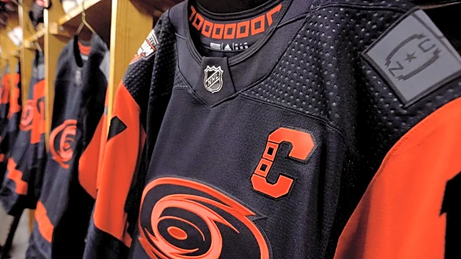
This also is a return to the team embracing the original Eye logo. Rumors have swirled that Hurricanes owner Tom Dundon wasn’t the biggest fan as the mark had been deemphasized more and more. Clearly, though, fans made their voice heard that they liked the logo and the team appears to have listened.
There are some other details that are worth pointing out. The front of the jersey wasn’t the only big change, but the shoulder patches are changed as well. The new storm flag logo goes away—indicating how well it works as a big logo but in a mini-form it’s much tougher to see—and it’s replaced with two logos that pop better and one that fans had been begging to be used more in the uniforms.
For an area that is so intertwined in college sports, plus just how much the team leaned into college sports for the Stadium Series, it just makes sense that they put on the Struttin’ Stormy that harkens to the collegiate template you see for a lot of strutting mascots—specifically Rameses from UNC and Tuffy from NC State. The Canes also make the modified NC flag easier to see than on any other previous jersey.
Lastly, the team is changing the font for the nameplate and numbers on the back for a regular uniform for the first time in over a decade. While it’s not the original “wind blown” font the Canes used to use, it is a return to a bigger font that looks a little more unique to the team, and more importantly it’s at an angle that does give that appearance like it is blowing in a gale.
As with any release, opinions will be mixed. What are your thoughts?