A true mark of the depths of the NBA offseason is when the hottest news on the block is about which city edition jersey each team will debut for the upcoming season. The uniform rumor surrounding the Sixers is especially exciting, as it appears they are finally bring back the early 2000s look made iconic by Allen Iverson. It certainly has all of us at LB excited about the returning look.
While Nike has perhaps learned the lesson that more is not always better with their city edition experiment, the Sixers
have fared better than most teams in the extra jerseys they received, depending on your taste. The 2001 throwbacks will make 12 special edition uniforms the Sixers have had since Nike became the NBA’s jersey manufacturer ahead of the 2017-18 season. So I went back and ranked the first 11 the Sixers have worn so far to see how they’ll stack up against a classic. These uniforms all probably have proper names, but how I remember them is how they’ll be referred to going forward.
11. Shitty Bell (2020-21)
Going with a cream colored jersey for the third time in four seasons, this one was the first that was undeniably a miss. This jersey is the worst combination of ugly and lazy. There’s no name or nickname for the team or the city. The only indicator is a big giant bell which is then covered up by the numbers. The stars coming up the sides on both the jersey and shorts feel disconnected as well. The only good thing about this jersey is it gets easily forgotten due to the other disaster the Sixers had with their other special jersey that season. Don’t worry, we’ll get to that.

10. Rocky Kits (2018-19)
Of all the tinkering that was done with this list, these uniforms sliding down the list is what moved the most. There are parts of this jersey worth liking. The shorts on their own were a hot item when this look was debuted. The jersey as a whole doesn’t quite come together, and for me that might just be how they looked in the Wells Fargo Center, sorry, the Xfinity Mobile Arena lighting. For contrast, I think they look a lot better in the social media promotional material. The concept was somewhat intriguing, with Philadelphia being the world’s capital for sweatpants and groufits, but this might have been a better idea on paper instead of practice.

9. Boathouse Rows (2020-21)
This remains a hotly debated topic in the Liberty Ballers Slack channel to this day. I was someone who initially didn’t hate the Boathouse Row jerseys. From a distance, they looked pretty clean out there in an all-black look and some of the additional merch that went with these uniforms weren’t bad. Even forgetting the PR disaster that came with these jerseys, there’s a lot of problems with them. The number being above both the city name on the front of the jersey and the player’s name on the back is an absolute mess. The actual boathouse row being in between the name and number makes it look a bit messier as well, even with the “TTP” being woven into one of the houses.
The real crime of these jerseys though were how they were rolled out. It had been 20 years since Allen Iverson’s MVP season that led them to the 2001 Finals. Not only did the Sixers tease a black jersey, but they used Iverson to promote them. Instead of getting a returning classic most of the fanbase wanted, they got a jersey that paid homage to a part of the city only prep school kids who rowed crew would have a connection to. If you still don’t hate this look that’s fine, but it’s hard to ignore what these jerseys represent.

8. Reading Terminal Markets (2023-24)
This is the first of many times my personal bias will come out in this ranking. It’s an interesting bias for this team too because frankly, I just don’t like navy blue as a jersey color. While the City of Brotherly Live written across the front of the jersey looks cleaner than another jersey that might pop up on this list, it’s still a bit of a mouthful. Unlike the previous entry, I do remember liking these jerseys a lot more when I saw them on the court as opposed to first seeing them promoted on social media. As someone from the area, the signage and font on the jersey that’s a nod to Reading Terminal Market is a nice touch.

7. A mouthful (2022-23)
And my bias rears its ugly head again. These jerseys probably aren’t better than what the team used the following year, but I slightly prefer them. The front of the jersey is even busier, with City of Brotherly Love written out in an even bigger font. The rest of the look though isn’t that bad. It was cool to see them use an off-white after going to the cream well for years. It paired really well with the throwback-looking court they paired with these jerseys, with an unpainted paint. There isn’t much to write home about with these jerseys, but it is a good example of how having a solid color scheme can save a team from Nike’s crazy ideas for city edition looks.

6. OG Spectrums (2021-22)
Is it blasphemous to have these jerseys so low? Maybe!
The point of the list where every jersey is unequivocally good though has been reached. Something the Sixers have done a decent job of this era is making a uniform look like a throwback despite it being a new uniform. Aside from the font that’s being used, nothing about this uniform had been used before. The colors of the spectrum down the side of the jersey is a really nice touch that gives it some life. The logo down on the shorts does the same thing. These were a fan favorites for a reason, and it was nice to see the team make this their regular uniforms in the playoffs.

5. OG Parchments (2017-18)
The Sixers first dive into the cream colored jerseys was a rousing success. It probably helped that once the Sixers started wearing this jerseys more often, the team started winning a lot more games, including a 17-game winning streak to wrap up the regular season. Nike actually got off to a decent start with their city edition jerseys and these were one of the reasons for that. Cream hadn’t been a color the Sixers had really used but it fit seamlessly into their scheme. They didn’t try to make the design too complicated, just changing the “Phila” font to a cursive font.

4.. Fleshed out parchments (2019-20)
Sometimes it takes a couple of years to really develop a look and that’s perfectly fine. I think a reason these jerseys aren’t looked at as fondly is they were worn in a year with pretty terrible vibes. That being said, this was a pretty damn good look. It gets some extra points here for having “Philadelphia” fully spelled as opposed to the abbreviation. It looks slightly better with the red numbers as opposed to the blue in the originals. Like the spectrum jerseys, these really have a throwback look despite being an entirely new creation.

3. S-e-v-e-n-t-i-e-s (2019-20)
Because these were worn in the same miserable season, one that was shortened due to COVID no less, they get forgotten more, which is a shame because I really liked them. I understand if using the same “S” for “seventy” and “sixers” is a bit much for you. Perhaps the jersey would look better if it just said “Sixers” but I like the older feel it gives by being there. It seems like Nike has made a concentrated effort to get teams to stop wearing white, so I’ve been glad to see the Sixers go in that direction with several of their jerseys.

2. White Rocky kits (2018-19)
Yet another example of the Sixers forcing a white jersey back into the fold. I can’t tell if it helps or hurts the Rocky jerseys that there was a successful version of them created. In a more traditional jersey color, the simplicity of the design really comes through. There was something about the circle of stars that captured the “76er” vibe better than any written form of “Phila” ever could. For good reason, this became such a popular fixture in this season that they became part of the regulars the Sixers wore throughout their playoff run.

1. White Spectrums (2024-25)
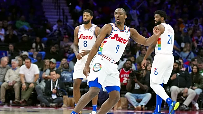
This is perhaps the hottest take on the list and again, it’s due to my bias against navy blue. There wasn’t a lot of hype for these jerseys when they were released, and it didn’t helped that the season they were worn in was quite possibly the most cursed season in franchise history, but man, it is a good look. Just like in 2022, the arena did a good job of throwing back every part of the game to really create the aesthetic. I love how the names are in red while the numbers are in blue, and the spectrum colors up the side come out so much more on a white jersey. I really felt immersed in the Spectrum experience the way most did with the original version of these three seasons prior. It is such a shame that a 24-win season will help such a look be forgotten.

