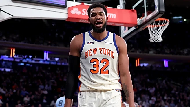
On Tuesday, the Knicks debuted their latest installment of the yearly City Edition uniforms against the Memphis Grizzlies. They were clean.
On Friday, the Knicks got to debut their newest Statement Edition
uniforms to conclude their seven-game homestand against the Miami Heat. I’m less of a fan, but I can see a case for them.
Since the NBA switched to Nike to create each team’s uniforms, the partnership has been innovative in constantly providing fans with fresh looks. While the Knicks’ home whites and road blues are iconic and have transcended across generations, it’s never bad to mix it up, especially over a slog of an 82-game regular season.
That had me thinking, where do all 13 of these special uniforms stack up?
To perform this exercise, we will grade each of these uniforms on a 1-10 scale with the following metrics:
- On-Court Look: The jersey needs to be visually pleasing on the basketball court. Pretty cut-and-dry.
- Off-Court Look: On a scale of 1-10, how likely am I to purchase this jersey? How good does it look to wear, as a fan?
- Personality: Most unis will get a 5 or something similar here, but some of them have an added importance for a variety of reasons. Is it a callback to an iconic former uniform? Does it have symbolism?
- Knick-ness: The biggest criticism of these alternate jerseys around basketball is that some look bizarrely out of place for the team in question. While the Knicks don’t have that problem as much, it definitely exists.
No. 13: 2017-18 City Edition

On-Court Look: 6
Off-Court Look: 1
Personality: 8
Knick-ness: 6
TOTAL: 21
Alright. I know some people like them, but these are the worst ones.
I love the color scheme, I love the symbolism, I think it’s a solid jersey. The problem is that these get crushed by being completely unwearable off the basketball court. It grades out well with the personality of honoring the city’s firefighters and has some sleek aspects, but it’s very Christmas uniform-coded with a gigantic symbol in the middle. Just not a fan, and this is as someone who got a Kristaps Porzingis version of this.
No. 12: 2018-20 City Edition

On-Court Look: 7
Off-Court Look: 4
Personality: 8
Knick-ness: 5
TOTAL: 24
I’l be honest, I like pretty much all of these uniforms, so I’ll have to force critiques out of them. This one’s weakness is being a bit clunky if you were to buy it on your own.
It looked really nice on the court. I’m a big fan of the white numbers on the navy blue background, and it gets extra personality points for the skyline on the sides, but it’s ultimately just not as good as some of the ones we have coming up next.
No. 11. 2022-23 City Edition

On-Court Look: 8
Off-Court Look: 5.5
Personality: 5
Knick-ness: 6
TOTAL: 24.5
Again, it’s not bad. It’s slick, a good play on the theme of incorporating black as a major color, and a good, solid wear. My favorite part about this jersey is the blue-and-orange Nike swoosh in the NYC on the top left patch.
My criticisms are mostly based in that this is a rehash of a very, very good 2021-22 City Edition that was unfortunately wasted on a brutally disappointing team. The orange on the sides is also a bit rough.
No. 10: 2017-19 Statement Edition

On-Court Look: 8
Off-Court Look: 7
Personality: 2
Knick-ness: 8
TOTAL: 25
A good uniform undone by its lack of creativity. It is identical to the team’s iconic home whites, but with additional white outlines throughout. It’s aesthetically pleasing and looked pretty good when I saw it on a fan once (a Kadeem Allen jersey in Section 215 at MSG).
Ultimately, this isn’t a bad uniform, but it’s hurt by the bangers we have coming up.
No. 9: 2025-26 Statement Edition

On-Court Look: 7
Off-Court Look: 5
Personality: 7.5
Knick-ness: 6
Total: 25.5
This was a hard one to rank because it’s one of those that might need more time to grade. Ultimately, I thought it popped well on the blue NBA Cup court, but it is relatively underwhelming in other aspects. I’m not in love with the orange lettering.
It suits some players very well, though. Jordan Clarkson and Josh Hart look made for these unis.
No. 8. 2020-21 City Edition

On-Court Look: 6
Off-Court Look: 5
Personality: 9
Knick-ness: 6
TOTAL: 26
This jersey is carried by its personality. It’s a solid uniform overall, but the meaning behind it is what elevates it.
First, good symbolism. Similar to the 2017-18 City Edition, it directly dedicates itself to the city and is creative in doing so with a circular logo. It looks way nicer than the FDNY jersey, as well.
But you know what really carries it? The fact that the first Knicks’ playoff win in eight years came in this uniform, and it was the uniform everyone associates with the team that revived Knicks basketball.
No. 7: 2022-25 Statement Edition

On-Court Look: 9
Off-Court Look: 5
Personality: 6
Knick-ness: 7
TOTAL: 27
Again, these are good. When I think of these unis, I think of Donte DiVincenzo’s iconic three-pointer to knock off the Sixers in Game 2 of the 2024 First Round.
The navy blue with the orange letters is great, but my favorite part is that they made the names white. This jersey would be dead last if everything were orange, but the white names make it look nice. Again, it’s a victim of some really, really good jerseys in front of them.
No. 6: 2019-22 Statement Edition

On-Court Look: 9
Off-Court Look: 8
Personality: 5
Knick-ness: 6
TOTAL: 28
This uniform had something special. First of all, it’s the only special uniform to go with a lighter shade than the Knicks’ usual royal blue, and it popped, especially with the orange outlines on the white numbers. Frankly, I loved it when they wore these, and they were a good transition uniform, going from the dark ages to the team’s revival. I once had that picture of RJ Barrett and Mitchell Robinson as my Instagram profile picture!
No. 5: 2021-22 Classic Edition

On-Court Look: 9
Off-Court Look: 6
Personality: 9
Knick-ness: 6
TOTAL: 30
It is a damn shame what happened to these jerseys. Of all the ones on this list, this was worn the least, ditched before New Year’s 2022, when they only debuted on October 20. They were brought out for the NBA’s 75th Anniversary, and the Knicks, as one of the league’s three inaugural franchises, got these beauties. Unfortunately, James Dolan wasn’t a fan, and they were scrapped even before that depressing season fell apart. Kemba Walker’s Christmas triple-double occurred after the last time these were worn on December 12!
Would I wear it? I’m not really sure, but this gets carried by just how awesome they look on the court and the importance of this jersey. I’m not saying it had to stick around forever, but the fact that it was only worn a few times is a tragedy.
No. 4: 2021-22 City Edition

On-Court Look: 9
Off-Court Look: 10
Personality: 5
Knick-ness: 7
TOTAL: 31
Remember how I docked the 2022-23 City Edition for being a worse version of this one? Do you see why?
This is the absolute pinnacle of black Knicks jerseys. Everything about it is smooth and clean. Like the Classic Edition, I’m bummed it was wasted on a mediocre team and that I specifically wasted my money on buying a Kemba Walker jersey, but these were just tremendous. If I had bought anyone but Kemba, I’d still be wearing this one to this day.
No. 3: 2024-25 City Edition

On-Court Look: 8
Off-Court Look: 9
Personality: 7
Knick-ness: 8
TOTAL: 32
This one might be unpopular, and I get it. The two “New York”s across the chest looks a bit odd, but you’d be lying to yourself if you didn’t think it looked great on the court.
I bought a Karl-Anthony Towns jersey in one of these, and it’s a great off-court wear, despite the wonkiness of the names. It’s a great play on the home whites and has its own personality with the pinstripes and double names. It’s not the best version of this specific uniform, though…
No. 2: 2025-26 City Edition

On-Court Look: 9
Off-Court Look: 8
Personality: 7
Knick-ness: 9
TOTAL: 33
Is it early? Absolutely, but I love these jerseys. The only criticism I have is that I’m not in love with the blue outlining the jersey, but I feel I’ll get used to it.
This one gets personality points for the cream hue that has never been tried before in Knicks’ history. The lettering brings back memories of the iconic jerseys of yesteryear. While not as creamy as, say, those Bucks jerseys, it’s still nice and I plan to buy one (player TBD) at some point. Hopefully, we get some iconic moments in these uniforms to establish them as instant classics.
No. 1: 2023-24 City Edition

On-Court Look: 10
Off-Court Look: 7
Personality: 8
Knick-ness: 9
TOTAL: 34
Maybe the single most aesthetically pleasing uniform in Knicks history.
The way it contrasted the Sixers’ red and Pacers’ yellow uniforms in the playoffs, the iconic moments we got, the way the blue accentuates the pinstripes, the way the white and orange letters bounce off each other. The black on the sides!!!
It’s a better version of the 2024-25 jersey and is just magnificent. It’s one of my favorite uniforms I’ve ever seen the Knicks wear, and the only reason it isn’t my all-time favorite is because of those early Melo Era uniforms.
