



Newcastle United’s long-running badge redesign process has entered its final stage. Still, instead of debating which new crest the Magpies fans prefer, many supporters are asking whether they were really given much of a choice at all, let alone for the betterment of the club’s brand.
After promising an evolution rather than a complete redesign, Newcastle have unveiled (h/t Footy Headlines) three final crest options and opened an official poll for eligible supporters. Wheter or not those are different,
we let you explore and try to find out.


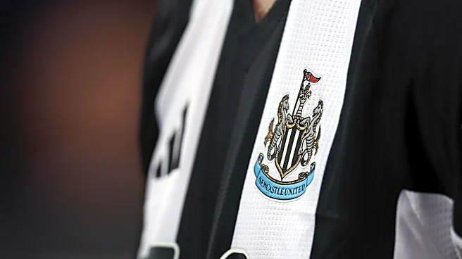
As kinda expected, all three new logos preserve the club’s signature elements—the striped shield, twin seahorses, castle topped by a lion and the blue ribbon bearing the club’s name—but the remarkably small differences between the designs and the striking resemblance to the current badge have quickly become the biggest talking point.
The club previously explained why it believes a refresh is necessary, saying the current crest, introduced in 1988, “struggles to perform in a modern setting.”
“Its complexity affects how we show up. Its intricacies and irregularities make consistent, high-quality reproduction impossible – from modern digital platforms, to broadcast environments and merchandise,” Newcastle said. The club added: “Evolution is essential, ensuring our crest remains authoritative, legible, and unmistakably Newcastle. Not just for supporters today, but for every generation that follows.”
According to Newcastle, extensive supporter consultation also shaped the process. The club said “84% of respondents confirmed they favour updating the existing crest to honour our heritage, rather than pursuing a wholesale overhaul,” while feedback overwhelmingly favored retaining the castle, black-and-white shield, seahorses and ribbon.
However, the release of the three shortlisted designs has generated a different discussion online. Many supporters have argued the options are so alike that the vote feels largely symbolic, with only subtle differences—particularly to the seahorses and detailing—separating one crest from another.
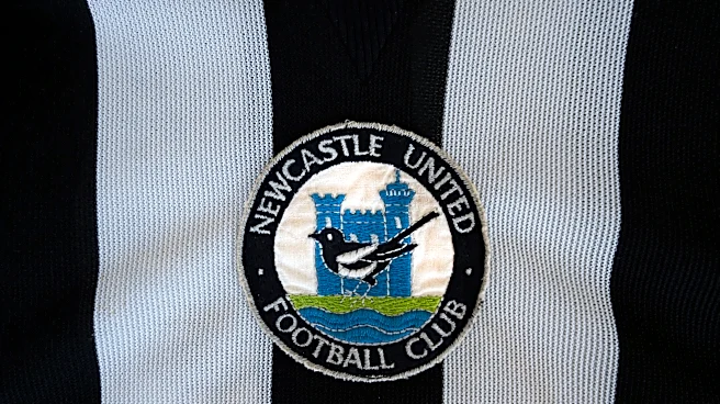
Others (count me among them) have continued calling for a return to one of the club’s retro badges instead of any modernized version or a plain bad simplification of the current logo..
Do you like Newcastle’s approach of making only subtle changes, or would you have preferred either a true redesign or a return to one of the club’s classic retro badges? Among the three above, which one do you prefer? Let us know your thoughts in the Coming Home Newcastle comments section below.