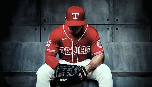


The biggest issue with the new City Connects is that their first ones were too good.
My memory of the unveiling of the first Rangers City connects was that I liked them pretty immediately. (My tweets may say otherwise but i’m not going back to the depths of hell to find them.) The deep cuts to the history of the area and the team, the whimsical peagle, the almost prophetic slogan to “dream the big dream”, and even the fashion risk of navy pants! All felt deeply thought through.
“Reimagining tradition”
is the theme of the new look and I see it but somehow it feels like not enough happened.
The new edition feels less thought through. Though still has a story behind the little details. It feels more slapped together than woven in.
From Kennedi Landry’s article: “It’s also in homage to the Tejano culture as we know it. There’s a large mix of Mexican-Americans here in Texas. It’s in the spirit of celebrating Texas culture.”
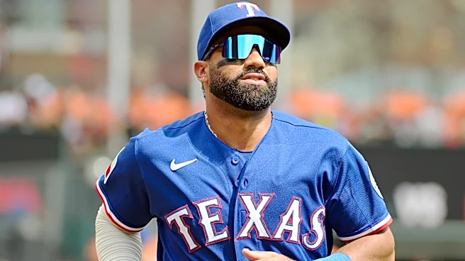
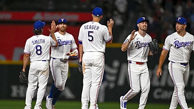
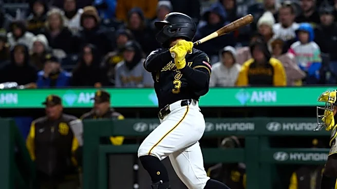
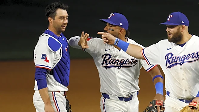
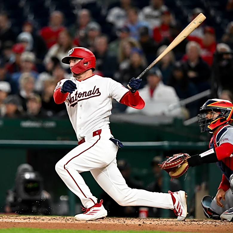
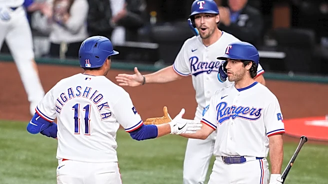
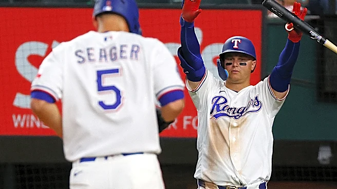
The photos don’t give celebration and maybe that’s the part that’s sticking more because that was the first impression.
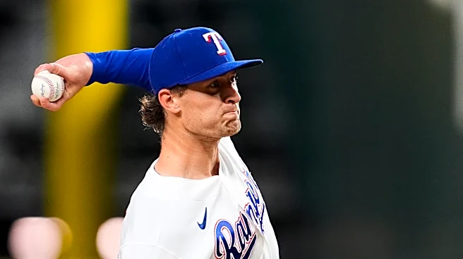
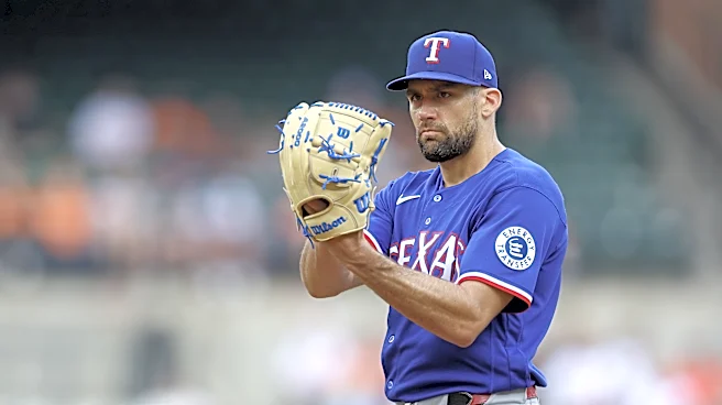
It is hard to get a grasp on the exact shade of red from the videos and photos. It’s definitely a different shade than the previous city connects, a little deeper than the old red uniforms, but in some photos seems brighter than what is supposed to be a crimson shade.
In their teaser photo on Tuesday looked like there was a pattern inlay that would’ve been cool on the letters, if it was visible. I thought it was completely gone until I zoomed in all the way on photos. Which means it’s not showing up at all on the field. Which is unfortunate given how intricate it looks.
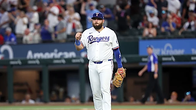
However, the details of the charro pattern on the piping of the sleeve of the jersey (and apparently the piping on the pants but I have yet to see a good photo of that) looks really cool. Especially taking into account it’s the block T logo repeated to create the pattern.
I especially love the detail of the papel picado patch on the sleeve in the palace where the Texas flag is on all their other jerseys, that feels like a thoughtful way to combine the cultures they were intending to.
My favorite aspect is the block T on the hat and it being in a raised weave. Again, another level of whimsy, something that makes it different from a normal Rangers cap with the oldschool logo. I wish they had that raised weave all over the jersey, or at least on the front letters.
Speaking of those letters, the fonts clash. I would’ve loved to see the Tejas be in the same block print as the hat or in the same font as the small “Viva Tejas” that’s on the bottom of the jerseys near the MLB authentic logo.
Lastly, the Rangers posted a video of them showing these unis to the team at spring training. Modeling the unis? Wyatt Langford and Alejandro Osuna. I love that Osuna got to show them off as he is a native Mexican. In my perfect world for these uniforms, Osuna and Nathan Eovaldi (as the native Texan) are the ones in the nike promos to really emphasize the Tex-Mex blend of cultures. Just a nice thoughtful touch that would show a little deeper thought.
Overall, I am happy to have a red uniform back and I do think the more I see it, the more I’ll learn to love it.