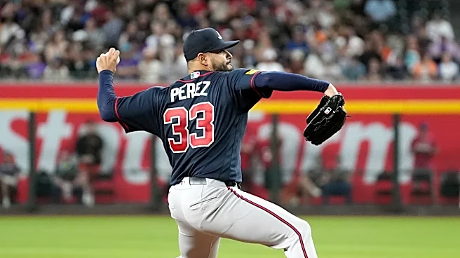

The Atlanta Braves debuted their updated City Connect uniforms over the weekend, showcasing a familiar style that combines several classic design elements from the franchise’s rich history.
Inspired largely by the 1980s era of Braves baseball, during which time the team’s games were beamed across the country via the wonders of owner Ted Turner’s TBS Superstation, the latest version of the City Connect concept prominently features vintage uniform iconography on a period appropriate powder blue palette.
In other words, what’s old is new again.

Insung Kim is the Creative Director for the Atlanta Braves and he was charged with creating yet another memorable design for a franchise with no shortage of memorable looks. Once again, the club leaned on its storied past to help chart the course for its future ensemble.
As the three-year window to update the club’s City Connect uniforms ticked away, Kim and his creative team focused on a particular time period when the club’s profile was rapidly expanding thanks to its far-reaching television footprint.
“We have this large reach of Braves fans all over the country and all over the world who grew up watching the Braves on TBS,” Kim said of choosing an ‘80s aesthetic. “We wanted to celebrate those fans, and we wanted our City Connect 2.0 to talk about that heyday in Braves Country, when so many fans fell in love with baseball and fell in love with the Braves during that era.”

With those memories in mind, the design team settled on powder blue as the featured color and began to sketch out the rest of the details that would complete the updated attire.
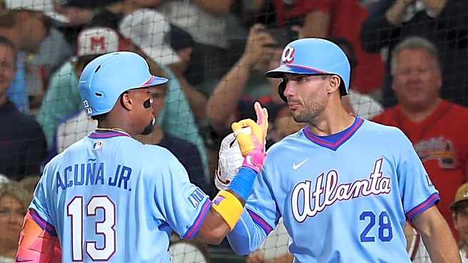
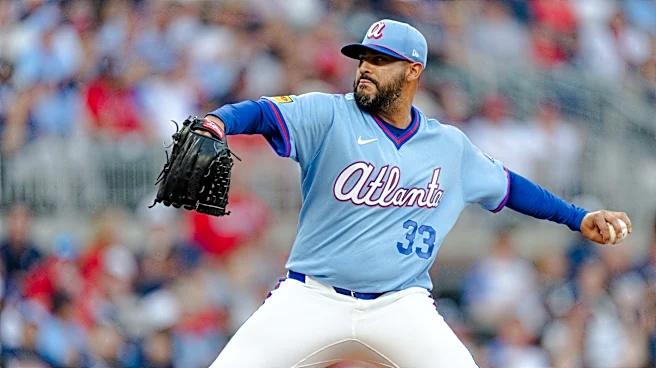
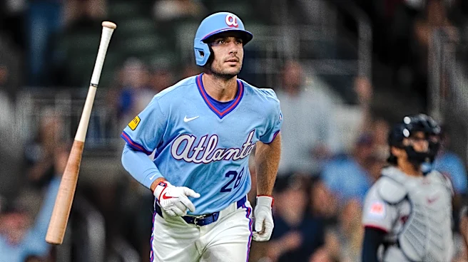
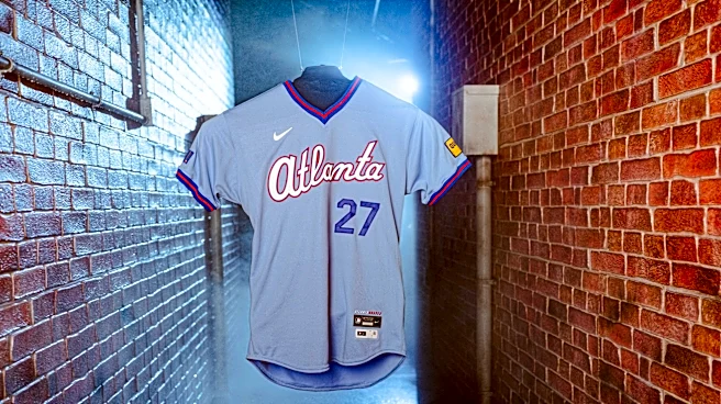
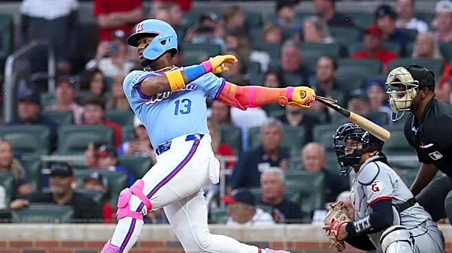
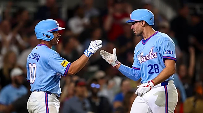
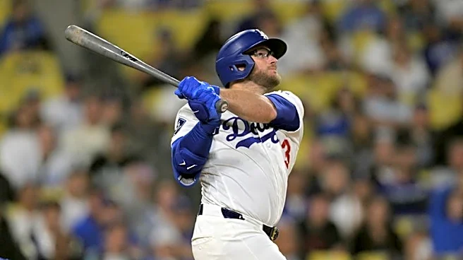
Atlanta’s new City Connect uniform features a light blue pullover jersey with white lettering wrapped in red trim above navy numerals on the front atop white pants with prominent red and blue piping. The player names on the back of the jersey are in navy and sit above white numerals outlined in red. Both the cap and helmet have a light blue crown along with a navy visor accented in red and adorned with the club’s lowercase “A” logo.
“We have such a rich history as a team,” Kim said of choosing the elements that made up the final design. “We’re over 150 years old. So, for me as a designer and a creative, I have this amazing toolkit of logos and designs that I can look back on… I think this is a really cool remix and a modern update of the classic powder blue uniform.”
Choosing just the right shade of blue was a painstaking process for the design team. They reviewed dozens of shades before choosing the primary color for the jersey.
“We were very specific about the shade of powder blue for this new City Connect,” Kim said. “We wanted to make sure that we nailed the color exactly right so that it’s a modernized version of the old powder blue. If you look back at the old powder blue jerseys, it’s actually a lot darker than you imagined. We wanted to make sure that this was a nice bright blue, (so) that when the team wears it on the field, whether it’s day or night, it’s going to look beautiful.”
Not only does that color celebrate a decades long love affair for the Braves on television, but it also taps into a revival of the uniform style taking place across the country on youth fields today.
“There are little details that we put into the jersey that reference the TBS generation, but at the same time, it is an update,” Kim said of the color scheme. “We wanted it to be bright and vivid for this new generation of fans. If you go out and watch youth baseball, you’ll see that light blue is one of the most popular colors for uniforms. So, we thought, how cool is that that we’ve got this new generation of baseball fans and Braves fans who just love bright blue, like powder blue? This is the perfect time to bring that back.”

Pulling from both late-‘70s and early-‘80s design elements worn by the team as Turner’s television empire gained traction was an easy choice for this new uniform combination. While the team struggled to remain competitive in those days, Atlanta’s broadcast represented an access point for generations of baseball fans from coast to coast for the better part of three decades.
That television history was a hallmark of the Braves, and the TBS influence found its way onto the jersey and even the socks for the new City Connect uniform.
“The jersey is a v-neck because that is what the players from that era wore,” Kim said. “We also have an ATL patch on the sleeve, which is a nod to the old TBS logo.”
Player comfort was another factor the design team considered when creating the new uniform.
“We heard feedback from the players,” Kim said. “They really love wearing the v-necks because they’re so comfortable. If you think about the heat out here in Atlanta and the humidity, wearing a v-neck versus a button-down is a little bit more comfortable.”
Braves third baseman Austin Riley was one of the players consulted during the design process. Seeing the final result and then slipping on a pullover jersey was exactly what he hoped for.
“I think they’re awesome,” Riley said. “I love the accents, the ATL on the sleeve. I like the outline in the red. I think they really did a good job on the hats and the helmets. For me, my big thing was that I love no buttons (for the jersey). That was my take. It’s hot here and this is a little bit lighter.”

As the Braves became “America’s Team” on TBS during the ‘80s, superstar outfielder Dale Murphy became a household name while wearing a powder blue road uniform. That color scheme was a favorite garb for many teams at the time, but Murphy’s popularity became almost synonymous with the look while winning consecutive National League MVP Awards in 1982 and 1983.
When it came time to officially announce its latest City Connect design, the team released a hype video that prominently featured Murphy as well as a new take on one of his most iconic photographs. Several current Braves donned the new uniform and took promotional pictures in a brick alleyway, paying homage to Murphy’s “Power Alley” poster released by Nike some 43 years ago.
That poster was a must-have for Braves fans of that era and pictured Murphy standing in between two buildings in full powder blue uniform holding a glowing baseball bat. The effect was primitive and achieved by running a series of cords through Murphy’s uniform and plugging it into a nearby outlet.
“We actually rebuilt the ‘Power Alley’ set down in Florida at our spring training facility,” Kim said. “We had the guys like Ronald Acuña, Austin Riley, Matt Olson, and Michael Harris, who were modeling the jersey for us, in the set (and) holding a bright blue bat or a glowing stick that was reminiscent of the old ‘Power Alley’ poster. We wanted to have that connection of looking at the past but updating it with our guys in our new City Connect uniforms.”

For Braves fans of the 1980s, an opportunity to revisit the “Power Alley” in 2026 was an added bonus. The team brought the alleyway set to Truist Park over the weekend, setting it up just outside the team store and offering a unique photo opportunity to promote the new uniforms which were worn for all three games of the series against the Cleveland Guardians.
Olson was one of countless young fans to grow up watching the Braves on TBS. Coming home to play for the team he grew up watching provides numerous chances to flash back to those formative days. While he may be too young to have experienced rooting for Murphy’s teams of the 1980s, the nostalgia attached to Atlanta’s new City Connect uniforms is unmistakable.
“Right away you think of those Dale Murphy powder blues,” Olson said. “I thought that was cool. I love the color, with a little new flair to it with the red piping and stuff. I think they look great.”