


As the current season winds down (or heats up), we often get the fun little tidbit that is the leak of next season’s kits as designs get locked in and marketing materials start to be disseminated. For some reason, Footy Headlines consistently have the inside channel on these, and next season’s kits are no exception:
Nowadays, we have to be a little more careful with Footy Headlines posts, as they have taken to generating their own
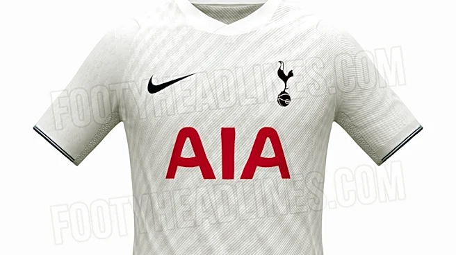
“interpretations” based on some of the marketing materials (such as color schemes, etc); but these appear to be the real deal, as over the last couple of weeks, Footy Headlines have leaked both Spurs’ home kit AND their away kit for the 2026/27 season (pictured below):


Alrighty then.
Now I am no barometer when it comes to fashion. I am a deeply uncool Millennial whose fashion sense can probably best be described as “business casual wannabe rockstar dad”. But that doesn’t mean I don’t have opinions.
Let’s start with the home kit. My first thought on this is it’s boring. And my use of the bold font there is more exciting than the kit itself – the fact that font usage generates more of an emotional response kind of says everything. My hot take is home kits should be boring, tried and true classics in the vein of the 2013/14 kit, with maybe a simple design embellishment here or there. These though don’t do enough. The subtle texturing is a nice touch (why, hello Patrick Bateman), but the lack of any trim on the hemline or collar just makes the whole thing feel a little flat.
The away kit on the other hand goes way off in the other direction. One of the most popular kits (and one of my personal favorites) in recent years was the 2021/22 “Galaxy” kit, and it seems like they’ve tried to replicate that beauty with this latest attempt. It’s a deep navy-blue base (described as “obsidian”) with stripes? flashes? chunks? of pink, purple, and orange, and it’s just a pure visual assault. There’s an implied line where the design changes just above the AIA logo where if they maybe kept that which is above (or below) that cutoff it might carry a bit more consistency, but instead it just feels confused.
I could see it running into the same problem as the Galaxy kit as well, whereby Spurs were forced to include a plain patch of fabric on the back for squad numbering in the matchday kits due to the design making legibility difficult.
All in all, the kits are pretty uninspired; some would say perfectly so following such an uninspiring season.
What are your thoughts on these kits? Sound off in the comments!