

The Packers have unveiled their new “Rivalries” uniforms, and they confirm what we’ve previously suspected: the uniforms pay tribute to the Packers’ unique ownership structure, and Ed Policy was absolutely right in his extremely tepid praise for them. These are certainly among the Packers’ uniforms of all time.
The set trades the Packers’ iconic green and gold for a pair of colors Nike is calling “vintage green” and “alabaster,” which basically look like washed out versions of green and gold. Not
exactly the strongest start if you’re trying to represent the essence of the Packers, but we can work with it if we have to, I guess.
The rest of the storytelling elements (and there are always storytelling elements, it’s never just a uniform, even if it’s a transparently cynical merchandising cash grab) point basically in the direction we expected. Ed Policy said last year that the uniforms were inspired by “one of the most unique and defining pieces of Packers history” and that they would “celebrate owners.”
I don’t know if you can call this, at best, pretty “meh” uniform a celebration of anything other than the money it will generate in jersey sales, but Nike is certainly trying to tell the story of the Packers’ ownership. AsI predicted last week, the Packers’ new uniforms pay homage to the Packers’ shareholder certificates, both in their color scheme and in the numerals.
The colors, Nike says in the official reveal, are “reminiscent of the aged paper color of historic Packers stock certificates and accented with the team’s signature gold.” The numbers, meanwhile, are intended to call to mind “the intricate lettering on paper currency, reflective of the financial contributions from the fans that helped sustain the franchise over the years.” You can also see a different font on the lettering used on the nameplate.
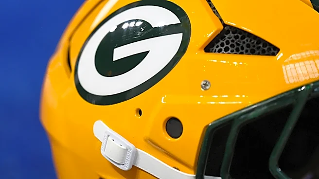
The Packers’ helmet is reminiscent of their “Winter Warning” alternate at first glance, but there are a few changes. The new look has a green facemask and lacks the small green and gold flecks in the finish. It also has an interlocking GB logo on the back, and the helmet stripe has some texturing/detailing on it that Nike says is supposed to echo “the ornate borders found on Packers stock certificates.” There’s also similar detailing on the numbers.
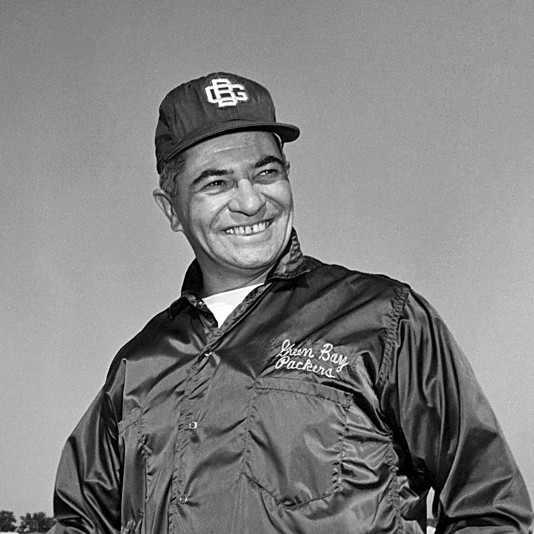
The jersey also features the Packers’ little-used interlocking GB logo, something Vince Lombardi tried to popularize during his reign as the Packers’ head coach, which you can see on this famous picture of the coach.
All that is fine, in its own way, but I think we are obligated to talk about the larger universe in which these uniforms exist. I know they’re not for me. Maybe they’re not for you. I’ve said previously (somewhat but not entirely tongue in cheek) that this whole “Rivalries” uniforms push exists only to appease an extremely online group of fans, all of them younger than me, who tend to describe uniforms in terms of how “clean” or “fire” (or fire emoji) they may be, and I still understand that to be true. Whatever my taste may be, these uniforms are not intended for me. I’m already in the ecosystem. They’re not trying to court my attention or bring me into the tent as a long-term consumer of NFL goods and media. And to the extent that I want more people to be fans of football because I think it’s a good and worthwhile thing to follow, I’m fine with that. If these uniforms convert a few more Packers fans, I can be okay with that — to a point.
But.
The Packers are one of the oldest and (not using this term lightly) most iconic franchises in the NFL. Their story is one of independence and self-determination. They exist in the world of big money professional sports not because of their deep-pocketed owner, but in spite of the fact that they don’t have one at all. A megacorporation like Nike hijacking their visual identity to sell some more consumer goods is antithetical to that story, no matter how many nods they make to the people who actually own the Packers.
And a hijacking is exactly what it is. This is not a uniform the Packers would have chosen for themselves. They already have one of the most recognizable uniforms in sports. They categorically do not need any help. The green and gold. The white block lettering. The G itself. That already tells the story of the Packers, and it doesn’t need a reinterpretation or reimagining. It’s already fine as is. Way better than fine, in fact.
It’s easy to dismiss it as “just a uniform,” but it’s not just a uniform. It’s a conscious choice to take control of the Packers’ story and if the Packers’ story is about ownership, this is an affront to that story. They’ll wear this “Rivalry” uniform in Week 5 against the Bears, their oldest and most hated rival, but if I can do a little marketing storytelling myself, maybe this whole thing shows us who the real rivals should be. It’s not the Bears. It’s the people who want the Packers to be just like every other team