The Toronto Tempo have finally announced the look of the jerseys for their inaugural season, and it seems that the team in the 6ix will be dressed to the nines when they take the court next year.
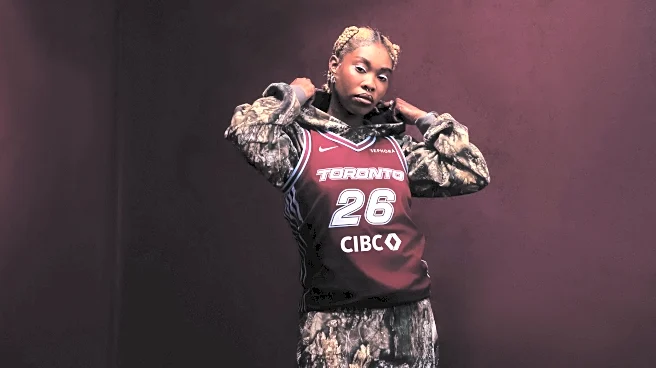
The Tempo will play in two different kits, the “Explorer” in the wine-coloured Bordeaux, and the “Heroine” in white. The Explorer’s colour is described as “fashion-forward” and “unique across the league,” designed explicitly to be worn by the team on the court, and by non-players as an elevated-looking jersey,
leaning into the optics of streetwear.
That much was evident from the photos used in promotional material, with the most prominent model of the jersey decked out in the camo pattern now in vogue, drawing the mind to an urban catwalk as opposed to the bench on the hardwood. Both jerseys were modelled by women and men decked out in chunky rings and slim chains, adorned with henna and covering their faces with massive sunglasses. The models looked as if they’d walked into the photoshoot out of Queen West party rather than a Coca-Cola Coliseum locker room, so the push for the Tempo’s jersey to become a fashion symbol before an icon of athletics seems to be in progress.
For a team that won’t be debuting for months, this is a great way to generate hype and get the name “Tempo” out on the streets of Toronto in a more organic way than billboard ads would. The dark bordeaux red of the Explorer jersey gives the team some visual connection to the Raptors, while maintaining enough visual distinction that the two couldn’t be confused by someone familiar with either brand. The use of a diverse group of models serves to reflect Toronto even better than the six “speed lines” representing the six boroughs. Seeing women of all different ages and backgrounds wear Tempo colours proudly is the best part of the jersey rollout.
When the Tempo branding was announced for the first time just about a year ago, I was thoroughly underwhelmed and extremely disappointed. My feelings on the “T” logo and the team colours have not changed. The logo (and name) of the franchise still appear derivative of the Indiana Pacers’ “P” with its trailing lines; as well, the names “Tempo” and “Pace” both relating to speed are too close for comfort. The branding being centred around powder blue and dark purple felt disconnected from the historic use of bright blue and red in the city’s sports teams, without being visually interesting enough to stand alone.
With the jerseys, the Tempo have done what I always hoped they would, and begun the move away from their initial awkward visual identity. They did so by embracing a much bolder set of colourways and an ethos of fashionability, while continuing to incorporate the blue as an accent colour rather than as the dominant hue.
Myself and other some members of the Raptors HQ staff have pointed to the CIBC logo as excessively large, which I believe is something that could be corrected in future iterations of Tempo uniforms. Compared to many modern WNBA jerseys, with large sponsor logos on the back, the Tempo will be showcasing their corporate relations front and centre, which is less than ideal when trying to build an independent identity.
I hope that with time, the Tempo will continue upon the path they have begun upon with these jerseys, evolving their identity into a more complete version of itself.
