


For most NBA teams, a uniform unveiling is a relatively simple affair. The team releases a few photos. Social media argues for 48 hours. Some people love them. Some people hate them. A few months later everyone has moved on and the jerseys just become part of the routine.
For the Minnesota Timberwolves, this past week’s unveiling felt different. Partially because the jerseys and logo had already leaked online days before the official reveal, taking some of the surprise out of the process. By the time
the team officially pulled back the curtain, most Wolves fans had already spent the better part of a week debating fonts, trim packages, color schemes, and whether the black uniform was worthy of being mentioned in the same sentence as the legendary Black Trees jersey.
Even with the surprise element largely gone, however, one thing became immediately apparent once the dust settled. Wolves fans overwhelmingly seem to agree on one thing: These are a massive upgrade.
After nearly a decade of what many fans affectionately, or not so affectionately, referred to as the “sailor suit” era, Minnesota has finally returned to looking like the Minnesota Timberwolves again.
And honestly? It was overdue.
The uniforms the Wolves have worn since 2017 were never terrible. They were clean. They were perfectly acceptable NBA uniforms. The problem was that they never felt particularly Timberwolves. They felt like something generated by a focus group tasked with creating the safest possible basketball jersey.
They lacked personality. They lacked history. Most importantly, they lacked any meaningful connection to the eras that fans actually loved. The new look changes that.
What stands out immediately is how intentionally the organization blended together multiple chapters of franchise history rather than simply recreating one specific era. Instead of choosing between the original expansion-era identity, the Kevin Garnett years, or the modern look, Minnesota essentially took pieces from all three and built something that feels familiar without feeling like a pure throwback.
The original blue, green, and white color scheme is back. That alone feels significant. For longtime Wolves fans, those colors are synonymous with the franchise’s roots. Before the redesigns, before the multiple rebrands, before the highs and lows and playoff heartbreaks, those colors are where everything started.
There’s something comforting about seeing them return. At the same time, the Wolves didn’t simply copy and paste their 1989 uniforms. The jersey typography carries clear influences from the Kevin Garnett era. Not to the extreme degree of the late-90s and early-2000s uniforms, but enough to evoke that era without becoming a nostalgia act. The black uniform takes things a step further with the inclusion of the trees trim, perhaps the most iconic visual element in franchise history.
Meanwhile, the logo itself feels like an intentional bridge between generations. The howling wolf profile remains recognizable from the most recent logo iteration, but there’s also a noticeable callback to the original Wolves “Old Shep” identity. It’s almost as if someone took the current logo and ran it through an old-school filter, giving it just enough of that original expansion-era DNA without sacrificing modern design principles.
Too often teams either go completely retro or completely modern. Minnesota found a middle ground. The organization essentially looked at every era of Timberwolves basketball and asked a simple question: “What parts actually worked?” Then they built around those answers.
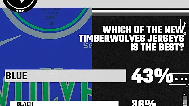
Of course, the next question immediately became which uniform fans liked best. The Canis Hoopus poll results were fairly decisive.

The blue uniform emerged as the clear favorite, and honestly, it’s not hard to understand why.
The royal blue jersey is gorgeous. It’s vibrant without being loud. The green wordmark and numbering pop beautifully against the blue backdrop. It immediately evokes the original road uniforms from 1989 while still feeling contemporary enough to fit today’s NBA aesthetic. Perhaps most importantly, it feels uniquely Timberwolves. You could glance at it from across an arena and instantly know which team is wearing it.
In an NBA increasingly filled with alternate uniforms, city editions, statement editions, and designs that sometimes seem determined to hide team identities entirely, there’s something refreshing about a uniform that unapologetically screams “Minnesota Timberwolves.”
The black uniform finished second in the voting, and this is where things become a little more complicated. Last year’s Black Trees throwbacks were one of the most anticipated uniform releases the franchise has had in years. Those jerseys occupy a unique place in Wolves history. For an entire generation of fans, they are the Timberwolves uniform.
Kevin Garnett wore them. The franchise experienced its greatest success wearing them. They’re iconic.
Which is exactly why this new black uniform faces an almost impossible challenge. It’s competing against perfection. The updated version isn’t bad. Far from it. But personally, I find myself agreeing with many fans who feel something is slightly off.
For me, it’s the addition of the blue accents. The original black Trees uniforms worked because they were remarkably clean. Black. White. Green. That’s it. Simple. Elegant. Timeless.
The new version introduces blue striping and blue outlining around the numbers and wordmark. It isn’t enough to ruin the look, but it does create a sense that the design is trying to add something extra to something that was already complete. It’s like remaking a classic movie. Even if the remake is good, you’re still inevitably comparing it to the original. That’s a battle most remakes lose.
The white uniform finished third, although that says more about the strength of the blue jersey than any weakness in the white version. In many ways it feels like a cousin of the throwback uniforms Minnesota wore during the franchise’s 35th anniversary celebration. Those jerseys were a little more faithful to the original home design, while this updated version incorporates some modern tweaks.
Personally, I have the white and blue uniforms nearly tied. They’re essentially mirror images of one another, and both succeed because they embrace the franchise’s original identity without becoming trapped by it.
Ultimately, ranking the three uniforms feels almost beside the point. The bigger takeaway is that Minnesota finally has a cohesive visual identity again. For years the franchise felt stuck between eras.
Not anymore.
While jerseys don’t win basketball games, they do matter. Sports are emotional. Fans connect to imagery. They connect to memories. They connect to eras. A great uniform becomes part of a team’s identity. It becomes part of the story.
When you think of Jordan, you picture the Bulls red.
When you think of the Showtime Lakers, you picture gold.
When Wolves fans think about Kevin Garnett, they think about the Trees.
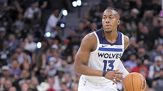
Now Minnesota has an opportunity to create a new visual era, and the reality is that these uniforms will likely become associated with Anthony Edwards. These aren’t just the jerseys for next season. These are potentially the jerseys of Ant’s prime. The jerseys that will appear in highlight packages for years. The jerseys that will define the next chapter of Timberwolves basketball.
And who knows? Maybe someday they’ll become something even more significant. Maybe years from now we’ll look back at these uniforms the same way fans currently look back at the black Trees era. Maybe they’ll become synonymous with the greatest stretch of basketball the franchise has ever played. Maybe these are the uniforms Anthony Edwards is wearing when he finally brings the Larry O’Brien Trophy to Minnesota.
That remains to be seen.But for now, after years of looking like a team trapped in an identity crisis, the Timberwolves finally look like themselves again.
And that’s a pretty good place to start.
Speaking of the Larry O’Brien Trophy… Hopefully Karl-Anthony Towns will be hoisting it tonight! If you’re looking for one last bit of NBA betting action before the off-season begins, FanDuel Sportsbook has you covered for your Finals wager!