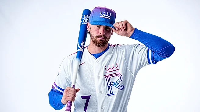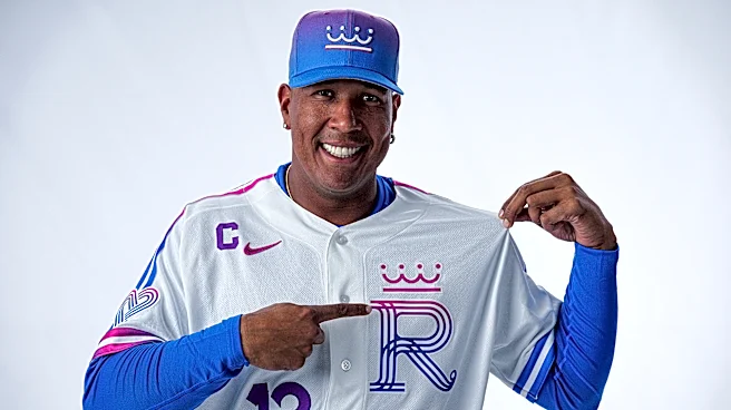


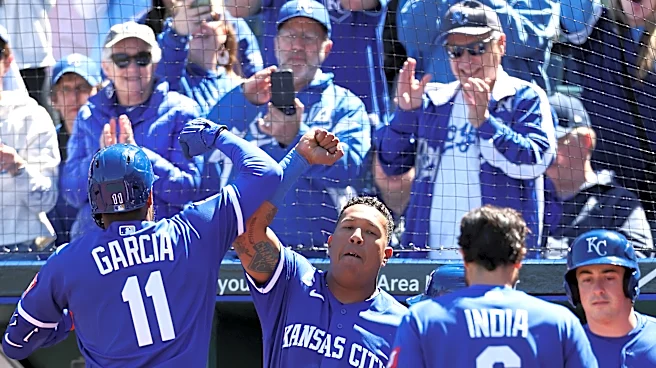
The Royals unveiled new City Connect jerseys this week, with mixed reactions from fans. The uniforms, which will be worn Friday evening, include a Royals “R” in a font similar to that used in the city flag with gradient colors celebrates the City of Fountains logo adopted by Kansas City in 1991.

They are one of eight new City Connect jerseys around baseball unveiled this year. The jerseys are an outlet for added creativity, but let’s face it, it’s also a way to move more merch. Here’s a look at some
of the other designs.
Atlanta Braves
The Braves have had a number of different jerseys over the years, but they went with a classic baby blue jersey with the 70s era “Atlanta” script across the front.

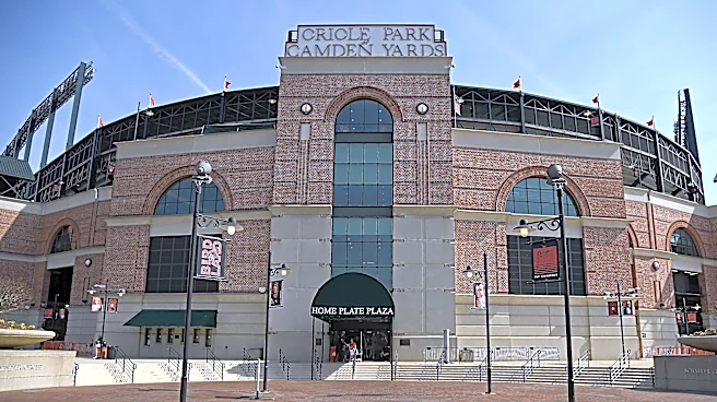
Baltimore Orioles
The Orioles went with “BMORE” across the chest, with a 1890s Baltimore Baseball Club “B” logo on the cap.

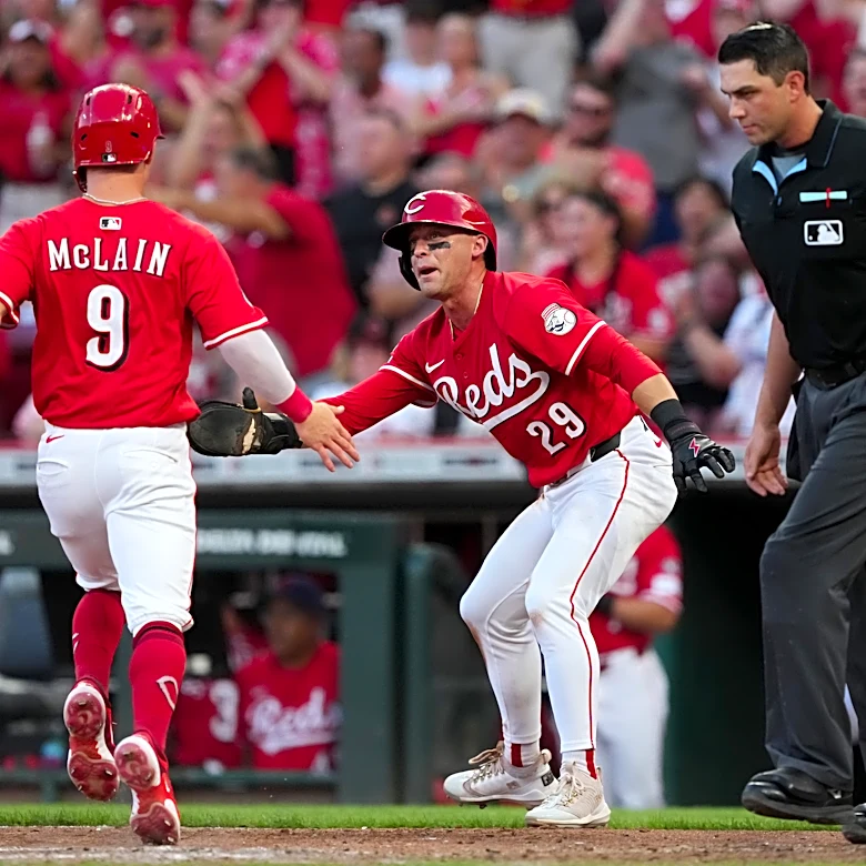
Cincinnati Reds
The Reds really leaned into their name – the jerseys are very, very red. The sleeve graphic features the Tyler Davidson Fountain, a notable landmark in Cincinnati.

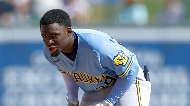
Milwaukee Brewers
The Brew Crew design features “Wisco” across the chest and “Forward,” Wisconsin’s state motto, sewn into the collar, and a Barrelman sleeve patch and a wheat/barley braid.

Pittsburgh Pirates
Pirates uniforms include a 1997-era Pirate wearing an eyepatch with a red bandana on the left sleeve, along with 1887 split in half by “PGH” in the same font as the front.

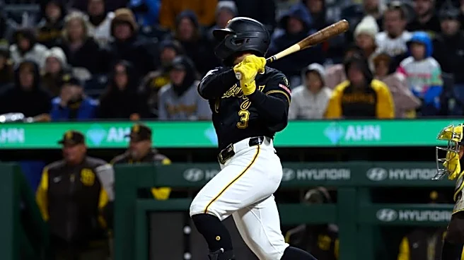
San Diego Padres
Padres uniforms are “bone, obsidian, marigold, aqua, fireberry, and Padres gold” with a sleeve patch honoring Dia de los Muertos.

Texas Rangers
The Rangers spell out “Tejas”, a word rooted in the Caddo language, which has historically been spoken by Native American groups across Texas and Oklahoma, and is “Texas” in Spanish.

Of the new City Connect jerseys, which one is your favorite? Least favorite? Which of the past City Connect jerseys is tops in your book?