
It’s that time of year: NBA City Edition jerseys. You either love or hate your team’s edition of the jerseys every year, which is fair given that teams take some… artistic liberties on the designs.
The
Toronto Raptors have been through a few iterations of their city threads. For a long stretch there, the team leaned VERY far into the “OVO” black and gold look, until they had literally wrung that colour scheme dry. Last year, the Raptors arguably had the best city edition jerseys in the league, with a black-and-purple design featuring the Vince Carter Raptor, and they came with a BEAUTIFUL city edition court.
Pour one out for the Vince Raptor purple and honey oak court, we miss you angel
It’s time for another year of city edition jerseys, and the Raptors have decided to retreat from purple… again. For some reason. That I will never understand.
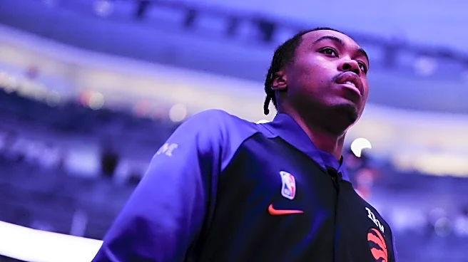
This year’s Raptors City jerseys are similar in design to last year’s, with a few updates. First, the Raptor is back to his original stance, instead of the Carter Dunk pose he took up last season. The Raptor is also wearing a red and white jersey this year, with the number 19 — not to celebrate Jakob Poeltl, but to remember the 2019 championship season. The jersey he is wearing is specifically the Raptors jersey from the championship season.
The black pinstripe background is the same as in previous editions, and they have brought back the word “Toronto” in the design, rather than the simpler look from last season. The details are in silver, with silver borders and the player names on the back in silver.
The Raptors HQ staff has… some opinions on the threads. Let’s get into them!
Chelsea: 7/10
I don’t hate them, but it’s hard to compete with last year’s edition. The fans constantly scream about how much they love the purple elements from the early days of the franchise, and we keep going back to red and white… why? Plus, to tease us throughout the 30th anniversary celebrations by bringing back purple just to take it away again? MEAN.
Taking away that element of it, they are pretty cool. I like that we have kept the Raptor on the front over the past few seasons, and I like that we have retreated from the OVO colours. It does kinda look like when you use that feature on a 2010’s digital camera, where only one colour comes through and the rest is desaturated. Maybe if the borders on the neck and sleeves were red as well, it would be less like that. I also really like the nod to the championship jersey, even if it feels like a nod to Poeltl??
These also feel like they will look WAY better in person.
Jay: 6.5/10
It’s like the glow in the dark design… without the cool glow in the dark feature. It’s like the Canadian flag… without enough red or white. It’s like past city edition jerseys… without a wow factor.
(Editor’s note that Jay was unimpressed, if you couldn’t tell)
Kristian: 7/10
The jersey isn’t amazing, but it’s still cool. I actually would prefer they come back with the 2019 North Earned jersey that the Raptor is wearing in this edition. Can someone help me find that jersey? I regret not purchasing one during the championship run…
Anyway, when we make the playoffs, we will have deserved a better alternate jersey.
Note: if you have a 2019 North Earned Raptors jersey you wanna sell to Kristian, reach out.
Joe: 8.5/10
It’s a fun way to blend the ’90s look with honouring the championship! The black and white is slightly dull, but overall, I am happy with it.
Don’t, however, let this distract you from the fact that the team needs to abandon the chevron on their regular jerseys immediately.
Julian: 8/10
I like the homage to the championship run, but design-wise, it looks pretty washed out because of the white dino. The font is great, though.
Rebecca: 5/10
I feel like they are gatekeeping what the fans actually want as well. I like the Raptor on the front, but the whole jersey within a jersey thing isn’t my favourite, and it feels really desaturated. There’s been some really good ones around the league, and I hope that maybe it’s our turn soon.
(Editor’s note: I think our time was last year, tbh)
What do you think about the Toronto Raptors City Edition jerseys this season? Let us know your thoughts below!