

A post on reddit was the genesis of viral reactions earlier this week.
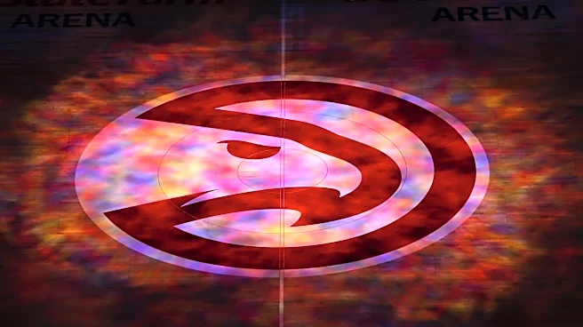
The user named mandevillan admitted that they had never seen the Hawk in the ‘Pac-Man’ logo used by the team as an alternate since 2014. The logo itself is a revamping of a bygone era for the franchise (and it’s seemingly more widely used that the primary logo that has “ATLANTA HAWKS BASKETBALL” in a ring around the hawk — even at halfcourt in State Farm Arena).
This person had been looking at this logo from right to left, apparently.

From the post:
I’ve been a fan since I was a kid who moved to Atlanta in 1992. Thirty-plus years!
I was on NBA.com just now looking at standings, and I noticed something that I never have before…I finally saw the Hawks logo the way it was meant to be seen.
My whole life I’ve been viewing it right to left. It always looked like some predatory Pac-Man-esque creature, like a hawk with a single tooth and open beak snapping at prey or something.
But today, for the first time ever, I viewed it left to right. And it’s clearly just… a hawk. In flight probably. That’s it. That’s the whole thing.
I feel like an idiot. Thirty years. I can’t be the only one. Right? Right??
That post drew ridicule from people. How could you not clearly see the Hawks with its eye and beak???
A quick backstory on the history of the logo (much of this info came via the great Chris Creamer at SportsLogos dot net). The original design debuted in 1972, just the fifth season since the franchise moved from St. Louis to Atlanta.
That logo had the hawk titled in an upwards direction from left to right. It’s an iconic and clean look that perfectly uses minimalism to great effect. I mean, just look at these warmup jersey sets:

But since the Hawks weren’t able to bring back the logo in its original form in 2014, they made a primary and an alternate logo that contained a re-designed Hawk outline, going from “ATLANTA HAWKS BASKETBALL CLUB” back to “ATLANTA HAWKS BASKETBALL” in the writing of the primary logo in 2020.
Pac-Man, the arcade game character, came out in 1980. You know, the loveable guy that gobble up white pellets and tries to avoid the ghosts chasing him.
That original character was just a yellow circle with a pie-shaped cutout for a mouth to the side:

So when you overlay the Hawks logo with the original Pac-Man, you can see the resemblance and reason behind the colloquial name — the ‘Pac-Man’ Hawks logo.
But, man, missing the hawk in the logo for almost 35 years? And then admitting that on the wide world web? You couldn’t torture that info out of me.
What do you think? Did you ever misinterpret the old or even current logo? Let me know in the comments.