


Logo changes in the Indian Premier League are rare but significant events. Franchises usually opt for them to mark a fresh identity, boost fan engagement,
or shake off bad luck. While most teams make only minor tweaks over the years, a few have gone for complete redesigns.
The IPL 2026 season saw a rebranding of Lucknow Super Giants in their crest, as they changed their logo significantly ahead of the season. Here is a detailed look at the major full logo changes among current IPL teams, along with the on-field story of the season when the new logo debuted.
Mumbai Indians
Mumbai Indians refined their iconic logo in 2010 by flipping the Sudarshan Chakra from anti-clockwise to clockwise, giving it a refreshed and energetic appearance. The new look remains the core identity even today.
In IPL 2010, the team reached the final for the first time but finished as runners-up, losing to Chennai Super Kings by 22 runs. They had a strong league stage with 10 wins, and Sachin Tendulkar claimed the Orange Cap with 618 runs.
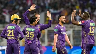
Kolkata Knight Riders
Kolkata Knight Riders unveiled a major redesign ahead of IPL 2012. They moved away from the black and gold Viking helmet to a striking purple and gold Corinthian helmet on a shield. Owner Shah Rukh Khan believed the earlier black colour was bringing bad luck.
The change brought instant success. KKR won their first-ever IPL title that season, defeating Chennai Super Kings in the final by five wickets. Under new captain Gautam Gambhir and with mystery spinner Sunil Narine shining as Player of the Series, the team staged a remarkable turnaround.
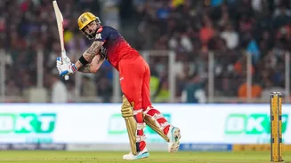
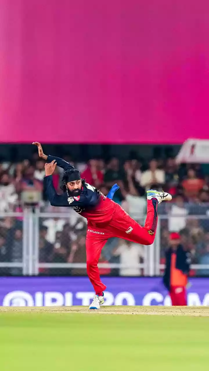
Royal Challengers Bengaluru
RCB introduced a prominent lion into their crest in 2016, removed the shield, and added black as a secondary colour.
That season turned out to be memorable for batting fireworks as they reached the final but lost to Sunrisers Hyderabad by eight runs. Virat Kohli scored a record 973 runs, including four centuries, yet the title eluded them.
In 2020, RCB gave the logo another update with a bigger lion and a more simplified, bold design. The team reached the playoffs that year but exited in the Eliminator during the COVID-affected tournament held in the UAE.
Ahead of IPL 2024, they tweaked the name to "Royal Challengers Bengaluru with a cleaner straight-line text under their signature font. They made it to the final that year but lost to Kolkata Knight Riders.
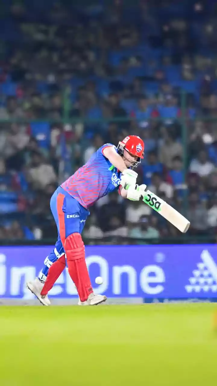
Delhi Capitals
Delhi Daredevils underwent a complete rebrand in 2019 and became Delhi Capitals. The new logo featured tigers, a shield, and a crown, with a fresh colour scheme positioning Delhi as the "power centre.
The season marked a strong revival. The team finished third in the league stage, reached the playoffs after seven years, and won their first playoff match in the Eliminator.
Rajasthan Royals
Rajasthan Royals gave their crest a modern refinement in 2019, updating the lions and crown elements while shifting emphasis toward pink and blue tones to connect better with fans.
On the field, however, the season was disappointing as they finished seventh and missed the playoffs despite a star-studded batting lineup.
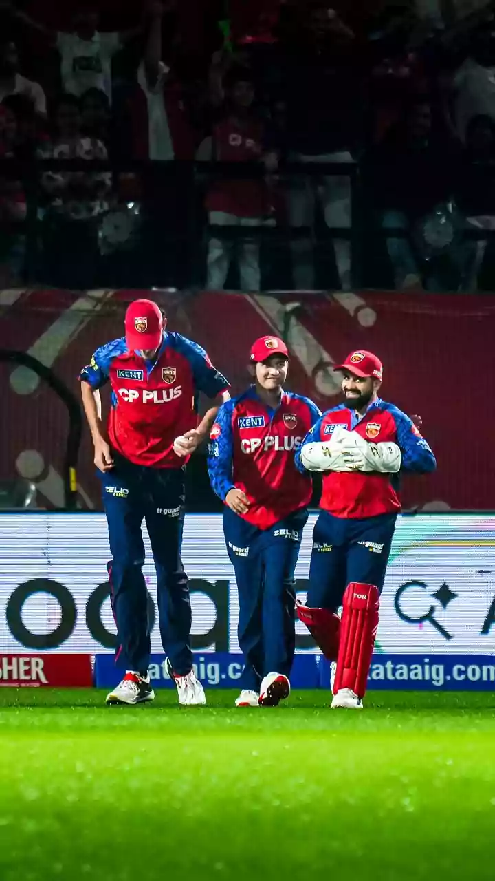
Punjab Kings
Punjab Kings dropped "XI from their name and launched a simplified lion monogram logo in 2021 to reflect the vibrant spirit of Punjab.
The rebrand aimed at a fresh start, but results stayed average as the team ended the season in the middle of the table without reaching the playoffs.
Lucknow Super Giants
Lucknow Super Giants introduced a new emblem in 2026 featuring a Garuda, crown, and elephant elements along with a shift toward red and Tiranga-inspired colours to deepen cultural connection with Uttar Pradesh. The team has been eliminated from the playoffs in IPL 2026 after their defeat against Chennai Super Kings/
These logo changes often signal a team's desire for renewal. While some, like KKR in 2012, delivered immediate trophies, others brought mixed fortunes. In the IPL, a new look can energise fans and players alike, but success ultimately depends on performance between the ropes.