
Say this for NFL fashion – the baseline standard and ever-expanding variety of uniforms across the league are at their highest level in decades, if not quite at the peak heyday of the 1980s ... in one man's opinion.
Four teams (Commanders, Rams, Ravens, Titans) made notable alterations to their primary look ahead of the 2026 season, and a few more nuggets (read: alternate kits) about the upcoming campaign have emerged in recent days. Yet to come: Nike’s unveiling of this year’s “Rivalries” uniforms, re-imagined threads with local ties that will debut for NFC North and AFC South clubs this season after the program initiated in 2025 with AFC East and NFC West squads, who will also continue to wear them on occasion.
With training camps upon us –
and the Bills and Rams just revealing the full breadth of their closets ahead of what should and could be memorable campaigns for those franchises – now seemed like the perfect time to update USA TODAY Sports’ annual NFL uniform power rankings, listed from worst to best (previous rank in parentheses):
32. Cleveland Browns (32)
From the horrid color combination to the boring presentation – Cleveland still the only NFL team without a helmet logo – to the DUDE Wipes sponsorship of their monochrome brown “Alpha Dawg” alternates, which land somewhere between self-deprecating and humiliating, they remain anchored to the bottom of this list. And their secondary Dawg Pound logo remains underutilized − further proof of their cultural aversion to wins.
and the winner is...
— Cleveland Browns (@Browns) June 12, 2023
Introducing our new official dog logo!! 🐾🎉 #DawgPound pic.twitter.com/zny6NxobHy
31. Washington Commanders (30)
A franchise that’s been in constant flux since leaving its former, racist identity behind in 2020 can’t necessarily be faulted for trying to retain the more appropriate ties to its past – namely last year’s throwbacks, which approximated what the Joe Gibbs-era teams wore (the Commanders logo replacing the one from the Super Bowl glory days of the 1980s and ‘90s). Those throwbacks have now been effectively adopted as the Commanders’ primary unis … though the team just couldn’t help but introduced a “Hail Raiser” alternate that added a spear into the current “W” logo meant to, per the team, symbolize “the top fighters, the front lines, those leading a mission who are unafraid to step into the fire.” OK, stop. And stop – to listen to the Native Americans on that front.
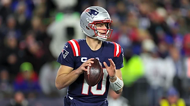
30. New England Patriots (28)
They look best in their “Pat Patriot” throwbacks. The best alternative? Last year’s “Nor’Easter” look from the “Rivalries” collection. Maybe it’s hard to leave the "Flying Elvis" era that dates to the 1990s and has basically been used in 11 of the team’s record 12 Super Bowl appearances. But it’s time to fully move beyond the Tom Brady epoch … particularly given how Drake Maye and Co., uh, looked in Super Bowl 60.
29. Atlanta Falcons (24)
Like the Browns and several other clubs, they’ve managed to stray too far toward uninspired and not close enough to classically understated. Worse, the Falcons had an opportunity this year to rectify so many past wrongs – namely, following the Jets route and re-instituting their 1980s (or even glorious 1960s debut/throwback ... or black 1990s Deion Sanders-era version) unis and scrapping their recent iterations. Alas.
Authentic, Fast, Timeless pic.twitter.com/mUu516fq1g
— Atlanta Falcons (@AtlantaFalcons) April 2, 2026
28. Arizona Cardinals (26)
Another relative avian failure – though the Cards have less to work with than their predatory cousins, for example, and their 2023 rebrand to a cleaner look was certainly an improvement from the piping and panels they’d worn previously. Arizona’s desert-themed “Rivalries” uniforms were arguably the best of the eight that debuted in 2025. More of that.
27. Denver Broncos (21)
Good luck finding anyone within the Mile High City’s limits or elsewhere who wouldn’t advocate to turn back the clock to the “Orange Crush” or John Elway-era look with the horse rearing back inside the former “D” logo. There are some decent Easter eggs in the new version – “5280” and summit markers appear throughout – but the Broncos are among several franchises (Patriots? Eagles? Seahawks?) where the uniform apex didn’t align with organization’s best teams.
26. Carolina Panthers (31)
The sweetest part of uniforms that largely appear trapped in their 1990s roots? The panther head logo designed to resemble the combined states of North and South Carolina. The easiest way to rectify this? Pivot to the niftier alternate black matte helmet permanently with stripped-down modifications of the team’s black and “Panther Blue” jerseys. Phase out the silver.
25. Jacksonville Jaguars (27)
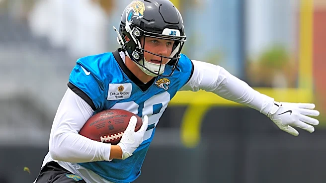
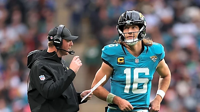
They’ve done far more tinkering through the years than the Panthers, the Jags’ 1995 expansion brethren. Ironically, while Jacksonville’s contemporary uniforms are forgettable if inoffensive stylistically, their best option is their “Prowler” throwback. Adding some light jaguar spots to the striping might jazz up the current variant.
24. Miami Dolphins (22)
Their best attribute is the aqua-and-orange color scheme that evokes South Florida, though the original dolphin logo wearing the helmet probably still gets the nod. Their dark “Rivalries” uniform were a miss – especially at the expense of something more “Miami Vice”-esque – and probably turned out the lights on former WR Tyreek Hill’s career.
23. New York Giants (23)
We know you don’t want to mimic the Jets, but going back to the 1980s uniforms full-time is also the right call for Big Blue … which still doesn’t have any blue, the helmet notwithstanding, in its regular roadies.
22. Baltimore Ravens (25)
They know how to do a reveal party, rolling out their slightly modified uniforms in front of 6,000 adoring fans at a Maryland concert venue in April. A heavier emphasis recently on purple and gold nicely brightens an inherently dreary look. That said, the new "Darkness Helmet," now topping the all-black alternates, should be a showstopper when they’re first worn at M&T Bank Stadium, likely in prime time.
21. Buffalo Bills (18)
Solid, particularly their standard duds. Last year’s “Cold Front” edition was a nice addition from the “Rivalries” collection. The just-announced “Nickel City” alternates? Nice sentiment behind them … but a little too UFL-adjacent in execution, the helmet specifically, and something unlikely to age well. The social media reaction has been less than warm.
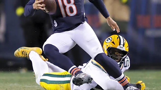
20. Chicago Bears (20)
Traditional. Historic. Staid. Meh. But stick with what you know given Da Bears’ struggles to do captivating alternates – as we await this year’s “Rivalries” model with bated breath.
19. Green Bay Packers (17)
Traditional. Historic. Staid. Meh. But stick with what you know given the Pack’s struggles to do captivating alternates – as we await this year’s “Rivalries” model with bated breath.
18. Kansas City Chiefs (14)
They’re fine – basic uniforms topped with an arrowhead logo featuring their city’s interlocking initials. The Chiefs are the only team in the NFL that continue to resist sporting some kind of secondary uniform, though they’re scheduled to get their “Rivalries” next year.
17. San Francisco 49ers (13)
They’re fine – basic uniforms topped with an oval logo featuring their city’s interlocking initials. Their heavily black “Rivalries” unis, dubbed “For the Faithful,” did a nice job incorporating legit gold coloring and a saloon font into the jersey numbers.
16. Detroit Lions (19)
The recently added shoulder stripes nicely conjure a Ford Mustang for a team owned by the Ford family. Coach Dan Campbell also got the Lions to re-embrace black alternates, with the “Motor City Muscle” look debuting in 2024. Honolulu Blue and silver may not exactly scream king of the jungle, but it is distinctive.
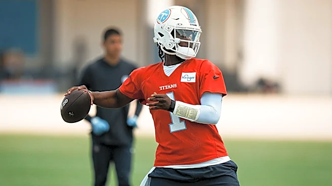
15. Tennessee Titans (29)
After years of overly busy designs that included a flaming logo and details hinting at a Roman centurion, the Titans basically reverted to their Oilers roots in March. The color scheme nearly duplicates the franchise’s final years in Houston, though the new unis are officially “Titans Blue.” No oil derrick, but the current logo has been nicely simplified. The "6-String Stripe" an ode to the musicians − guitarists in particular − who have helped make the Music City what it is, is a deft element. Still, a shame the Oilers unis are once again mothballed – and, worse, not sent back to Houston, where they truly belong.
14. Houston Texans (16)
Credit the league’s youngest franchise, entering its 25th season, for creating its own tradition – adhering to its primary bullhead logo, which dually resembles Texas’ state flag, throughout its history. The primary jerseys were modified slightly in 2024 but remain clean. And, like them or not, give the Texans credit for taking big swings for their alternates, also released in 2024, which were crafted with a great deal of fan feedback. Now, if only they could be the Oilers for a week or two every season, but fat chance the division rival Titans ever permit that.
13. Dallas Cowboys (12)
One of the NFL’s iconic looks – one the Cowboys should probably tinker with less … aside from the red helmet stripe they add annually to celebrate the league’s “Salute to Service” program.
12. Indianapolis Colts (11)
One of the NFL’s iconic looks – one the Colts should probably tinker with less … namely, those “Indiana Nights” alternates, though a blue helmet with a white version of the familiar horseshoe logo would go a long way toward remediating them.
11. New York Jets (10)
Just when it seemed they’d finally found their way with the 2024 reversion to their glorious 1980s look, the Jets seem to be slowly veering off course again. The manhole effect of the “Rivalries” uniforms was a fashion fail, especially for a team perpetually stuck in the gutter. The recently announced "White Out" model for 2026 gives the NYJ a fifth helmet option, four of them essentially varying color combos around their primary logo. But if you’re going to go to that much trouble, why not go the Texans’ route and at least come up with one truly inspired departure given the potential of the source material?
10. Minnesota Vikings (9)
Elegantly simple while incorporating aspects of Norse culture with the helmet horn and longboat-esque striping. The icy “Winter Warrior” uniforms even have Nordic knots and shields woven into the neckline. Skol, baby.
9. Cincinnati Bengals (8)
Moving to the tiger-striped helmet in 1981 was viewed as a bold decision at the time, but it’s held up quite well. This will be the fifth season the Bengals have the even better all-white uni at their disposal, the team set to take that alternate to the next level with a "White Bengal Stripe" effect at Paycor Stadium against the Ravens on New Year’s Eve.
New Year. New 𝘚𝘵𝘳𝘪𝘱𝘦. pic.twitter.com/ORnDmYFKxm
— Cincinnati Bengals (@Bengals) July 20, 2026
8. Tampa Bay Buccaneers (7)
Long underrated and underappreciated, the Creamsicle throwbacks are again a regular aspect of the rotation – the team already announcing that the original roadies brought back last year to celebrate the franchise’s 50th season will return in 2026. Yet the Bucs don’t get enough credit for the swashbuckling vibe they introduced in 1997 and again in 2020 upon Brady’s arrival – following a six-season mistake in an exaggerated version of it. The red and pewter tones, ship and pirate flag logos plus skull and crossbones all tie in nicely with the port city’s history – and have been worn for both of the franchise’s Super Bowl victories.
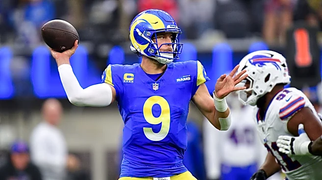
7. Los Angeles Rams (15)
The first team to adorn its helmets, the Rams initially painting those famous horns on their headgear back in 1948, they return to a deserved spot in the top 10. Earlier this year, they fixed the mistakes from their 2020 overhaul – mothballing the bone uniforms and gradient elements, which had included the numbers on the home jerseys. Earlier this month, they rolled out two alternate looks which hearken back to their early days in L.A. both from the 1950s and ‘60s. A team expected to be awesome in 2026 will certainly look the part.
Still thinkin' about these 😮💨 » https://t.co/nFA87ZFeFZ pic.twitter.com/EdN7FbZFWG
— Los Angeles Rams (@RamsNFL) July 25, 2026
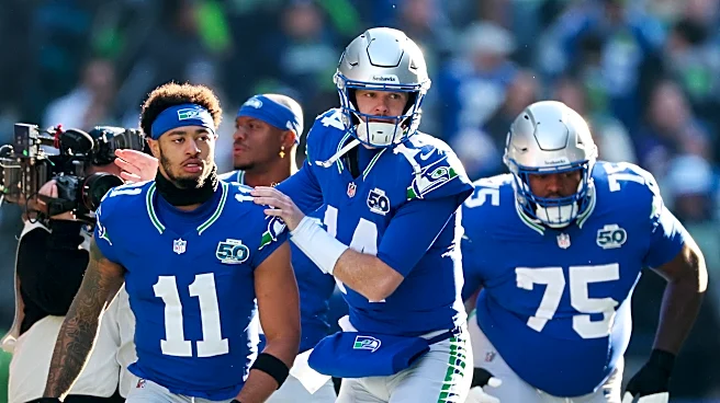
6. Seattle Seahawks (6)
Maybe most folks wouldn’t have a team that was slightly better than the Rams in 2025 ranked slightly ahead of them. But the look the Seahawks have predominantly used since 2012 has always been original – from its nods to the “12s” fan base, unique color choice and the subtle feather patterning, including a tapered effect down the crown’s centerline. A logo inspired by regional Native American art remains one of the league’s best. Add in the throwbacks, which are perhaps the equal of their 1976 expansion siblings in Tampa, and the “High-Decibel Zone” installment from the “Rivalries” collection (worn in last year's Week 16 classic vs. the Rams) – I can’t tell you how many Seahawks players told me they love them – and you have the makings of a quality closet.
5. Pittsburgh Steelers (3)
Black and gold scream Pittsburgh. The Steelmark symbol used by the American Iron and Steel Institute with the trio of hypocycloids is uniquely identifiable to both the city and team – the Steelers the only one to place their logo on just one side of the helmet. The Dark Knight alternates and occasionally worn Steel Curtain throwbacks are also on point. What typically isn’t are the team’s attempts to reach way back into its history.
4. Philadelphia Eagles (4)
They’ll never look better than they do in those glorious Kelly Green throwbacks that took Nike so long to replicate. But the Eagles have never had such a sustained run of success, including both of their Super Bowl triumphs, since switching to Midnight Green in 1996. It’s all good … save maybe for those seemingly extraneous black helmets.
3. New Orleans Saints (5)
Perhaps the only way to tie them more closely to the Big Easy would be adopting a purple, green, and gold color palette while perching a king cake baby from the timeless fleur-de-lis symbol – and, yes, we’re still advocating for such an imaginative alternative. Regardless, the Saints almost invariably look good in Old Gold and black – last year’s monochromatic all-black choice (helmet included) offsetting the (unnecessary?) return of gold jerseys. The alternate white helmets resembling vanilla ice cream were a nice touch.
2. Las Vegas Raiders (2)
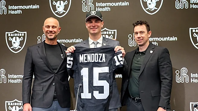
The Silver and Black’s look is as intimidating – yet glorious – as any in pro sports. (Hopefully new saccharine QBs Fernando Mendoza and Kirk Cousins can embrace the sinister ethos … though the Autumn Wind apparently doesn’t blow inside a desert’s indoor stadium.) Yet while maybe some embrace the Raiders’ simplicity and lack of variety, I’ll continue to vouch for the introduction of predominantly black pants and a dark helmet with the color scheming reversed.
1. Los Angeles Chargers (1)
They lack for nothing – awesome logo, awesome colors, versatility among myriad combinations. The Bolts even have the requisite self-awareness when something isn’t working – for example, the gold “Charger Power” jersey and pants combo introduced last season that was widely panned on social media … on a day when the Chargers got panned by the Colts on the scoreboard. This year, they’ll break out the “Charger Power” jersey but with white pants – and in Week 13 against the Bucs in what could be the uniform matchup of the year. Conversely, as great as the powder blues are, I’d vote for the all-navy “Super Chargers” retros to become the version most heavily used in this rotation.
gold on the road pic.twitter.com/0zkcttjpKq
— Los Angeles Chargers (@chargers) July 22, 2026
All the NFL news on and off the field. Sign up for USA TODAY's 4th and Monday newsletter.
This article originally appeared on USA TODAY: NFL uniform power rankings: Rams rise, Bills slide after revealing new looks