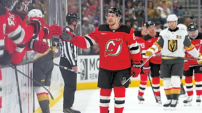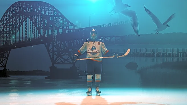








Fanatics and the NHL unveiled their Hometown Remix jerseys on Monday, Nov. 2, and the New York Islanders' snarling fisherman logo has risen from the depths.
That's not a good thing.
That logo, which was first used in 1995, was derided as the "Gorton's fisherman"and lasted only two seasons. It was cut pretty early during a fan-designed contest for a third jersey in 2027-28, with a lighthouse the winning bid.
But now the fisherman jersey will be worn for select home games this season. At least, the Buffalo Sabres didn't bring back the Buffaslug jersey, opting for the snorting buffalo head, instead.
The Hometown Remix does mix things up. The currently orange Anaheim Ducks will be green. The Chicago Blackhawks also switched to green, from red. The black-and-gold
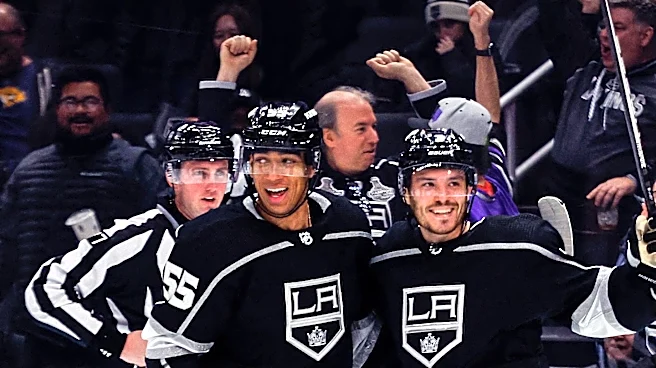
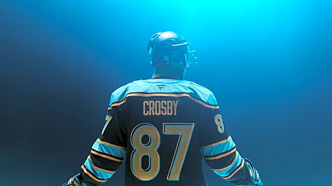
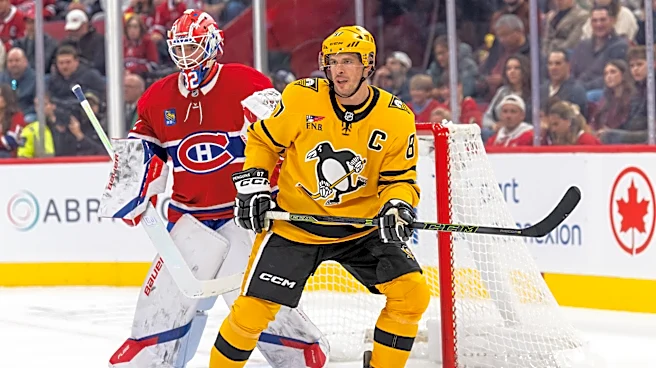
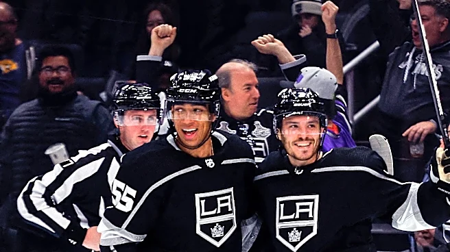
Pittsburgh Penguins shift to their early colors with a mix of dark blue and light blue. The Los Angeles Kings revert to purple.
The Washigton Capitals' sharp-looking Capitol dome logo is back, and the Detroit Red Wings add Hockeytown above their winged wheel.
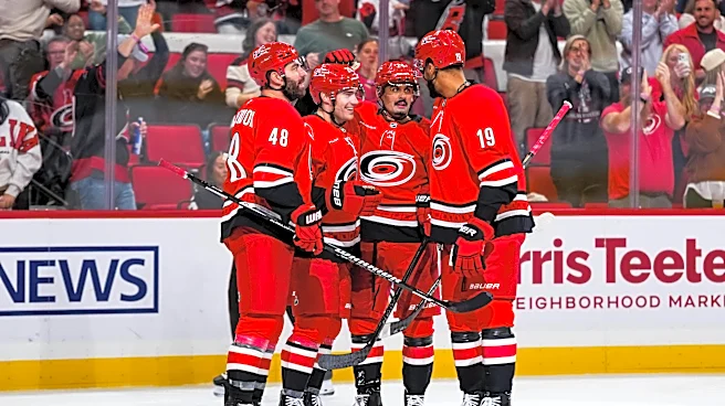
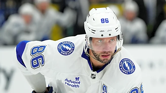
Some teams go a different route. The Tampa Bay Lighting feature a skull, the Carolina Hurricanes display mascot Stormy, the Columbus Blue Jackets have the scary loud cannon that causes visitors to jump, the Utah Mammoth have a U and a tusk and the Seattle Kraken use an anchor, ironically in a season when the team doesn't seem weighed down.
The best one: the San Jose Sharks.
The shark looks more menacing than the regular logo, it's not biting a stick and it's popping through the letters SJ.
Enough to frighten a fisherman.
This article originally appeared on USA TODAY: Hometown Remix misses with Islanders fisherman, but other NHL jerseys look sharp