


HOUSTON – The Houston Comets unveiled the team's new logos on Thursday, Oct. 29, ushering in a modern era of basketball for one of the WNBA's original franchises.
The four-time WNBA champion Comets existed from 1997-2008 and will return for the 2027 season following the sale and relocation of the Connecticut Sun to Houston.
Since the official announcement in May, Comets officials have been working on branding for the relaunch.WNBA rules legally prohibit reviving an old design as a primary logo, meaning the Comets couldn't simply reproduce the franchise's former branding. Jose Lopez and Taylor French, Houston’s senior creative director and senior director of marketing operations, respectively, told USA TODAY Sports they wanted to design logos
that simultaneously captured the team's history and moved the franchise forward.
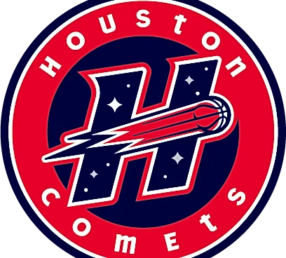
They decided to keep the Comets' original color palette – navy blue, red and silver – and took inspiration from the team's former secondary "H" icon to create a sleeker, modernized version.
The new Comets global and primary logos feature a red basketball comet streaking across the blue letter "H," for H-town, which slants upward to symbolize the team’s ascendance and pursuit of greatness. The franchise's four championships are represented by four diamond-shaped quasars, an ultra-bright galactic nucleus. Three of the quasars are silver and the fourth is white to represent the Lone Star State.
In all three logos, the words "Houston Comets" use lowercase letter "Ts" to tie in with the retro rebrand the Rockets underwent this summer. In the two secondary logos, a basketball comet streaks through the "Os" in "Houston" and "Comets," reminiscent of the original wordmarks.
"The logos, they're a memory," Lopez said. "They're one of the championships that you went to with your family. If you're watching television or listening to the radio and you hear 'Houston Comets,' all those memories come back, right? So when you see these, when you see this color scheme, I think that people will really gravitate to it."
In addition to paying tribute to the past, French said she hopes the refreshed branding can connect with the next generation of Comets fans.
"The way the WNBA is now, today, there's so much energy and so much excitement with the league in general that it'll be really exciting for us to open that door to the city and to the market to bring in a new fan base," French said.
Out of respect for Connecticut, the Comets delayed their logo reveal and "She's Back" marketing campaign until after the Sun’s final season concluded. The Comets plan to unveil their uniforms, court design and mascot later in the offseason.
The franchise is moving ahead with the Comets branding even though the WNBA is still battling to trademark the Houston Comets name after a company tied to rapper Travis Scott filed a competing federal trademark application for the general word mark. Trademark registration is not required under U.S. law, which allows use in commerce to establish rights. On Oct. 28, the WNBA filed intent-to-use applications for the Comets' new design marks.
The Comets are owned by billionaire Tilman Fertitta, the U.S. ambassador to Italy who also owns the NBA's Houston Rockets. The Comets will play all their home games at Toyota Center, the downtown arena that is also home to the Rockets. Comets season tickets for the 2027 WNBA season are on sale now.
On Oct. 22, the team announced a multiyear partnership to broadcast Comets games locally on KTBU and Houston's CBS affiliate KHOU, with games also simulcast on Space City Home Network, the team's regional sports network.
This article originally appeared on USA TODAY: Houston Comets reveal modern logos for highly anticipated WNBA revival