





Birmingham — a tony, Oakland County suburb that boasts of upscale boutiques and a "walkable downtown" — is one of the latest metro Detroit municipalities to put up expensive signs to create so-called gateways.
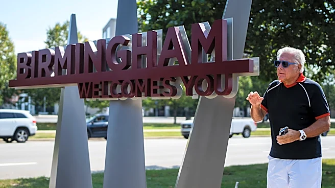
Yet many people are starting to wonder if the new design, which includes what appear to be spikes rising out of the ground, projects the right image for Birmingham or even evokes thoughts or feelings close to what the creators had intended.
Some are comparing the new signs to design fails, such as "The Halo," a 35-foot ring in Sterling Heights that became colloquially known as the "Golden Butthole," and a "DETROIT" sign that was billed as a smaller Midwest version of the 45-foot-tall "HOLLYWOOD" sign overlooking Los Angeles.

And a few folks,
like Robert Dempster, believe Birmingham's new sign still can be saved.
"When I saw it, I was embarrassed," the 77-year-old owner of his own design company and a former Birmingham resident who now lives in Bloomfield Township told the Free Press. He is hoping officials will fix it. "It hurts my heart that it’s not a fit."
Dempster has designed signs throughout his life and pointed out that a good one can make all the difference to a community. It inspires pride and increases property and business value. But he said a bad sign — one that doesn’t capitalize on a community’s character or worse, leaves a poor first impression — is a waste of taxpayer money.
Birmingham's new one, he added, doesn’t do much for him and could even give someone an unwelcoming feeling.
A quaint and progressive place
Birmingham rolled out new branding in April. The look was inspired by a local landmark, a sculpture in its central square, Shain Park, that was designed by a former famous resident, Marshall Fredericks, whose artwork is in public places throughout Michigan.
A local committee and advertising agency McCann Detroit were credited with the concepts. And to folks familiar with the sculpture, “Freedom of the Human Spirit,” the concept behind the new logo made perfect sense.
Birmingham was named in the 1830s after what was then England's biggest industrial center by Michigan residents who had high hopes for it. But the village, which the story goes was hewn out of the wilderness, never took off that way.
Instead, according to the community’s website, the suburb became a "quaint" and "progressive" place to live. By 1933, the city noted, Birmingham organized into a city yet is still a place where residents "still enjoy the small town charm that characterized days gone by."
The sculpture — which originally appeared in the 1964 New York World’s Fair, the same one that also featured another Michigan landmark, the Uniroyal Giant Tire now in Allen Park — offers an aspirational message: Humanity is eternally on the rise.

Fredericks, who taught at Cranbrook Academy of Art and lived in Birmingham, gifted the design to the city, which later commissioned a 28-foot tall bronze replica of it and placed it in the park. The work features swans and male and female figures with their arms raised.
Praise, criticism for the look
In April, Jana Ecker, who is now city manager, praised the branding decision in the Oakland County Times, a local, online news outlet. She noting that the new designs incorporated an "iconic sculpture," which makes the city, with its 22,000-some residents, "special and unique."
The design concept went something like this: If you think about the sculpture, you’ll think about the park where it’s at and the surrounding downtown, and that will make you think about Birmingham as a pedestrian-friendly place and all the upscale shopping and dining it has to offer.
The project reportedly had a budget of about $700,000, including expensive signs.
But something got lost when it came to translating the message in the sculpture to the new street sign on Woodward Avenue and 14 Mile that recently went up. Instead of a symbolic representation of an upward trajectory, some, instead saw vicious spikes — or swords, like the Iron Throne in HBO’s "Game of Thrones."
Even Dempster — who said he knew about the sculpture and Fredericks from their Birmingham days — is suggesting an alternative design. He wrote in his social media post that the sign made him think of "Vlad the Impaler" or seemed like something from a "Star Wars" movie.
Besides that, Dempster added, the sign is difficult to read.
'The Halo' and new Detroit sign
The Birmingham has yet to receive as much criticism as "The Halo" in 2019 or a new Detroit sign in 2024.
It also is hardly the first municipality to add or update its image with signs or to have it's gateway in the news. This summer, for instance, two other Oakland County communities — Oak Park and Farmington Hills — added new signs. And in Taylor, a Downriver city in Wayne County, a semi-truck a couple years ago crashed into its "Eureka Way" sign.
"The Halo" was unveiled in the median of M-59 and Hall Road and is better known by a vulgar name. The ring was part of a plan to make the city, with about 134,000 residents, more distinctive, and it was gold to connect it to the area’s Golden Corridor, so called because of the community's economic potential.

But the art piece, which cost more than $440,000, didn’t receive attention for how good it was, as its name suggested. Instead, the Free Press and other outlets reported that people gave the "golden icon" new, unpublishable nicknames and parodied it with Facebook pages, including "The Golden Butthole of Macomb County."
Then, two years ago, ahead of the NFL draft, the state’s largest city with nearly 650,000 people installed a sign made up of seven letters along Interstate 94 between Central Street and Cecil Avenue. As football fans drove past, they would know when they entered the Motor City.
The $400,000 sign also failed to be the hit officials had hoped it would.

The joke on the internet: It was the Temu Hollywood sign because it looked nothing like the well-known one in California. Instead, it was a cheaper version, like something that you might find on Temu — short for "Team Up, Price Down" — a Chinese-owned, online discount marketplace.
Detroit rapper Gmac Cash even penned lyrics mocking the sign, suggesting the letters looked like they came from a toy store and were so flimsy they looked as if they would blow over. It "ain't the sign that we ordered," he wrote, urging that the city "take it back."
Awareness is what’s important
It’s unclear whether the new Birmingham sign will get a makeover.
Caruso Caruso — a downtown boutique that sells denim, including $200 and $300 jeans — posted a photo of the sign on social media asking: "What’s up" with its "three large spikes that shoot up from the ground?"
Lennon Lalonde, a manager for the shop, told the Free Press that many customers are curious.

He said that unlike Pleasant Ridge’s "cute, little sign" on Woodward that he drives by twice a day as he’s goes to and from his home in Ferndale and work, Birmingham’s sign doesn’t seem to generate the same vibe.
In the comments of the store’s post, about a hundred people weighed in on it.
But Birmingham officials are mostly keeping quiet.
"The city has no additional comments regarding the wayfinding signage," Birmingham’s Communications Director Marianne Gamboa replied in an email to Free Press messages left with various officials, pointing out that information already "has been published and distributed to the community."
But maybe it doesn’t matter much if people are in love with the city’s sign if you believe that all signs — like all publicity — are good because awareness is the aim and the only thing worse than being talked about, even if that chatter is critical, is not being talked about at all.
Contact Frank Witsil: 313-222-5022 or fwitsil@freepress.com
This article originally appeared on Detroit Free Press: Some want to spike Birmingham's new sign, which they find unwelcoming