

Nothing marks the start of a nitty-gritty, down-and-dirty, rough-and-tumble football season like a sincere, practical discussion about the twilling process of sewing stripes on to breathable fabric.
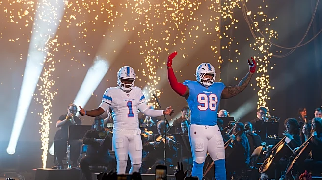
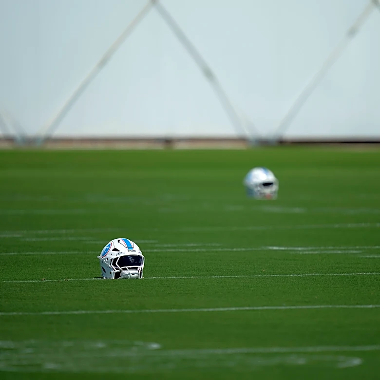
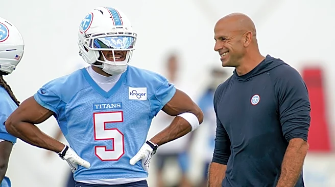
The rebranded Tennessee Titans will officially debut their new logos, new uniforms, new lettering and revised color scheme in regular-season action when they host the New York Jets at Nissan Stadium on Sept. 13 (noon CT, CBS). Before the redesign finally gets its national spotlight, The Tennessean sat down with Titans senior vice president of brand marketing Erin Swartz and senior design director Christine Zambetti to discuss how the rebrand came together and some of the intricacies of the process that folks without degrees in graphic design would
never have considered.
From Buzzfeed-style surveys and hiding behind box forts to a big book of T's and whatever the heck a "flywire chassis" is, here's a look at how the Titans ended up with their new branding.
Listening to fans . . . no matter how creatively
Ask anyone from the Titans what sparked the rebrand and they'll inevitably defer to two topics: One, the new Nissan Stadium opening up in February. And two, years of data collected through fan surveys and focus groups. The overwhelming evidence, Swartz claims, is that fans liked the color palette that led with light blue and were drawn more to the classic design elements that belonged to old Houston Oilers uniforms than they were to the busier elements in more modern Titans branding.
With the new stadium construction reaching a point where interior structures were being installed, the time for turning that feedback into change was nigh.
"You’re just asking them, ‘What does it mean to you to be a Titan? What does this franchise mean to you? How important are these colors to you?’ " Zambetti told The Tennessean. "Just all the different components and what that means to the fans. We really wanted to stay true to that, and then once we got the results from that, we even had some fun things.
" ‘If the team was a car, what kind of a car would it be?’ We came up with pickup truck was probably the top answer. We’re kind of tough and kind of gritty, but something that feels like home and southern and stuff, too. It’s kind of that cool dynamic of where you have this really important visual in your mind."
Designing a Titans uniform, logo
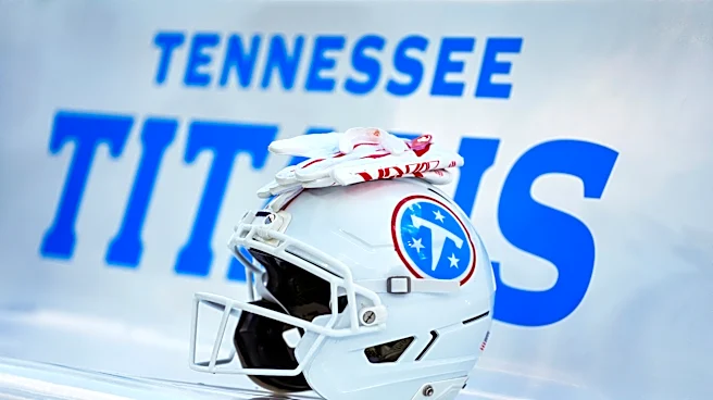
Zambetti jokes that she looked at one million "T" emblems before landing on the one at the center of the revamped logo. She says she looked through a book that was page after page of nothing but stylizes T's — serif, sans serif, slab serif.
And it wasn't just the "T." It was fonts and typefaces and color stroking. It was star spacing and letter angling. She says there came a point where the Titans mocked up 10-12 versions of the logo where the only differences were barely perceptible weight differences among the concentric white, blue and red circles.
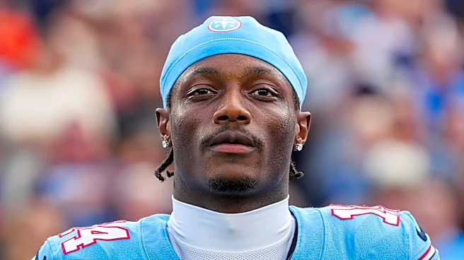
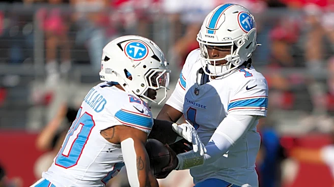
All of that to end up with a logo that, admittedly, looks like they traveled "all the way around the world to end up across the street," as Zambetti puts it. And to end up with uniforms that can be easily mistaken for the Houston Oilers uniforms of the 1980s and 1990s that the team wore as throwbacks in 2023 and 2024.
But design isn't just imagination. It's application. And sometimes that means working within the constraints put upon by your manufacturer.
Nike's football pants are made from a lightweight, perforated material that facilitates flexibility. Stripes are often woven on, stitched in a way that can impede movement and cause rigidity. So imagine a roughly nine-month process that included the Titans sending design ideas to Nike, who would send fabric samples to the Titans, who would turn the samples over to the equipment team for rip-and-tear tests.
And it wasn't just pants. Nike's uniform chassis also comes with a thick collar supported by a "flywire," which supposedly prevents tearing. It's a bulky uniform element that runs in conflict with the "cleaner" and "more classic collegial" uniform identity the Titans were aiming for. Finding that balance between design and functionality proved challenging at times.
None of that mentions the colors, which were frequently cited in fan feedback as a cornerstone positive. The problem, though, is that different materials absorb colors in different ways, so keeping color consistency from uniform to scoreboard to rally towels to souvenir mugs is already a challenge, even before considering the fact that the Titans/Oilers blue predates the Pantone color-matching system used to replicate hues for mass production.
The reveal
Through approximately two years of planning, designing and production, still very few in the Titans facility knew about the rebrand, and even fewer had seen the finished product. Even when it came time for the limited in-office reveal, Swartz shrouded the moment with secrecy.
"I had the box in my office and we kind of stacked up boxes so it was hiding behind it," Swartz said. "There were very few people here who had seen it or had the ability to. So I was calling them into my office like, ‘Look!’ Overwhelmingly, it was like ‘Oh my God.’ "
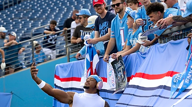
Anecdotally, public reviews of the redesign have been mixed-to-positive. Fans seem to have embraced the new look at practices, scrimmages and preseason games. USA TODAY's SaintsWire had the new logo as the NFL's 10th-best in its annual rankings for 2026. Sports Illustrated's rankings of the NFL's uniforms for 2026 have the Titans in 19th place. A recent post on the "UniWatch" page on Reddit had the uniforms ranked 24th. The voters on the SportsLogos.net forum have the Titans' logo ranked as the NFL's 20th best for 2026, up from 28th in 2025.
Swartz said it's too early to draw any data from the research they've done into fan engagement and response to the new brand. But the organizational philosophy points toward a belief that the responses will align with the research.
"They were telling us that’s what they wanted, and so we were delivering on what they had told us that the market was looking for," Swartz said.
Nick Suss is the Titans beat writer for The Tennessean. Contact Nick at nsuss@gannett.com. Follow Nick on X @nicksuss. Subscribe to the Talkin’ Titans newsletter for updates sent directly to your inbox.
This article originally appeared on Nashville Tennessean: How Tennessee Titans jersey, logo redesigns came together | Exclusive