



The Power of a Blank Slate
The single greatest strength of the Michael Myers silhouette is its complete lack of detail. The shape is defined by a blank, white mask and a dark jumpsuit, an outline that is human but devoid of humanity. John Carpenter, the film's director, referred
to the character as 'The Shape' in the original script, a name that perfectly captures this idea. The silhouette isn’t a person; it’s an absence of one. This blankness is a masterstroke of horror psychology. When we see a character with a detailed face, we are given emotional cues. We can read anger, sadness, or joy. But 'The Shape' offers nothing. The audience is forced to project its own deepest fears onto that empty canvas. He is terrifying because his silhouette invites us to imagine the worst, making him a personalized vessel for whatever scares us individually. It’s an interactive form of fear, driven by our own imaginations.
An Instantly Recognizable Icon
From a purely marketing standpoint, the silhouette is gold. Its core components—the stiff posture, the head tilted just so, the glint of a kitchen knife—are so distinct that the shape is immediately identifiable, even with minimal detail. This makes it an incredibly versatile and powerful branding tool. It can be stenciled onto a pumpkin, printed on a T-shirt, or used in a teaser trailer with just a flash of the outline against a dark background. Like the golden arches of McDonald's or the Nike swoosh, the Myers silhouette has become a globally recognized symbol. You don't need a title or a tagline; the shape alone communicates 'Halloween'. This instant recognition is a rare and valuable asset for any franchise, allowing for marketing that is both minimalist and incredibly effective. It's a visual shortcut straight to a feeling of dread and nostalgia.
Weaponizing Negative Space
Good design is often about what isn’t there, and the Myers silhouette is a masterclass in using negative space. In posters and film scenes, he is often depicted as a black void against a lighter background, or a pale mask emerging from total darkness. This technique does two things. First, it draws the eye directly to him, making him the undeniable focal point of any composition. Second, it creates a profound sense of unease. Our brains are wired to find patterns and complete images, but the featureless void of the silhouette denies us that satisfaction. The emptiness around and within the shape feels unnatural and threatening. This visual tension mirrors the character’s nature: an unstoppable void that consumes the light and safety of the suburban world he invades. The horror isn't just in the shape itself, but in the way it carves a hole in the reality around it.
The Promise of Inescapable Threat
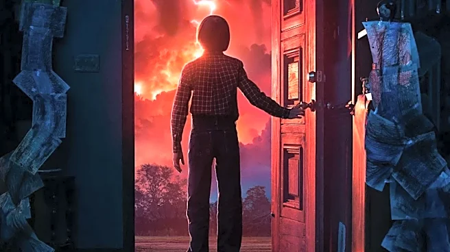
One of the most unsettling aspects of Michael Myers is that he never runs. He walks at a steady, deliberate pace. This unnerving calm is perfectly captured in his rigid, upright silhouette. While his victims sprint and stumble in panic, his dark shape glides toward them with an inevitability that is far more terrifying than a frantic chase. The silhouette communicates this methodical nature. It’s not the shape of a predator lunging for a kill; it’s the shape of something that knows it will eventually catch you no matter what. Marketing materials have used this to great effect for decades. A static image of the silhouette standing in a doorway or at the end of a street implies not a moment of action, but an enduring, patient threat. It tells the audience that this isn't just about a single jump scare; it's about a relentless, inescapable dread that walks, never runs.