




First, The Basics: What Is Color Blocking?
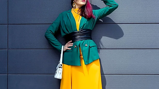
At its core, color blocking is the intentional use of two or more solid blocks of color in a single outfit. Think of a dress with a clean line dividing a swath of hot pink from a field of bright orange, or a simple outfit of a green shirt and blue trousers.
The look is graphic, clean, and deliberate, tracing its modern fashion roots back to Yves Saint Laurent's iconic Mondrian dresses of the 1960s, which were directly inspired by the artist's geometric paintings. The effect is striking because of its simplicity and structure. Each color has its own defined space, creating a look that is modern, bold, and easy to read. It's a statement of confidence that relies on the clean contrast of well-chosen hues.
Marni's Approach: Color as Feeling
Marni, especially under creative director Francesco Risso, treats color less like a graphic design element and more like a painter's palette. The brand's philosophy is rooted in an intuitive, emotional, and often eccentric use of color that prioritizes individual expression over traditional harmony. Where color blocking is about creating a clean visual statement, Marni is about telling a story or evoking a mood. Risso, who has a background in fine art, has described the process at Marni as a constant state of painting. The brand is known for its avant-garde and eclectic style, using color to create an unpredictable visual language that’s in constant dialogue with the art world. It’s less about following the color wheel and more about following a feeling.
Texture Makes Color Three-Dimensional
A key difference is that for Marni, color is rarely just a flat surface; it's inseparable from texture. Simple color blocking works well with smooth, uniform fabrics to keep the lines clean. Marni, however, revels in combining fuzzy mohair, slick leathers, chunky knits, and crinkled cottons. A shade of blue isn't just blue—it's the deep, saturated blue of a shearling coat or the faded, worn-in blue of a textured knit. This obsession with materials means that colors are never truly solid; they have depth, catch light differently, and interact in a tactile way. This adds a layer of complexity and sophistication that elevates the idea of pairing colors, moving it from a simple visual trick to a multi-sensory experience.
Embracing Prints and Unconventional Pairings
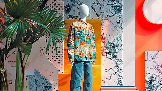
While classic color blocking typically avoids patterns to maintain its graphic purity, Marni joyfully throws prints into the mix. The brand is famous for its quirky, often hand-painted or abstract floral and geometric patterns that are layered with bold, solid colors. A striped sweater might be worn with checkered trousers, or a floral-print dress might peek out from under a vibrantly colored coat. Furthermore, Marni’s color combinations often defy conventional wisdom. Instead of pairing complementary colors for a high-contrast but balanced look, Marni might place a muddy, earthy tone next to a searing neon or a soft pastel. The result is a palette that feels subversive, off-kilter, and deeply personal, creating harmonies that are unexpected yet strangely compelling.