


First, What Are Analogous Colors?
Before diving into the debate, let's get the definition straight. Analogous colors are groups of colors that are neighbors on the color wheel. Think of a sunset's gradient of red, orange, and yellow, or a forest's palette of green, teal, and blue. In
fashion, this translates to creating an outfit from these related hues. Unlike complementary colors (opposites on the wheel, like blue and orange) which create high contrast, analogous colors produce a more harmonious, cohesive, and often subtle look. They share a common undertone, which makes them naturally pleasing to the eye. The effect is often described as elegant, rich, and sophisticated.
The Argument For: Effortless Harmony
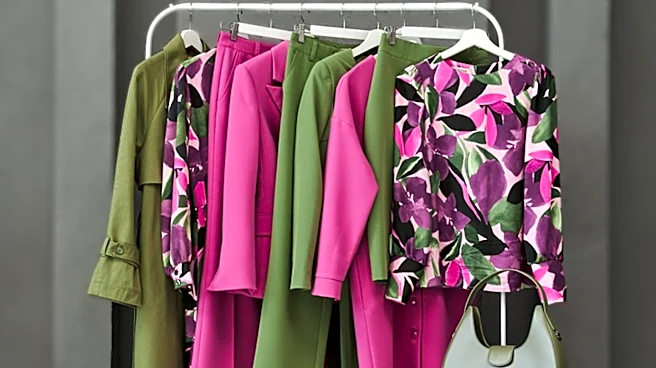
Proponents of analogous color schemes love them for their ability to create a polished, put-together look with minimal fuss. Because the colors naturally blend well, there's less risk of a jarring clash. Stylists who favor this approach see it as a masterful way to play with color that feels intentional and chic. An outfit combining a forest green blazer with a teal blouse and olive pants, for example, looks layered and visually interesting without being loud. It’s a step up from a simple monochromatic (single-color) look, offering more depth and dimension while maintaining a sense of balance and sophistication. For people who want to move beyond neutrals but are intimidated by bold color-blocking, analogous schemes are the perfect gateway.
The Argument Against: The Risk of a Muddy Mess
So, why the disagreement? The primary critique from cautious stylists is that analogous outfits can easily go wrong. When not executed with a discerning eye, the low-contrast nature of these palettes can cause the colors to blend into each other, creating a look that’s flat, muddy, or uninspired. Without careful balancing, a combination of, say, blues and greens can look less like a deliberate style choice and more like you got dressed in the dark. The very harmony that makes these schemes appealing can also be their downfall, resulting in an outfit that lacks a clear focal point and fails to make an impact. This is where professional skill comes in, and it's the crux of the disagreement.
The 'Real Reason': It's All About Nuance and Execution
The disagreement among stylists isn't really about whether analogous colors can work, but how to make them work. The 'real reason' for the debate lies in a series of advanced styling principles. First is proportion. Professionals who successfully use these palettes often follow a version of the 60-30-10 rule, where one color dominates the outfit, a second plays a supporting role, and a third is used as a small accent. Second is the critical role of texture. To prevent the colors from looking flat, stylists insist on mixing different materials—like pairing a smooth silk with a chunky knit or a sleek leather with soft cotton. This creates visual separation and depth. Third is personal coloring. An analogous scheme needs to harmonize with your skin's undertones and natural contrast level to truly shine. Finally, many stylists add a small pop of a neutral like white, black, or beige, or even a complementary color in an accessory, to break up the color scheme and add a point of interest. Without mastering these nuances, the look can easily fail.