

The Dries Van Noten Mystique
For decades, Dries Van Noten has been a fashion insider's favorite for his painterly approach to clothing. His runway shows are famous for their eclectic and romantic layering, where rich jacquards, opulent florals, and unexpected patterns live in perfect
harmony. The result is an aesthetic that feels both considered and completely spontaneous. At first glance, it seems impossibly complex—a skill reserved for stylists and the ultra-daring. But look closer, and you'll find a foundational principle at play that makes the whole composition work. It’s less about having a specific “eye” for it and more about understanding one key concept: scale.
The Golden Rule: Vary Your Print Scale
Here is the core secret: successful print mixing hinges on varying the scale of the patterns. To create a look that feels intentional rather than chaotic, you must combine prints of different sizes. Think of it as creating a visual hierarchy. Your eye needs a clear place to land first. When you mix two prints of a similar large scale, they compete for attention, creating a jarring effect. Conversely, mixing a dominant, large-scale print with a smaller, more subtle one creates balance. The large print becomes the star, while the smaller print acts as a richly textured supporting character, almost like a neutral.
Start with a 'Hero' Print
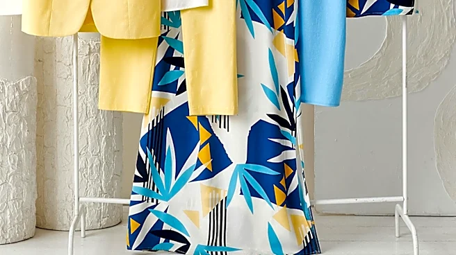
To put the rule into practice, begin by choosing one main garment with a large, bold pattern. This is your “hero” piece. It could be a blazer with oversized floral blooms, a skirt with wide, graphic stripes, or a dress with a large-scale geometric design. This piece will anchor your entire outfit. Building around a single, dominant print gives your look a clear focal point and makes the subsequent layering decisions much easier. By establishing the main event first, everything else you add is in service of complementing that statement piece, not competing with it.
Add the Supporting Cast
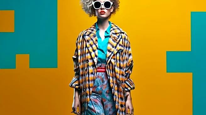
Once you have your hero, it's time to bring in the supporting prints. These should be noticeably smaller in scale. If your hero is a large floral, your supporting piece could be a shirt with a ditsy floral, a micro-check, or a slim pinstripe. The contrast in size is what prevents the patterns from clashing. These smaller patterns read almost as a solid color from a distance, adding depth and interest without overwhelming the eye. You can layer with two or even three prints, but the golden rule remains: keep their scales distinct. A large, a medium, and a small print can work together beautifully.
Unify the Look with Color
While scale is the most important rule, color is the glue that holds it all together. To ensure your mixed prints feel harmonious, look for a common color thread. Your secondary print should pick up on a color from your hero print. For example, if your large floral jacket features shades of blue and green, a smaller geometric print that incorporates one of those same colors will feel instantly cohesive. This shared color palette tells a unified story, making your bold choice look deliberate and chic. You can also use solids—like a neutral T-shirt or a solid-colored belt—to give the eye a place to rest and ground the entire look.