


A World, Not Just a Weekend
More than just a music festival, Camp Flog Gnaw is an immersive carnival curated with obsessive detail by its founder, Tyler, the Creator. Since its start in a Los Angeles parking lot in 2012, the event has blossomed into a massive cultural gathering
at Dodger Stadium, but it has never lost its core identity. That identity is built on a simple premise: this is Tyler's world, and attendees are invited to step inside. The rides, the games, and the meticulously selected lineup all contribute to the atmosphere, but the visual branding is what holds it all together. It’s a universe that feels handcrafted and authentic, intentionally rejecting the polished, corporate sheen of many other large-scale festivals. This aesthetic is a direct reflection of Tyler himself—playful, subversive, and deeply intentional.
Typography That Speaks Volumes
The fonts used across Camp Flog Gnaw’s posters, merchandise, and website are a critical element of its personality. The typography is often chunky, rounded, and joyfully imperfect. It evokes a sense of nostalgic, cartoonish fun, as if pulled from a vintage comic book or a Saturday morning cartoon. The letters are frequently distorted, bubbly, or given quirky, hand-drawn flourishes that make them feel alive and energetic. This typographic style is a deliberate choice to communicate the festival's ethos: it doesn't take itself too seriously. Fonts used in past years, with names like 'Droog' or custom-made bubbly typefaces, lean into a 'weirdness' that mirrors Tyler's own artistic persona. It’s a visual rebellion against sterile, minimalist design, creating a language that is immediately recognizable and deeply connected to the Golf Wang fashion brand from which the festival gets its name (Flog Gnaw is Golf Wang backwards).
Illustration as Storytelling
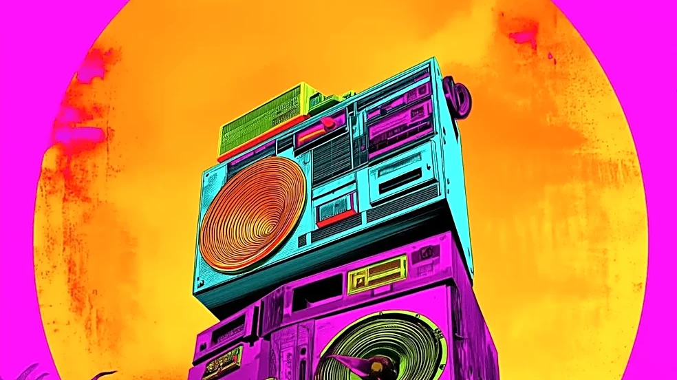
Alongside its distinctive typography, Camp Flog Gnaw’s illustrative style is central to its world-building. Posters and animations are populated with a cast of colorful, often surreal characters and motifs. From the iconic pink doughnut of the early Odd Future days to spiky-haired suns and other whimsical creatures, these illustrations create a cohesive narrative universe. The style often draws from Tyler's album art, creating a direct link between his musical and visual worlds. For example, designers have cited the illustration style of his 'Cherry Bomb' album as a direct influence. The vibrant, high-saturation color palettes and candid, film-like photography style used in promotion further enhance this sense of nostalgic, sun-drenched California escapism. These elements ensure that every piece of visual communication feels less like an advertisement and more like a postcard from the world of Camp Flog Gnaw.
An Ever-Evolving Aesthetic
Just as Tyler, the Creator’s music has evolved from the raw, aggressive energy of his early work to the sophisticated soul and jazz-inflected sounds of his later albums, so too has the festival's visual identity. While the core spirit of playful rebellion remains, the execution has grown more refined. The branding mirrors Tyler's own journey, reflecting his changing tastes and expanding creative universe. The festival has become an extension of his personal curation, a massive 'recommendation list' for his fans. This evolution is key to its sustained relevance. The visual identity adapts, incorporating new themes and styles with each iteration, yet it always feels unmistakably like Camp Flog Gnaw. This careful balance of consistency and change is what makes the branding so successful—it grows with its creator and its audience, ensuring that the carnival always feels fresh, vibrant, and authentic.