




Defining the Print Scale Mistake
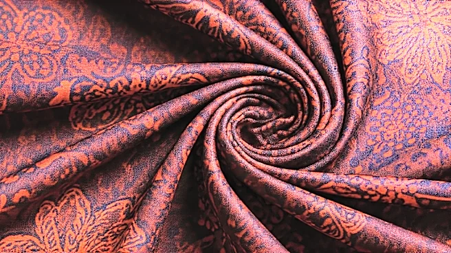
The print scale mistake is simple: it’s when the pattern on the fabric is too large for the garment it’s on. Imagine a beautiful, sprawling floral print with big, luscious peonies and intricate leaves. On a maxi dress or a wide bolt of fabric, it’s stunning.
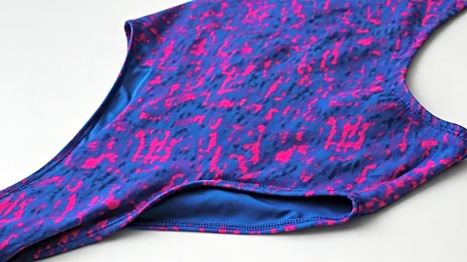
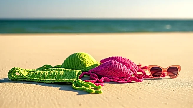
You can see the full artistic design. Now, imagine that same fabric used to make a string bikini. The tiny triangles of the top might only capture a single, unidentifiable petal fragment and a random sliver of a leaf. The bottoms might show a strange, abstract swirl of colors that was once the center of a flower. The original, beautiful pattern is completely lost. What you’re left with is a chaotic jumble of shapes and colors that looks accidental rather than intentional. This lack of visual coherence is what our eyes often perceive as looking “cheap” or poorly designed, regardless of the suit’s actual price tag or quality.
Why Your Brain Dislikes It
Our brains are wired to find order and recognize patterns. When a design has clear, repeating, or symmetrical elements, we perceive it as harmonious and intentional. A large-scale print is designed with a specific visual flow and balance. When you chop it up into the small, curved, and disconnected pieces required for swimwear, you destroy that harmony. Instead of seeing a deliberate design, the eye sees random splotches. This can create a jarring effect. The garment looks less like a finished product and more like it was made from leftover scraps of a much larger project. This is a subtle visual cue, but it has a powerful subconscious impact. It suggests a lack of thought in the manufacturing process—that the fabric was cut without any consideration for how the final pattern would present on the body. High-end designers, in contrast, often obsess over pattern placement, ensuring the design is showcased effectively even on a small surface.
What to Look for Instead
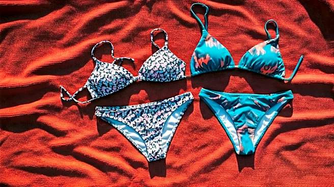
To avoid this trap, the solution is to match the print scale to the garment’s scale. For swimwear, think small. Small-scale prints, often called “micro-prints,” are your best friend. These include: - **Ditsy florals:** Tiny, repeating flowers that maintain their charm and recognizability even on a small strap. - **Small geometrics:** Think mini checkerboards, tight houndstooth, or small polka dots. Their repeating nature ensures they look consistent from any angle. - **Classic stripes or gingham:** These patterns are timeless for a reason. They are inherently scalable and look clean and crisp on the curved lines of a swimsuit. - **Animal prints (at the right scale):** A classic leopard or zebra print often works because the spots or stripes are small and dense, creating an all-over texture rather than a single large image. In all these cases, the pattern remains coherent and intentional. You’re not losing essential parts of the design when the fabric is cut, so the final product looks polished and complete.
The Exception: Strategic Placement
This doesn't mean you must banish all large prints from your beach bag forever. There is a key exception to the rule: strategic placement. A large print can look incredibly chic and expensive if it’s used as a deliberate, singular design element rather than an all-over pattern. For example, a one-piece swimsuit might feature one large, perfectly placed palm frond that curves along the side of the torso, creating a flattering line. Or a bikini top might have a single, symmetrical bloom centered on each cup. In these instances, the designer has clearly engineered the garment around the print, not the other way around. The pattern isn't randomly cropped; it's showcased. This is the hallmark of thoughtful design. So when you see a large print, ask yourself: Does this look like an intentional, artistic placement, or does it look like a random cutting from a bigger cloth? The answer will tell you everything you need to know.