


You Are Not the Main Attraction
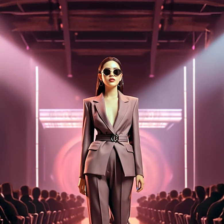
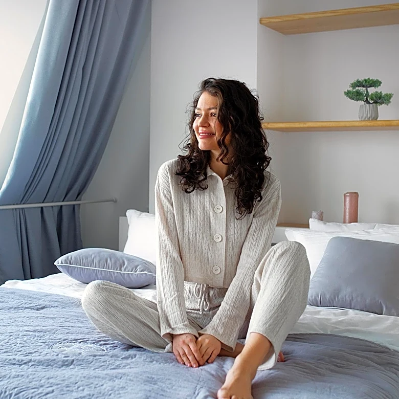
The first and most important rule of dressing for an art fair is a simple one: you are not the art. For stylists dressing high-profile clients, collectors, and gallerists, this principle is non-negotiable. In a space dedicated to celebrating visual expression, showing up in a loud, attention-grabbing outfit is seen as a rookie mistake. It signals that you’re there to be seen, not to see. A muted palette—think shades of stone, cream, charcoal, and olive—acts as a sign of respect. It allows the artwork to remain the focal point of the experience. This isn’t about being boring; it’s about being reverent. A quiet outfit communicates a certain confidence and understanding of the environment. It says, 'I'm here to engage with the work, not to compete
with it.' While the rise of Instagram has turned every event into a potential photo op, the serious art world still operates on an older, more subtle set of codes. Dressing down is, paradoxically, a way of showing you’re in the know.
The Insider's Uniform
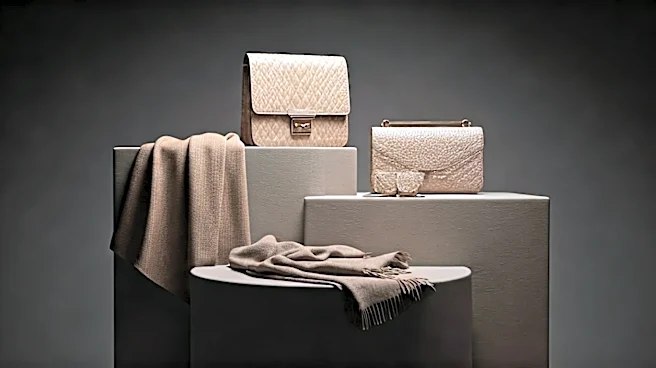
Fashion has always been a language of belonging, and at an event like Frieze, a muted wardrobe is the dialect of the inner circle. While tourists or first-timers might opt for bright colors and trendy, disposable pieces, seasoned veterans lean into what can be described as an 'art world uniform.' This often consists of architectural silhouettes, high-quality fabrics, and a distinct lack of flashy logos—all rendered in neutral tones. Brands like The Row, Jil Sander, and Lemaire have built entire empires on this philosophy of luxurious restraint. By choosing these understated looks, stylists help their clients project an air of seriousness and authority. A collector in a simple, perfectly cut black linen suit or a curator in a sculptural gray dress is making a statement about their taste and priorities. The message is clear: their focus is on acquiring art, not on acquiring likes. This quiet luxury is a form of power dressing that doesn’t need to shout to be heard. It’s the sartorial equivalent of a knowing nod across a crowded room.
A Respite from Visual Overload
Spending a day at a major art fair is an exercise in sensory endurance. You’re navigating crowded aisles, absorbing thousands of visual inputs, from monumental sculptures to intricate video installations. The sheer volume of color, texture, and information can be exhausting. In this context, a muted outfit becomes a practical tool for survival—a personal palette cleanser. Wearing neutral colors can create a sense of personal calm amidst the chaos. It’s a way to insulate yourself, allowing your mind to focus on the art without the added distraction of a vibrant print in your peripheral vision. It’s also physically practical. A well-chosen blazer, comfortable trousers, and elegant flats in black or beige can carry you from a morning viewing to an evening gallery dinner without a single change. This utilitarian aspect—style that is both chic and functional for a long day on your feet—is a hallmark of sophisticated dressing.
The Antidote to Dopamine Dressing
The trend towards muted colors in the art world also feels like a direct response to the broader fashion landscape. For the past few years, 'dopamine dressing'—the embrace of bright, mood-boosting colors like hot pink, kelly green, and electric blue—has dominated runways and street style. It was a joyful, optimistic reaction to the gloom of the pandemic. However, the art world often sets itself apart from mainstream trends. The move toward neutrals can be seen as a pivot back to a more timeless, intellectual approach to style. It rejects the fleeting nature of micro-trends in favor of investment pieces and personal signatures. While the rest of the world was chasing a sugar high of color, the art crowd doubled down on cerebral chic. This isn't a declaration that color is 'out.' Instead, it's a quiet assertion that for certain environments, subtlety, longevity, and context are the most powerful style statements of all.