



The Revolution Started in Cinemas
For decades, television titles were little more than a functional necessity, a simple roll call of names and titles card-punched over a static image or a few generic shots. The real revolution in title design didn't begin on the small screen, but in the movie
theater. Graphic designer Saul Bass was the trailblazer. In the 1950s, he transformed film titles from a boring contractual obligation into a vital part of the storytelling experience. For films like Alfred Hitchcock’s “Vertigo” and “Psycho,” Bass created mini-narratives, using kinetic typography and symbolic graphics to establish mood and theme before the first scene even began. He believed the title was a way to “dition the audience,” giving them an emotional resonance with the story to come. This philosophy, treating the opening as a prologue rather than a footnote, laid the essential groundwork for what television would one day embrace.
Prestige TV Demanded a Better Calling Card
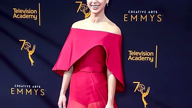
As cable television began its assault on the network model in the 1990s, channels like HBO needed to signal that their programming was different—it was cinematic, adult, and premium. The main title sequence became a key branding tool. The jarring, mundane drive from the Lincoln Tunnel to suburban New Jersey in “The Sopranos” wasn't just an intro; it was a weekly immersion into Tony Soprano's divided world. The show established that a title sequence could be a mission statement. Recognizing this creative boom, the Television Academy had already begun formally honoring the craft, awarding Emmys for graphic design and title sequences through the 90s. This validation encouraged more shows to invest in their openings, turning them into unique visual signatures that were as much a part of the show's identity as its characters or dialogue.
When the Intro Became an Event
Then came “Game of Thrones.” The 2011 fantasy epic didn't just have a title sequence; it had a dynamic, evolving map that was essential viewing. Created by the studio Elastic, the Emmy-winning intro swooped across a clockwork model of Westeros and Essos, with cities and castles rising from the ground. Crucially, the map changed week to week to reflect the ever-shifting plot and character locations, providing viewers with a vital 90-second geography lesson. This raised the stakes for everyone. The intro was no longer just a mood-setter but a piece of world-building that rewarded devoted fans and became a cultural phenomenon in its own right. The budget, complexity, and sheer ambition of title sequences exploded in its wake, as creators realized the opening could be an unskippable event.
The Art of the 'Unskippable' in the Streaming Age
The advent of the “Skip Intro” button presented a new and fascinating challenge: make the opening so compelling that viewers actively choose not to bypass it. In response, designers have leaned into making titles more conceptual, abstract, and thematically dense. Apple TV+'s “Severance” is a perfect example, winning the 2025 Emmy for Outstanding Main Title Design for its surreal, 3D-animated sequence that visualizes the main character's surgically divided consciousness. The creepy, thought-provoking visuals, created by artist Oliver Latta, became a calling card for the show. This trend continues with 2026 Emmy nominees like HBO's horror prequel “IT: Welcome To Derry,” which uses its titles to create a vivid and terrifying atmosphere before a single line is spoken. In the current landscape, a great title sequence isn't just an introduction; it's a piece of art that must justify its existence with every single viewing, proving its value in a world built for skipping.