


Beyond the Art Class Basics
You might remember the color wheel from elementary school art class. At its core, the concept of complementary colors is simple: they are pairs of colors that sit directly opposite each other on the wheel. The most common examples are red and green, blue
and orange, and yellow and purple. When placed next to each other, these pairs create the strongest possible contrast. This high-contrast relationship is precisely what gives them their power in a wardrobe. While a bright red and green combination might scream 'holiday party,' the principle is far more nuanced and sophisticated when applied to fashion. It’s not about wearing a traffic light; it’s about understanding that the tension between these opposites creates a visual harmony that looks intentional, confident, and effortlessly chic.
The Quiet Power of Intentional Contrast
Why does this work so well? A wardrobe built on complementary colors automatically looks curated. When you pair a deep navy sweater with a rust-colored suede skirt, the orange tones make the blue look richer, and vice-versa. The outfit doesn't just match; it communicates. It tells a story of deliberate choice. This is a significant departure from randomly buying pieces you like individually, only to find they don’t play well together. By embracing a complementary framework, you eliminate guesswork. Each piece has a built-in partner, creating a reliable system that makes getting dressed in the morning faster and more satisfying. The 'quiet' part of the headline is key—it’s a strategy that works behind the scenes, making your style look inherent rather than studied.
How to Start: Choose Your Power Pair
The most effective way to implement this is to choose one foundational complementary pair for your wardrobe. Don't think in primary colors; think in their sophisticated relatives. Instead of pure blue and orange, consider a palette of navy and cognac. Instead of jarring red and green, explore olive and blush pink, or burgundy and forest green. Once you’ve selected your core pair, you have a guiding principle for all future purchases. If your base is navy and cognac, you’ll start to see how new items—a cream blouse, a gray pair of trousers, a classic denim jacket—fit into that world. This doesn't mean you can only wear these colors. It means you have a reliable anchor that ensures your wardrobe remains cohesive. Your core pieces will always have partners, and your accent pieces will have a clear role to play.
Expanding the Palette with Tones and Tints
This is where the strategy becomes truly versatile. You are not limited to just two colors. A single color has a whole family of variations: its tints (lighter versions, made by adding white), its shades (darker versions, made by adding black), and its tones (muted versions, made by adding gray). Let's go back to the yellow and purple pairing. This could manifest as a bold, fashion-forward outfit. But it could also be a soft lavender sweater paired with a muted mustard-yellow scarf. Or an eggplant-purple coat worn over a pale, buttery yellow dress. By playing with the intensity and value of your chosen complementary pair, you can create dozens of combinations that range from subtle and professional to bold and expressive, all while staying within your cohesive palette.
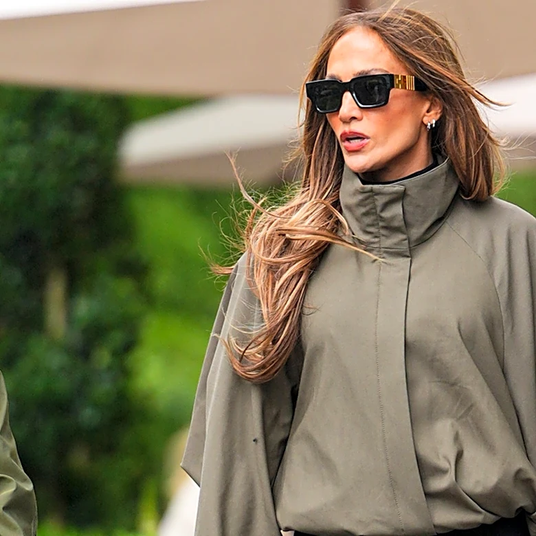
The Easy Entry Point: Neutrals and Accessories
If you’re hesitant to dive headfirst into a world of color, accessories are your best friend. A mostly neutral outfit—think black trousers and a white tee, or a simple beige dress—is the perfect canvas for a pop of complementary color. Imagine that beige dress paired with a vibrant orange handbag and striking blue earrings. The look is instantly elevated from simple to stylish. The colors are doing the heavy lifting for you. This 'third color rule'—two neutrals plus one or two pops from your complementary pair—is a foolproof formula. It allows you to experiment with high-contrast pairings in small, manageable doses, building your confidence and adding a signature touch to even the most basic outfits.