


1. USA 1994: The All-American Denim Disaster
Hosting the World Cup for the first time, the U.S. needed to make a statement. It certainly did, just not the one everyone expected. The Adidas away kit for the 1994 USMNT is a legend of bad taste. Featuring a wavy, faux-denim pattern with oversized,
scattered white stars, it looked like a patriotic tablecloth hijacked by a 90s acid-wash fever dream. Critics called it cartoonish and undignified. Defenders, often with the benefit of three decades of nostalgic irony, see it as a perfect, goofy time capsule—a kit so memorably awful that it has circled back to being iconic. Players like Alexi Lalas and Cobi Jones were forced to wear these into battle, and the sheer audacity of the design ensures no one will ever forget it. It didn't just split the fanbase; it created a permanent benchmark for how weird a soccer jersey could get.
2. Nigeria 2018: The Bold and Beautiful Sell-Out
Few kits have ever generated as much pre-tournament hype as Nigeria’s 2018 “Naija” collection from Nike. Shunning traditional solid greens, the design featured a jagged, lime-green-and-white feather pattern on the torso, with black-and-white sleeves that paid homage to the team's 1994 kit. For one side of the fanbase, it was a breathtakingly modern masterpiece—a vibrant, confident expression of Nigerian culture that instantly became a global fashion item. It reportedly received three million pre-orders. For the traditionalists, however, it was a radical, almost chaotic departure. They saw a loud, streetwear-inspired jersey that broke too far from the simple, elegant green the Super Eagles were known for. The split was between celebrating a new, globalized identity and honoring a more conservative, nationalistic aesthetic. In the end, the market spoke loudest, and the Naija kit became a cultural phenomenon.
3. England 1996: The Infamous Performance-Killing Grey
Can a shirt be blamed for a team’s poor performance? If you were an England fan during Euro '96, the answer was a resounding yes. The team's away kit was a dismal, washed-out grey affair with faint red and blue accents. Under the floodlights, it was notoriously difficult to see. After a dismal first-half performance against Germany in the semi-final, manager Terry Venables famously ordered the team to change into their classic white home shirts. The team’s performance instantly improved, cementing the grey kit’s reputation as cursed. While some now view it with a sort of morbid affection, at the time it was loathed for being both ugly and, allegedly, a tactical liability. Sir Alex Ferguson had made a similar claim about a grey Manchester United kit just months earlier, adding fuel to the fire. It was the ultimate split: a design choice seemingly at war with the very act of playing the sport.
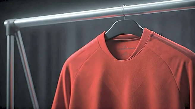
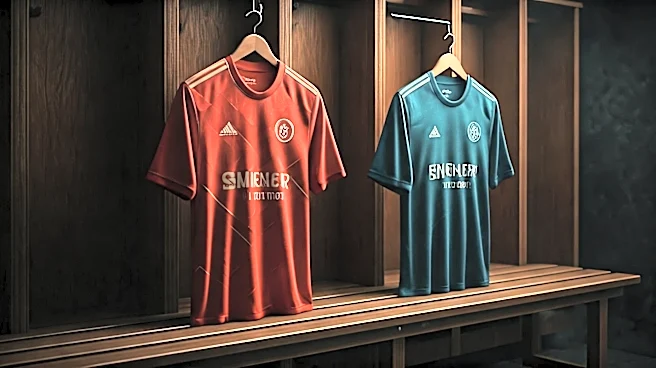
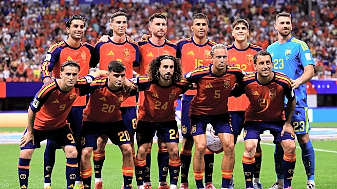
4. Spain 2018: The Unintentional Political Statement
Sometimes, the controversy isn’t about aesthetics but about what people see in the design. For the 2018 World Cup, Spain’s Adidas kit was inspired by their famous 1994 jersey, featuring a jagged red, yellow, and blue pattern down the side. The problem? The specific shade of blue, when combined with the red and yellow, appeared purple to many observers. In Spain, a red, yellow, and purple flag is the symbol of the Spanish Second Republic, a period preceding a brutal civil war and a deeply divisive topic. Right-wing media and politicians decried the kit as a republican conspiracy, while others insisted it was clearly blue and the outrage was manufactured. The Royal Spanish Football Federation had to issue a statement clarifying the color was “cobalt blue.” The kit instantly became a political football, splitting fans not on taste, but on their interpretation of history and national identity.