





Beyond the Basic Color Wheel
For years, style advice has revolved around broad color categories—'wear blues,' 'avoid yellows.' But this approach often misses the most crucial element. As we age, our coloring changes. Hair may lighten to silver or gray, and skin tones can soften or shift.
This means the contrast in our overall appearance changes, too. A color that looked stunning with high-contrast dark hair at 30 might now overwhelm a softer, more blended complexion at 55. The key isn't to abandon color or retreat into a sea of beige and gray, a common mistake that can drain the face of vitality. Instead, it’s about understanding a more nuanced detail that makes a palette truly work.
The Real Secret: Undertone and Intensity
The hidden detail is twofold: your skin's undertone and a color's intensity. Undertone is the permanent, subtle hue beneath your skin's surface—either cool (pink, red, or bluish), warm (golden, peachy, or yellow), or neutral. This undertone doesn't change, but pairing it with the right colors becomes even more important as skin evolves. The second part of the secret is intensity. Instead of just choosing 'blue,' the question becomes, is it a soft, dusty periwinkle or a bright, saturated sapphire? As natural contrast softens, high-contrast colors like stark black or neons can appear harsh, while washed-out pastels can make you look pale. The sweet spot is often found in rich, medium-depth colors that bring life to the face without overpowering it.
How to Find Your Skin's Undertone
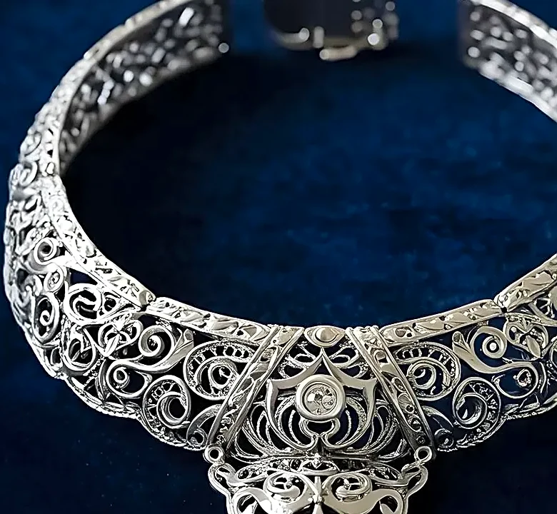
Determining your undertone is simpler than it sounds. One of the most reliable methods is the vein test: in natural light, look at the veins on the inside of your wrist. If they appear distinctly blue or purple, you have a cool undertone. If they look greenish, your undertone is warm (the yellow in your skin makes the blue veins appear green). If it’s hard to tell, you're likely neutral. Another quick check involves jewelry. Silver and platinum tend to flatter cool undertones, while gold illuminates warm undertones. Neutrals can often wear both. Knowing this is the foundation for building a color palette that feels like a natural extension of you.
Building a Palette for Cool Undertones
If you have cool undertones, your best colors will have a blue, pink, or purple base. Think of rich jewel tones like sapphire, amethyst, and emerald, which provide saturation without being harsh. Deeper reds with a blue base, like burgundy and berry, are far more flattering than a tomato red with orange notes. For your neutrals, swap out stark black, which can cast shadows, for a sophisticated charcoal or deep navy. Instead of creamy beiges, opt for cool taupe, soft gray, or pearl white. These colors will harmonize with the pink or blue hues in your skin, creating a bright, clear, and elegant look.
Building a Palette for Warm Undertones
Warm undertones glow in colors with a yellow, peach, or golden base. Earthy hues are your superpower. Think of rich olive green, warm terracotta, spicy rust, and deep cognac. These shades bring out the natural golden quality in your skin. When choosing brighter colors, opt for warm, saturated tones like coral, peach, and tomato red. For your essential neutrals, avoid cool grays and crisp whites. Instead, build your wardrobe around warm, rich options like camel, chocolate brown, warm ivory, and cream. These colors provide a soft, luminous foundation that enhances your skin's natural warmth and radiance.