




What is the Marni Approach to Color?
Marni, the Italian luxury brand, has built its identity on a specific kind of creative chaos. Under the direction of designers like Francesco Risso, the label became famous for its experimental and playful use of color, print, and texture. The 'Marni
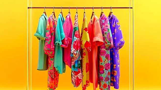
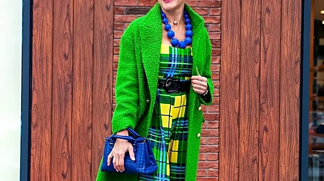
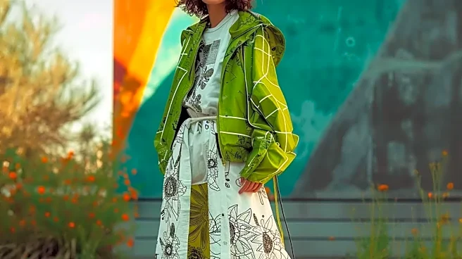
rule,' as style insiders see it, isn't about random messiness; it's about intentional, 'wrong' combinations that somehow feel right. It’s pairing a vibrant green with hot pink or a bold chartreuse with a deep purple. The brand's aesthetic is built on the idea that individual expression trumps traditional harmony, blending eclectic elements into a look that is sophisticated yet subversive. It’s a philosophy that sees your wardrobe as a playground, not a set of rigid guidelines. This approach is about finding beauty in the unexpected and celebrating a non-conformist romantic vibe.
The Joy of 'Dopamine Dressing'
This embrace of vibrant, clashing colors is part of a broader trend known as 'dopamine dressing'. The concept is rooted in the idea that wearing certain colors and clothes can actively boost your mood and create a feeling of happiness, much like the release of the dopamine neurotransmitter in your brain. After years of leaning on safe neutrals, many are finding that wearing bright, dramatic colors feels fresh and joyful. It’s a way to use fashion as a tool for self-expression and to shape your own emotional state. By choosing outfits that bring you personal joy, you can boost your self-confidence and project a more positive and creative image. It's less about following trends and more about wearing what makes you feel alive.
How to Master the Artful Mismatch
Breaking the color rules can be intimidating, but it doesn't have to be. The key is to make your choices feel deliberate. Start small by pairing a colorful item with a neutral like denim, black, or camel to make the combination feel more wearable. For instance, try a butter yellow top with classic black pants or a chocolate brown piece with light blue. Another easy entry point is to use a multi-tonal print as your guide; a floral or abstract pattern can provide a 'cheat sheet' of unexpected colors that work well together. You can also lean on the color wheel for inspiration—pairing colors that sit opposite each other, like red and green, creates a vibrant, high-contrast look. Unexpected pairings like rust and teal or lavender and camel are surprisingly chic. Trying a bold accessory, like a bag or shoes, against a more subdued outfit is another way to experiment without committing to a full head-to-toe clash.
Confidence Is Your Best Accessory
Ultimately, the secret to pulling off an unconventional color combination isn’t about memorizing color theory; it's about confidence. An outfit of olive and pink or red and leopard print works because the wearer owns it. When you embrace a bold look, you're making a statement that you dress for yourself, not for the approval of others. The Marni aesthetic itself is described as being for an individual spirit, not someone just following trends. Think of it as wearing a piece of art. The power of a clashing outfit lies in its ability to communicate creativity and self-assurance. So, whether you’re pairing royal purple with tomato red or lime green with chocolate brown, wear it like you mean it. The most stylish people know that an outfit worn with conviction can never truly be wrong.