








The Three-Second Audition
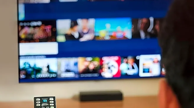
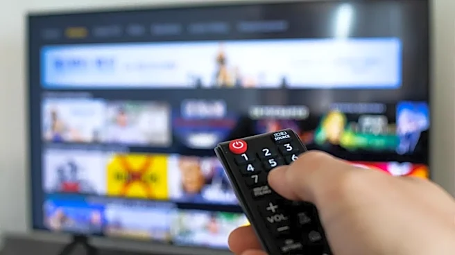
Gone are the days of circling a show in a paper guide and waiting a week. The modern viewing decision is a rapid-fire process of scrolling through a grid of horizontal images on Netflix, Hulu, or another service. Each new show gets, at most, a few seconds
to make its case. This is where key art—the industry term for a show's main promotional image—becomes the most valuable player in marketing. In this brief window, the artwork must do more than just feature a star's face; it has to answer the viewer's most basic question: 'What kind of story is this?' A viewer looking for a laugh won't linger on a dark, moody image, and someone seeking a tense thriller will scroll right past a brightly lit ensemble cast. The artwork is a show's audition, and if it mumbles its lines, the audience moves on without a second thought.
A Visual Shorthand for Story
Effective key art relies on a shared visual language, using established design tropes to signal genre instantly. Is it a comedy? Look for bright, clean backgrounds and characters in a casual, back-to-back pose. An action thriller? Expect dynamic, tilted angles, a blue or orange color palette, and a protagonist in motion. Horror often uses extreme close-ups of an eye or a face obscured in shadow. These aren't lazy clichés; they are efficient communication. A poster showing two leads embracing on a beach immediately signals 'romance,' while a lone figure with their back to the viewer looking out at a vast, strange landscape screams 'epic sci-fi or fantasy.' By using this shorthand, a show’s creators can instantly connect with the specific audience that is actively looking for that exact experience, cutting through the noise of hundreds of other options.
The High Cost of Confusion
When a show's artwork is ambiguous or misleading, the consequences can be fatal. In what's known as the 'paradox of choice,' an abundance of options can lead to anxiety and decision paralysis for viewers. If a poster fails to clearly define the show, it gets lost in this shuffle. Even worse, if the art promises a genre the show doesn't deliver—like marketing a dark character drama with a light, comedic poster—it betrays audience expectations. This leads to viewers tuning out after one episode and, crucially, generating poor word-of-mouth. In the era of Peak TV, where the sheer volume of content is overwhelming, a show needs to find its dedicated tribe of fans quickly. Confusing art actively prevents this, ensuring a show is either ignored or misunderstood, dooming it before it ever has a chance to build momentum.
Feeding the Right Clicks to the Algorithm
Key art isn't just for human eyes; it's also a primary source of data for the streaming platform's recommendation algorithm. When you click on a thumbnail, you're not just choosing a show—you're teaching the service what you like. Clear, genre-specific artwork ensures that the 'right' people are clicking. If a horror fan clicks on a horror-coded image, the algorithm learns to recommend that show to other horror fans. This creates a virtuous cycle of discovery. However, if the art is vague, the initial click data is messy. The algorithm struggles to identify the target audience, and its subsequent recommendations are less effective. In essence, a strong, clear poster helps a new show find its fans by providing clean data that tells the platform exactly who it's for, making it one of the most powerful tools for survival in a saturated market.