



More Than Just a Logo
Before the trailers, the posters, and the endless marketing cycle, there is the convention title card. Unveiled at massive fan events like San Diego Comic-Con or Disney’s D23 Expo, these graphics serve a singular, high-stakes purpose: to announce a new
film, series, or video game to a room packed with the most passionate fans on the planet. Unlike the final, polished logos that eventually adorn posters and merchandise, these are temporary, tactical pieces of design. They are not built to last; they are built to land. Their job is to crystallize a concept into one readable, shareable, and electrifying image that can survive being filmed on a thousand shaky phones and blasted across the internet in minutes. It's a statement of intent, a promise of what’s to come, often created long before a single frame of film is shot.
Designing for the Hall H Roar
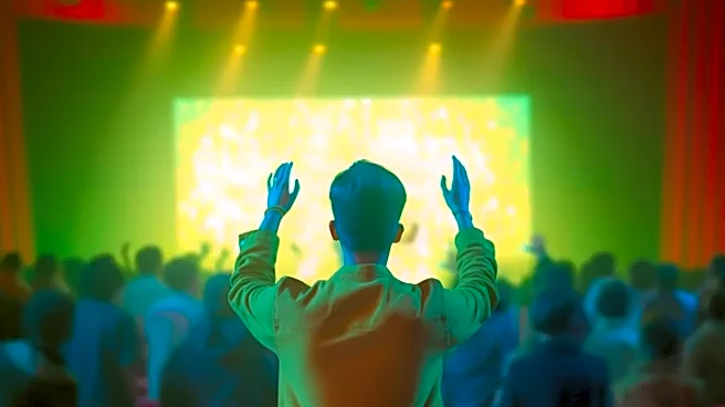
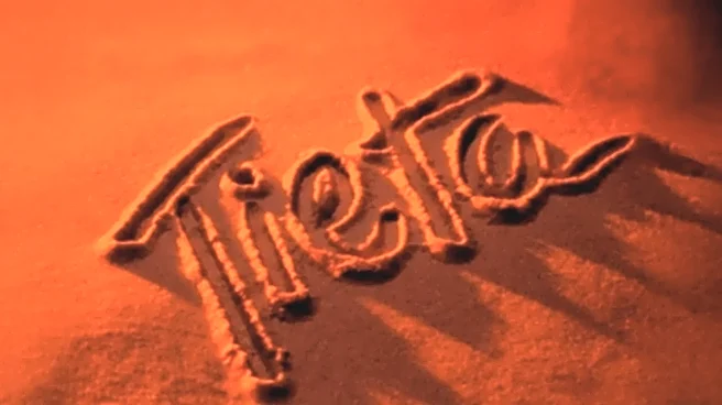
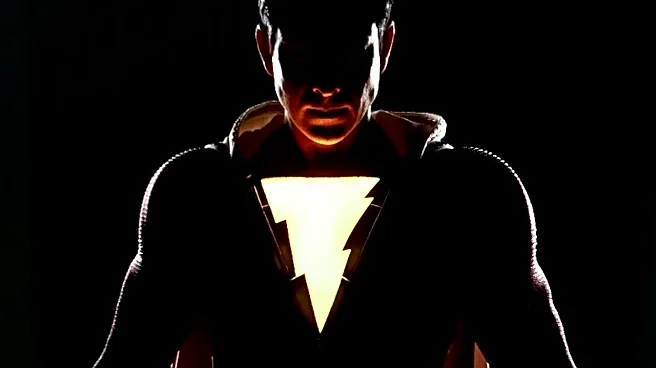
The creative constraints are immense. A convention title card has to be legible from the back of a room the size of an aircraft hangar. It must be visually arresting enough to command attention on a massive screen, yet simple enough to be immediately understood. Designers often work in intense secrecy with minimal source material—perhaps a comic book series, a character’s name, or a vague thematic brief. The typography does much of the heavy lifting, using style and texture to evoke a genre or mood. Jagged, distressed fonts might suggest a horror project, while sleek, metallic lettering could signal a sci-fi epic. The color palette is chosen for maximum impact in a darkened theater, meant to pop against a black background. It's a discipline that blends the principles of classic logo design with the raw, emotional power of a theatrical event. The goal isn't just to inform, but to generate a visceral, audible reaction from the thousands in attendance.
A Placeholder Full of Promise
One of the most fascinating aspects of these title cards is their ephemeral nature. Because they are often created so early in a project’s lifecycle, they represent a moment in time—a studio’s initial vision. It’s not uncommon for these titles to evolve or be replaced entirely as the project develops. Directors and writers change, scripts are rewritten, and the initial creative direction pivots. Fans who follow production closely can often trace a project's evolution from that very first title treatment. This temporary status is part of what makes them so specific. They aren't the final word; they are the first word. They give the studio something concrete to present to the world while affording the creative team the flexibility to refine their vision without being locked into a marketing aesthetic decided years in advance.
The Unsung Heroes of Hype
The artists and designers behind these title cards are often the unsung heroes of the Hollywood hype machine. Working in-house at studios like Marvel or at specialized design agencies, they operate under incredible pressure and tight deadlines. Their work is the culmination of months of strategic planning, all for a reveal that lasts less than a minute. They must distill the core essence of a story they may only know in the broadest strokes into a single, powerful graphic. These designers are masters of mood and suggestion, using their craft to build a bridge between the studio’s ambition and the audience’s imagination. They lay the first cobblestone on the long road of a project's public life, setting the tone for every conversation that follows.