


1. The Billboard-Sized Logo
There's showing team pride, and then there's turning your chest into a walking billboard. A common mistake is a primary logo scaled far too large for the garment. Instead of a sharp, confident statement, it overwhelms the piece, making it look like a novelty
item. A well-proportioned logo should complement the apparel, not dominate it. For a tee or hoodie, the graphic shouldn't extend awkwardly into the armpits or belly area; it should sit cleanly on the chest, typically between 8 to 12 inches wide for a full front design.
2. Awkward Graphic Placement
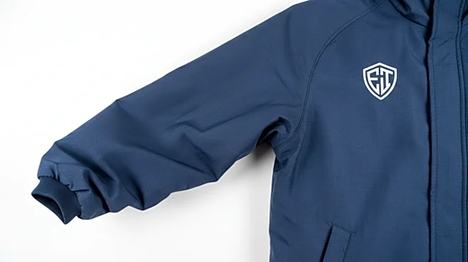
Placement is everything. A graphic printed too low—creeping down toward the stomach—can look unflattering and is often a sign of cheap production. Conversely, a design placed too high can feel like it's choking the wearer. The sweet spot for a standard front graphic is generally three to four inches below the collar. For a left-chest logo, the top of the design should align similarly, sitting neatly over the heart, not drifting toward the center or into the armpit.
3. Text That Screams (or Whispers)
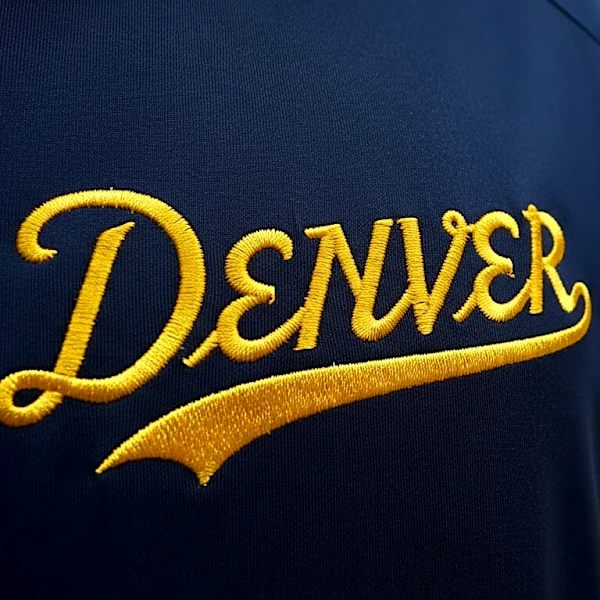
Typography is a delicate art, and on apparel, it's easily botched. Text that is too large can feel aggressive and unsophisticated, while text that is too small becomes unreadable from a short distance. Good design uses a clear hierarchy; not every word needs to be the same size. The goal is legibility without clutter. If you can't easily read a team name or slogan from a few feet away, or if the letters are fighting for space, the proportions are likely off.
4. The Cluttered Championship Design
Championship gear is notorious for this error. In an effort to commemorate everything about a victory, designers cram logos, scores, dates, and team rosters into one small space. The result is often a chaotic and illegible mess. Premium design understands the power of negative space—the empty areas around design elements. This breathing room is crucial for highlighting important information and creating a balanced, professional look, rather than a frantic jumble.
5. The Warped Sleeve Graphic
Sleeve graphics are a great way to add a secondary detail, but they're tricky to get right. A logo that is too large or placed incorrectly on a sleeve can stretch and warp with the natural movement of the arm, distorting the image. Proper sleeve logos are typically small, around 1 to 3 inches wide, and placed carefully to align with the shape of the garment, ensuring they look sharp whether your arm is straight or bent. This prevents the design from looking like a poorly applied sticker.
6. The Back Graphic That's Lost
The back of a hoodie or jacket offers a large canvas, but it’s often misused. A common mistake is placing a large design too low, where it can be obscured by tucked-in shirts or the natural fold of the fabric at the waist. A back graphic should typically start about 4 to 6 inches below the collar, allowing it to sit squarely between the shoulder blades. This ensures maximum visibility and keeps the design from looking like it’s sinking or misplaced.
7. The Puffy Hat Embroidery
On hats, proportion is key to avoiding a cartoonish look. The mistake here is often embroidery that is too large, thick, or has too many fine details for the small space. This can cause the front panels of the cap to bulge and pucker, making the hat look bulky and cheap. A high-quality embroidered logo should be crisp, clear, and scaled appropriately to the hat's structure, complementing its shape rather than fighting against it.