




A Hue Hiding in Plain Sight
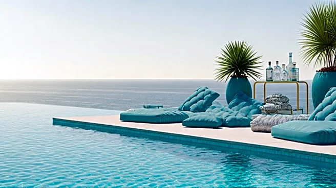
It’s the color of a sunlit Caribbean shoal, the tiled bottom of a Palm Springs pool, and the refreshing fizz of a gin cocktail served at exactly the right time. For decades, aqua—and its cousins turquoise, teal, and cerulean—has been a backdrop, an accent,
a playful but ultimately unserious part of the vacation palette. It was the color of nostalgia, often bordering on kitsch. But something has shifted. In the world of high-end resorts, boutique hotels, and resort-wear collections, this family of blue-greens is no longer just a fun throwback. It’s being treated with a new gravitas. From the serene, hand-glazed tiles lining the pools at newly opened hotels in Mexico to the monochromatic linen sets gracing the pages of fashion magazines, aqua has been elevated. It's emerging from its retro past to become a primary color of modern luxury, and its return feels both surprising and perfectly timed.
Shedding Its Kitschy Past
To understand why aqua’s return is so unexpected, you have to remember its history. The color is deeply embedded in the American consciousness as a symbol of mid-century optimism and, later, mass-produced tackiness. Think of the gleaming aqua Bel Airs of the 1950s, a futuristic statement of postwar prosperity. By the 60s and 70s, it had migrated indoors, covering Formica countertops and shag carpets. By the 80s and 90s, it was the color of Swatches and ski jackets, forever associated with a certain youthful, almost cartoonish, energy. For designers, this history presents a challenge. Using aqua meant risking association with Tupperware parties and dated Florida condos. Its inherent cheerfulness made it feel unserious, a color for play, not for poise. It was a hue you used for a pop of fun, not as the foundation of a sophisticated design scheme.
The Psychology of an Escape Color
So, why the comeback? The answer lies in our collective mood. After years of global uncertainty and digital saturation, we are craving tranquility, escapism, and a connection to the natural world. Aqua delivers on all fronts. Psychologically, it’s a profoundly reassuring color. It blends the calming stability of blue with the renewing, life-affirming energy of green. It is, quite literally, the color of water—the element we associate most with cleansing, clarity, and escape. In a world of beige, gray, and minimalist white, a splash of aqua feels like a deep, cleansing breath. It doesn't demand attention the way a hot pink or a fiery orange does. Instead, it invites you in, promising a moment of peace. It’s the visual equivalent of putting your out-of-office on, a shorthand for a state of mind that is both relaxed and refreshed.
The New Rules of Aqua
Crucially, the aqua that’s returning isn’t the same one we left behind in 1992. Its new-found seriousness comes from how it’s being used. The key is context and texture. Instead of being paired with jarringly bright neons or flamingo pinks, today’s aqua is set against a backdrop of earthy, organic materials. Designers are matching it with natural rattan, warm terracotta, light-toned woods, and burnished brass fixtures. This grounds the color, stripping it of its synthetic, plastic-y associations and highlighting its connection to the natural world. Texture is also playing a huge role. We’re seeing it in the rich pile of a velvet sofa, the slub of a heavy linen curtain, the uneven surface of a handmade zellige tile, or the soft wash of a watercolor-print dress. This tactile approach gives the color depth and maturity. It’s no longer a flat, shiny surface but a complex, inviting hue that you want to reach out and touch. It’s aqua, but all grown up.