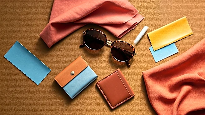

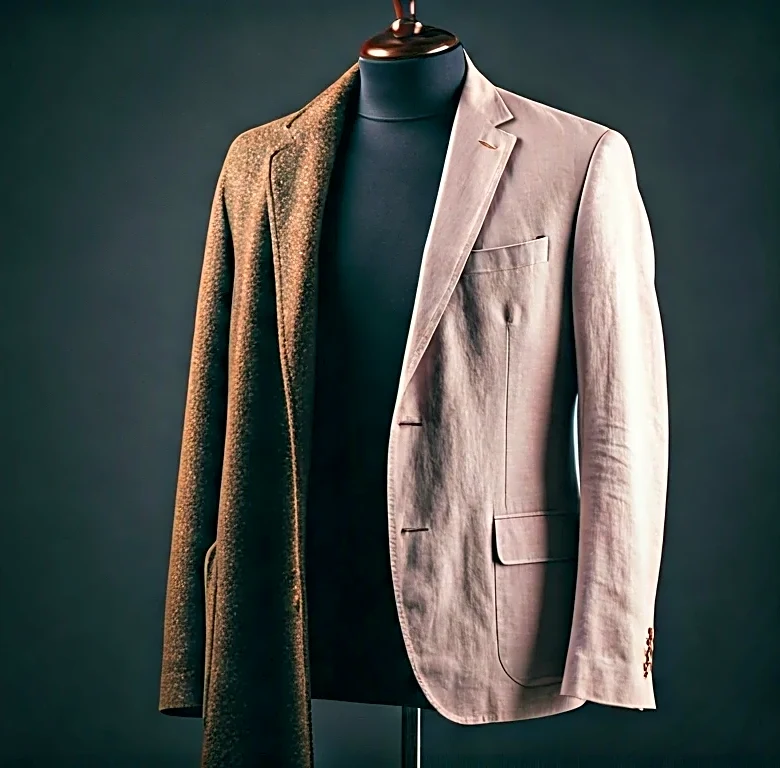


The Foundation: A Neutral Base
The secret to the sophisticated Pitti look isn't a riot of bright, flashy colors. It's the opposite. The entire system is built on a foundation of versatile, earthy neutrals. Think of colors that look like they've been gently sun-bleached on the Italian
coast: shades of beige, stone, cream, olive, and khaki. These form the canvas for your entire outfit. A pair of well-fitting chinos in a light stone color or a relaxed linen shirt in ecru isn't just a safe choice; it's a strategic one. These tones are inherently calming and upscale. They communicate a quiet confidence and work beautifully with a summer tan. Crucially, they also provide the perfect backdrop for other colors to pop in a controlled, elegant way. Instead of starting with a bold color, start with a rich neutral and build from there.
The Accent: One or Two Rich Colors
Once you have your neutral base, the formula calls for the careful introduction of one, or at most two, accent colors. But these aren't the primary reds or electric blues you might find in a typical resort collection. The Pitti palette favors rich, complex, and often muted shades. Consider terracotta, burnt orange, sage green, dusty rose, or a deep marine blue. Imagine a navy polo shirt paired with beige trousers and a terracotta-colored pocket square, or an olive green linen jacket worn over a white shirt and cream pants. The key is restraint. The accent color provides a point of interest and personality without overwhelming the eye. It’s the difference between shouting for attention and earning it with a confident whisper.
The Anchor: The Power of Crisp White
Within the neutral family, white deserves its own category. It’s the ultimate summer anchor. A pair of crisp white trousers or clean white leather sneakers can make any combination of colors look sharper, cleaner, and more intentional. At Pitti, you'll see white used to break up tonal outfits (like a white t-shirt under a beige suit) or to provide a sharp-edged foundation for an entire look (like a pair of white jeans). It acts as a visual palate cleanser, adding a dose of Riviera-ready freshness. Don't be afraid of white pants; they are arguably more versatile in summer than blue jeans and instantly elevate everything they're paired with. They are the workhorse of the polished summer wardrobe, making everything around them look brighter and more deliberate.
The Pro Move: Tonal Dressing
For a truly advanced, yet surprisingly simple, style move, look to tonal dressing. This involves wearing different shades of the same color. It’s a favorite among the Pitti regulars because it’s visually interesting without being loud. Think a pair of dark brown trousers, a lighter tan polo, and a cream-colored jacket. Or combine various shades of blue—a navy blazer, a sky-blue shirt, and light-wash denim. The effect is cohesive and incredibly chic. It creates a long, lean silhouette and shows a deep understanding of color theory. The trick is to vary the textures as well as the shades—pairing a soft suede with a crisp cotton, for instance—to prevent the outfit from looking flat.
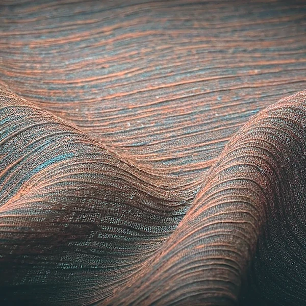
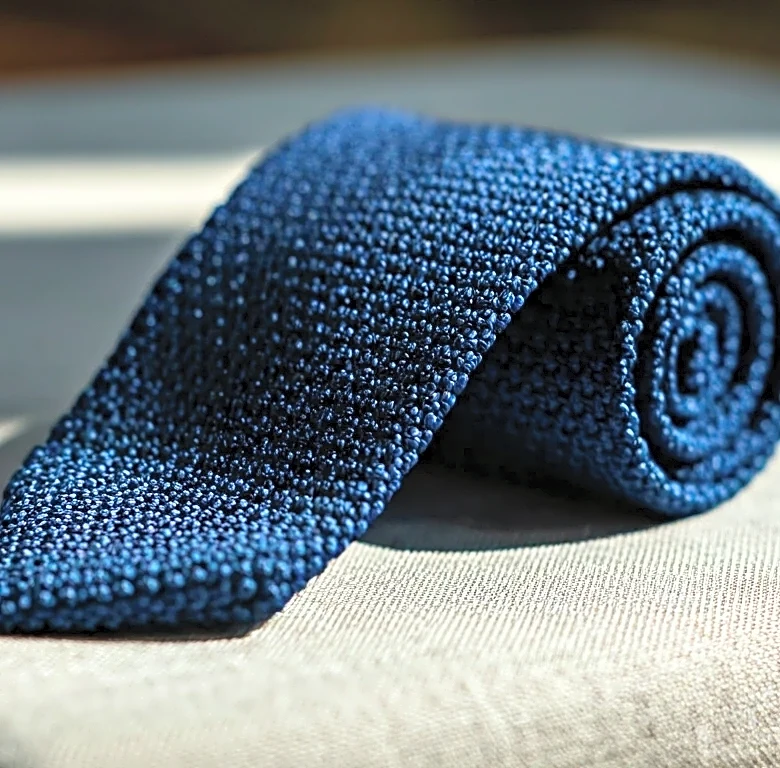
The Detail: Texture Over Pattern
Finally, much of the visual interest in these outfits comes not from busy patterns but from rich textures. The Pitti color formula works so well because it's often applied to fabrics with inherent character. Instead of a printed shirt, you’ll see a slub-linen shirt that has natural variations in its weave. Instead of patterned shorts, you’ll see seersucker, with its distinctive pucker. Suede loafers, knitted polo shirts, and raw silk ties all add a tactile dimension that makes simple color combinations feel luxurious. When your palette is restrained, texture does the heavy lifting, adding depth and sophistication that a loud pattern rarely can.