


The Challenge of One-Note Color
Going monochrome sounds easy. Pick a color—black, navy, beige, olive—and wear it from head to toe. The problem is, when all the fabrics are the same, the outfit can fall flat. A matching cotton shirt and cotton chino combination, for example, can look
less like a deliberate style choice and more like a work uniform or a pair of pajamas. Without variation, the eye glides right over the look. It becomes a single, unbroken block of color that lacks depth, dimension, and personality. This is the primary pitfall that separates the amateur from the adept. The goal isn't just to match colors; it's to build a cohesive and compelling silhouette. The best-dressed men at Pitti Uomo understand that the solution isn't more color, but more substance.
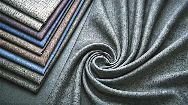
Defining Textile Contrast
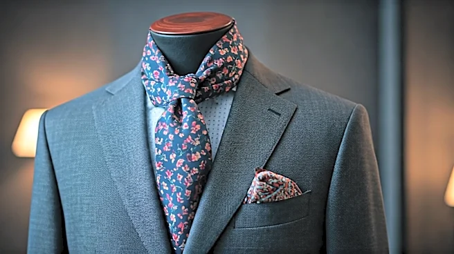
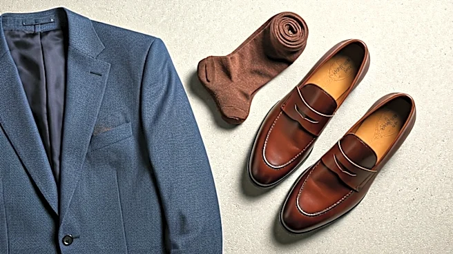
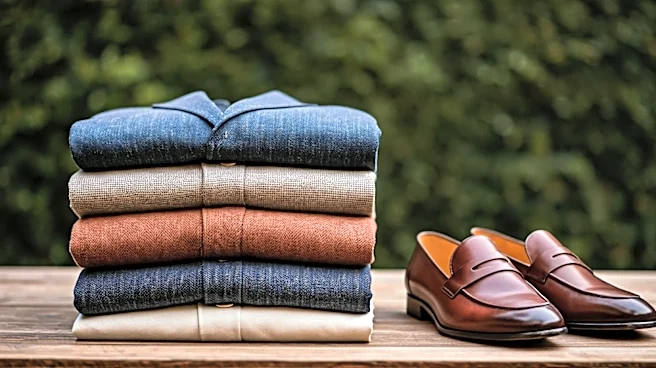
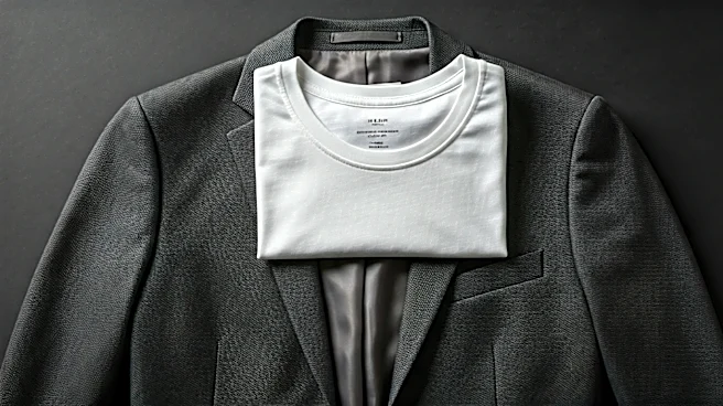
This is where textile contrast comes in. In simple terms, it’s the art of mixing different fabric textures and weaves within the same color family. Think of it as creating a tactile landscape. You're pairing something rough with something smooth, something matte with something that has a sheen, or something structured with something that drapes. A single navy-blue outfit can suddenly become a symphony of materials: a chunky, ribbed wool sweater, a pair of crisp cotton twill trousers, a smooth leather belt, and maybe even suede loafers. Each piece is navy, but each one interacts with light and shadow in its own unique way. This contrast is what gives the outfit its visual weight and sophistication.
Creating Depth and Visual Interest
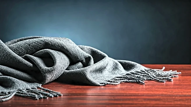
Why does this work so well? Because our eyes perceive texture as a form of detail. A nubbly wool coat doesn't just look warm; its uneven surface creates thousands of tiny shadows, making the color appear richer and darker in places. A silk tie, by contrast, catches the light, creating a bright focal point. When you combine them, you're creating a dynamic interplay of light and dark, even within a single hue. This layering of textures prevents the outfit from becoming a monotonous blob. It guides the viewer's eye across the different elements, allowing them to appreciate each piece individually while still admiring the cohesive whole. It’s a technique that signals confidence and a deep understanding of clothing—you’re not just wearing clothes, you’re composing an outfit.
How to Master the Mix
Getting started with textile contrast is easier than it sounds. The key is to think in pairs. Start with an all-black, all-navy, or all-grey outfit in mind and try some of these classic combinations seen on the Florentine streets:
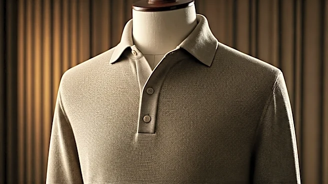
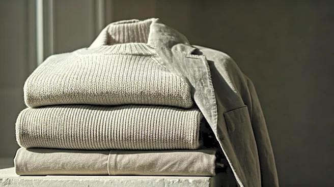
* Wool & Cotton: This is the workhorse of textural dressing. Pair a heavy wool overcoat or a chunky fisherman's sweater with simple, sturdy cotton chinos or denim. The roughness of the wool makes the smoothness of the cotton pop.
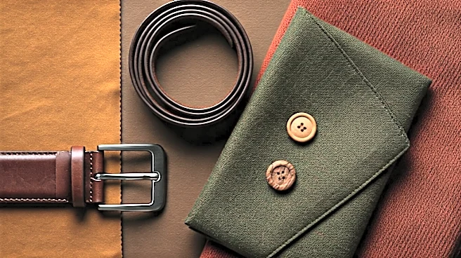
* Leather & Cashmere: The peak of rugged luxury. A sharp leather jacket adds a hard, sleek edge to the incredible softness of a cashmere or merino wool knit. The contrast is both visual and tactile.
* Suede & Denim: A perfect blend of refined and casual. The soft, matte nap of a suede bomber jacket or Chelsea boots looks fantastic against the rugged, slightly uneven texture of raw or washed denim.
* Corduroy & Twill: Play with ribbed and smooth surfaces. Corduroy trousers bring a vintage, academic feel with their distinct wales (the raised ribs), which stand out beautifully against a simple, flat-front twill jacket or shirt.
The Pitti Uomo Blueprint
Walk through the Piazza Pitti during the fair, and you'll see this principle in action everywhere. You’ll spot a man in an all-ivory ensemble: wide-leg linen trousers that flow and wrinkle naturally, a fine-gauge cotton knit polo, and a pair of suede espadrilles. Each piece is a slightly different shade of off-white, and each texture tells a different story. Another might be in head-to-toe olive green: a waxed cotton field jacket with a slight sheen, heavy-duty corduroy pants, a rugged knit beanie, and worn-in leather boots. It's a masterclass in monochrome, proving that the richness of an outfit doesn’t come from a loud color palette, but from the thoughtful combination of materials. It’s a quiet, confident statement that speaks volumes.