




Start with Mood, Not a Match
Before you even consider color, tune into the painting's emotional frequency. Does it feel chaotic and energetic, like a work by Jackson Pollock? Or is it serene and contemplative, like a Mark Rothko color field? This mood is your true starting point.
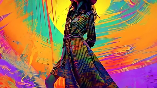
For a chaotic painting, think in terms of dynamic layers, asymmetrical cuts, and a mix of unexpected materials. For a serene piece, lean into minimalism, clean lines, and soft, flowing fabrics. The goal is to wear the feeling of the artwork, not a print of it. This emotional connection creates a look that is deeply personal and resonant, turning your outfit into a form of self-expression that communicates a specific energy.
Borrow the Color Palette, Don’t Copy It
A direct one-to-one color match can look costumey. Instead, act like a designer and extract a palette of two to four key colors from the painting. Identify a dominant hue, a secondary shade, and one or two accent colors. Your outfit doesn't need to feature these colors in the same proportion as the artwork. For instance, if a painting is overwhelmingly a deep blue with flashes of yellow, consider a navy dress with a single, striking yellow accessory like a handbag or scarf. You can also play with tones; a painting's vibrant primary colors can be reinterpreted in more muted, sophisticated pastel or earthy versions for a wearable, chic look. This approach uses color theory to create harmony and visual interest without being overly literal.
Translate Texture and Brushstrokes into Fabric
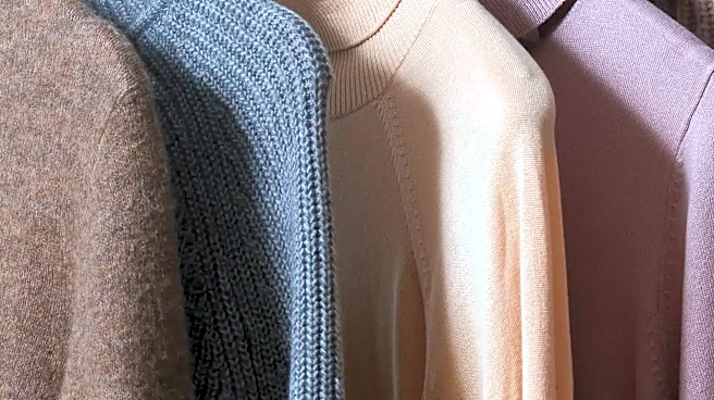
Abstract art is often as much about texture as it is about color. Look closely at the artist's technique. Are the brushstrokes thick and visible (impasto)? Translate that into chunky knits, raw-hemmed denim, or textured bouclé. Are the colors smoothly blended or washed, like a watercolor? Echo that with soft, flowing materials like silk, chiffon, or fine-gauge cashmere. Sharp, graphic lines might inspire you to choose crisp cotton shirting, structured leather, or sharply tailored blazers. The physical surface of the painting offers a rich vocabulary for fabric choice, adding a tactile dimension to your art-inspired look that goes far beyond a simple printed pattern.
Echo Composition and Shape in Your Silhouette
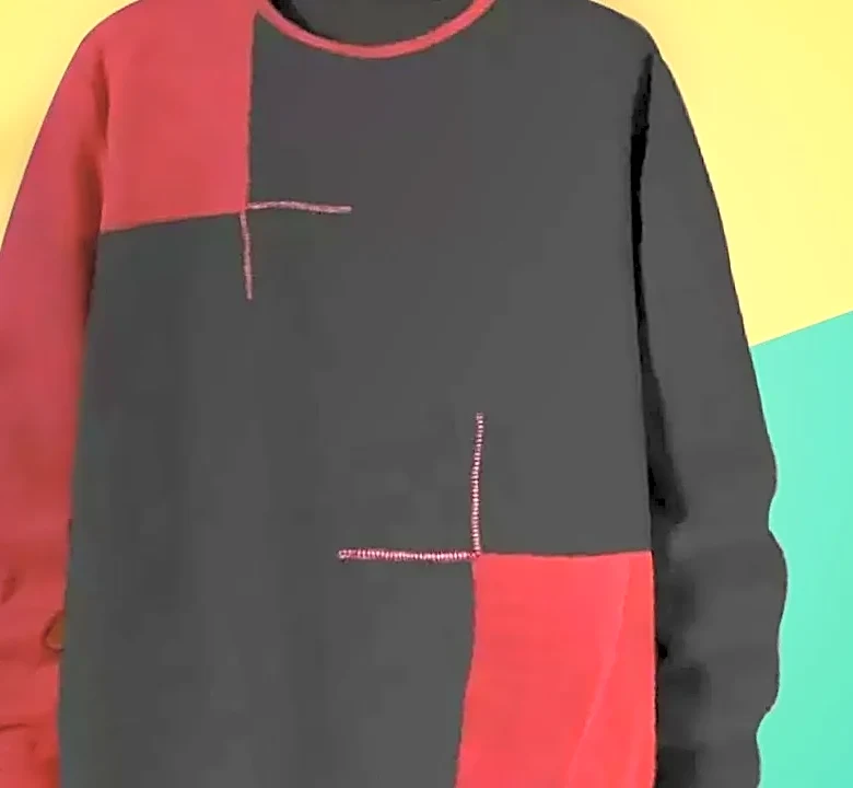
The way an artist arranges shapes on a canvas is its composition, and you can mirror this in your outfit's silhouette. A painting dominated by large, expansive blocks of color could inspire a color-blocked outfit with oversized, architectural shapes. A piece with dynamic, swirling lines might translate into a gracefully draped dress or a flowing skirt that moves with you. Conversely, art with rigid, geometric forms, like the work of Piet Mondrian, could be reflected in a structured blazer paired with wide-leg trousers, creating clean, defined lines. Think about the overall form of the artwork—is it grounded and heavy, or light and airy? Let that guide whether you choose a body-skimming silhouette or something more voluminous and free-form.
Use Accessories as Your Focal Point
Sometimes the most powerful way to reference a painting is through small, intentional details. An artwork's single, brilliant splash of red doesn't have to be a shirt; it can be a bold lip, a pair of statement earrings, or a vibrant watch band. A painting featuring metallic elements can be honored with gold or silver jewelry that catches the light. Think of your core outfit as the neutral background—the canvas—and your accessories as the final, impactful brushstrokes. This method allows you to pay homage to a piece of art in a subtle, sophisticated way that feels integrated into your personal style rather than overpowering it.